Chuck: A bold brand for a bank that refuses to look average
Join in connection
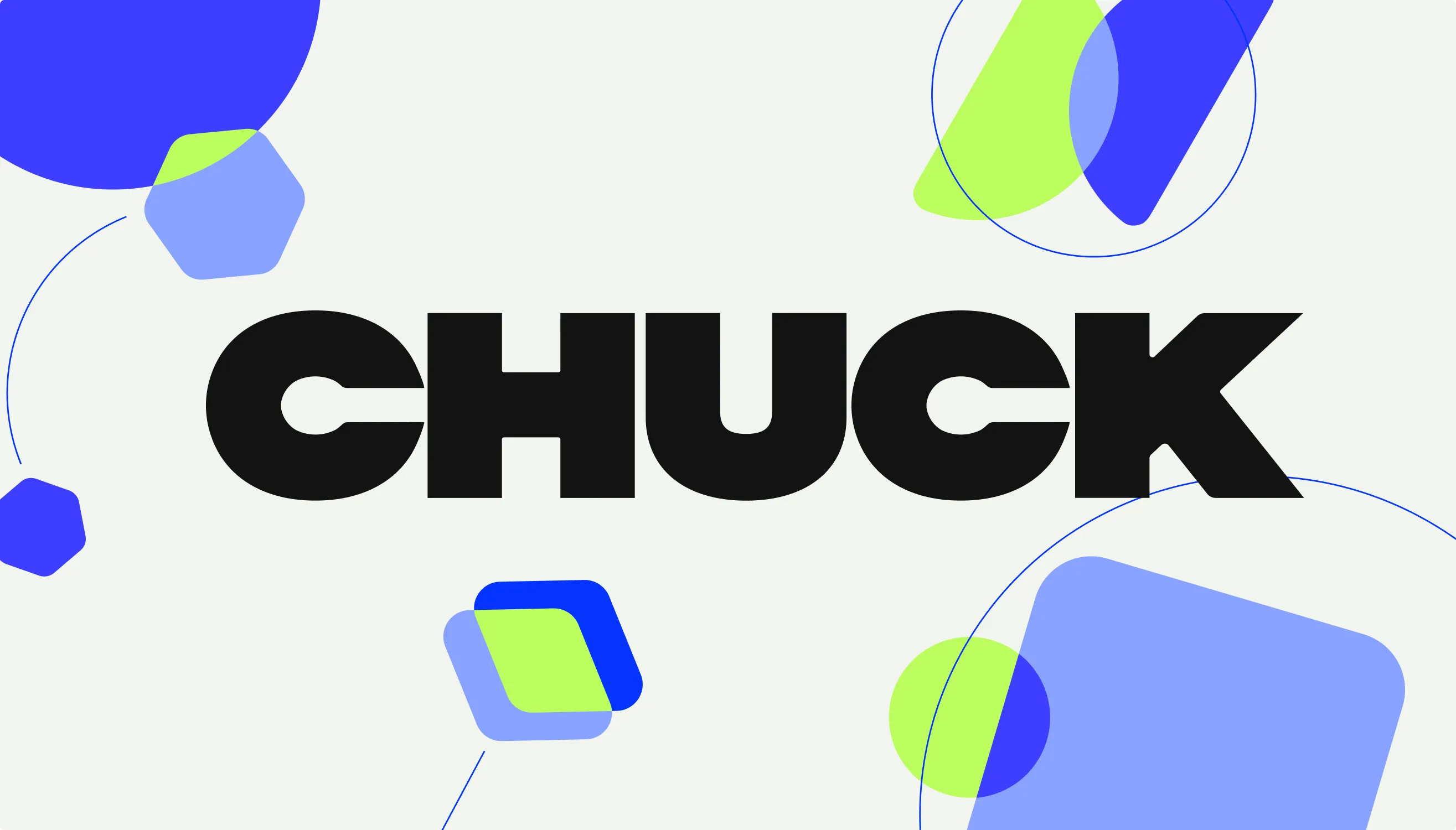
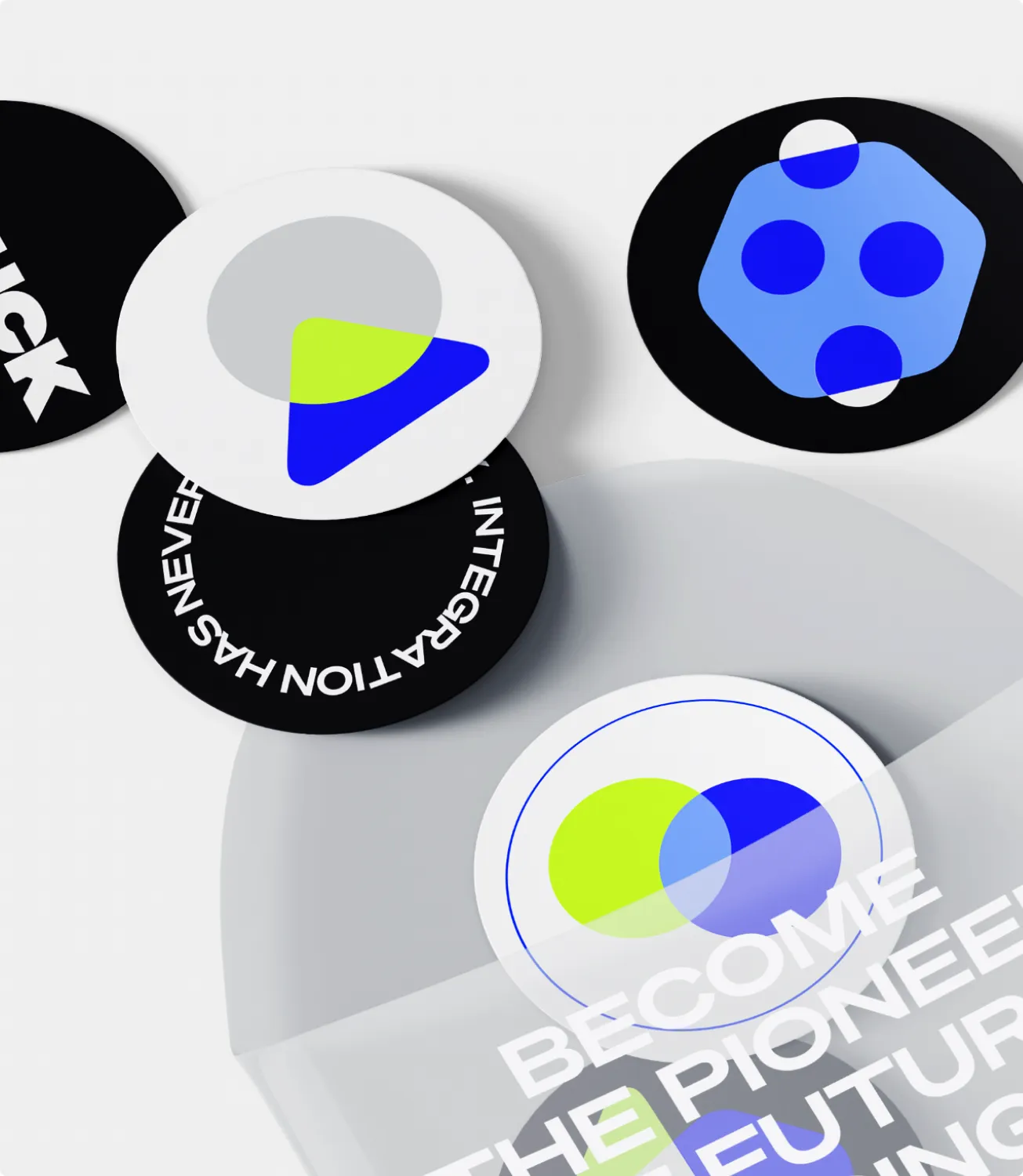
We wanted to illustrate seamless integration offered by Chuck — so every new connection shines with a new color.
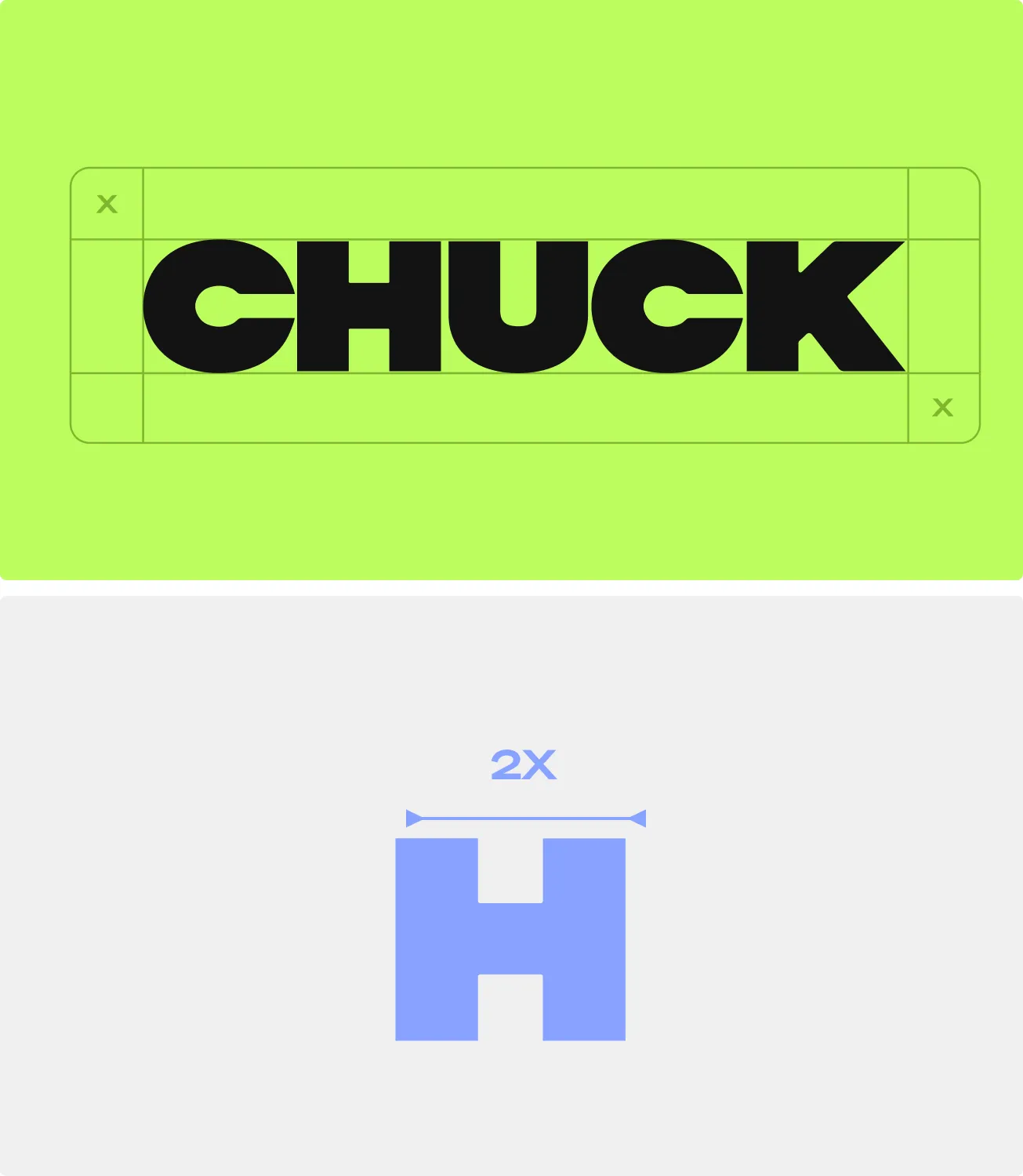
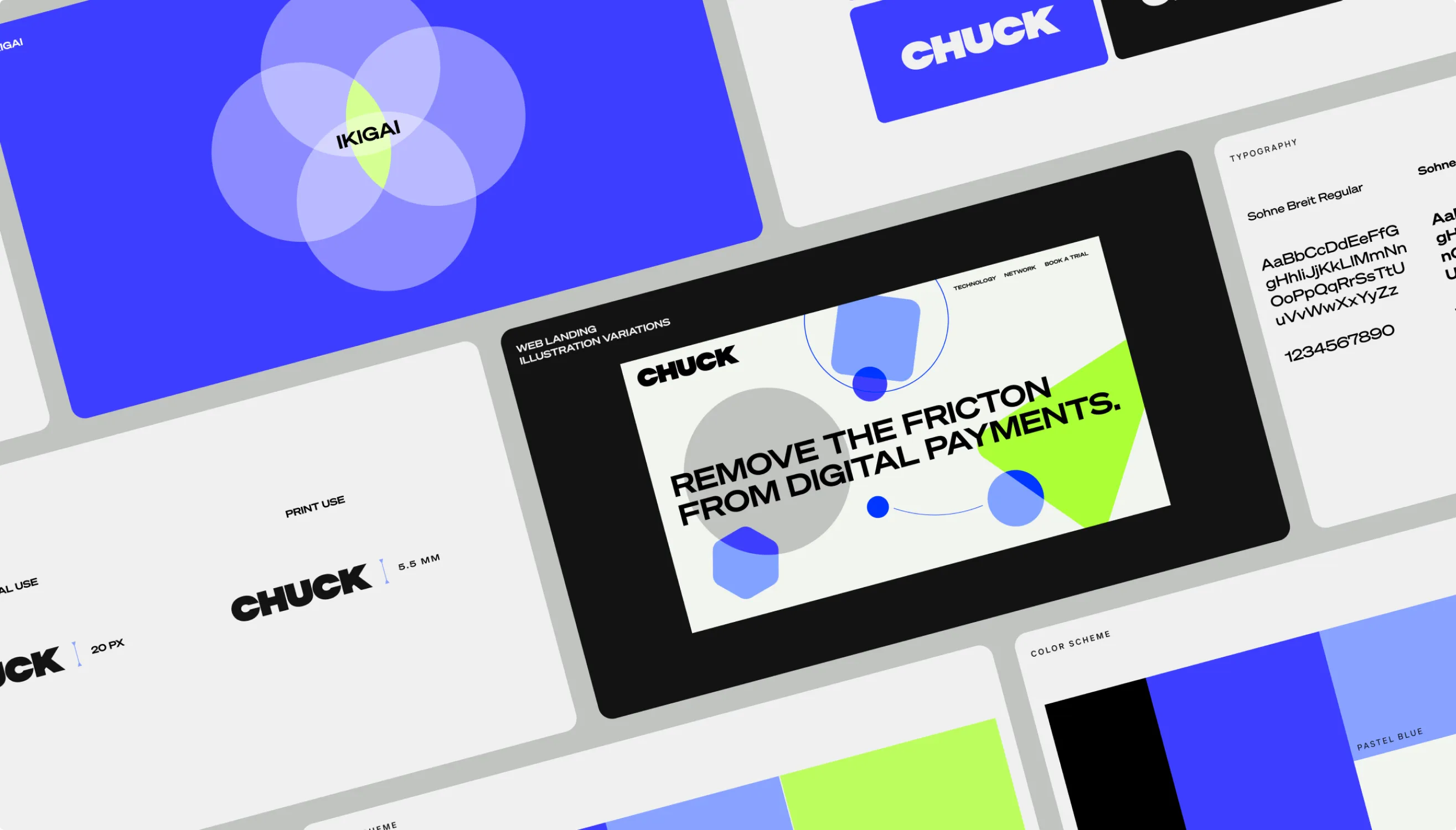
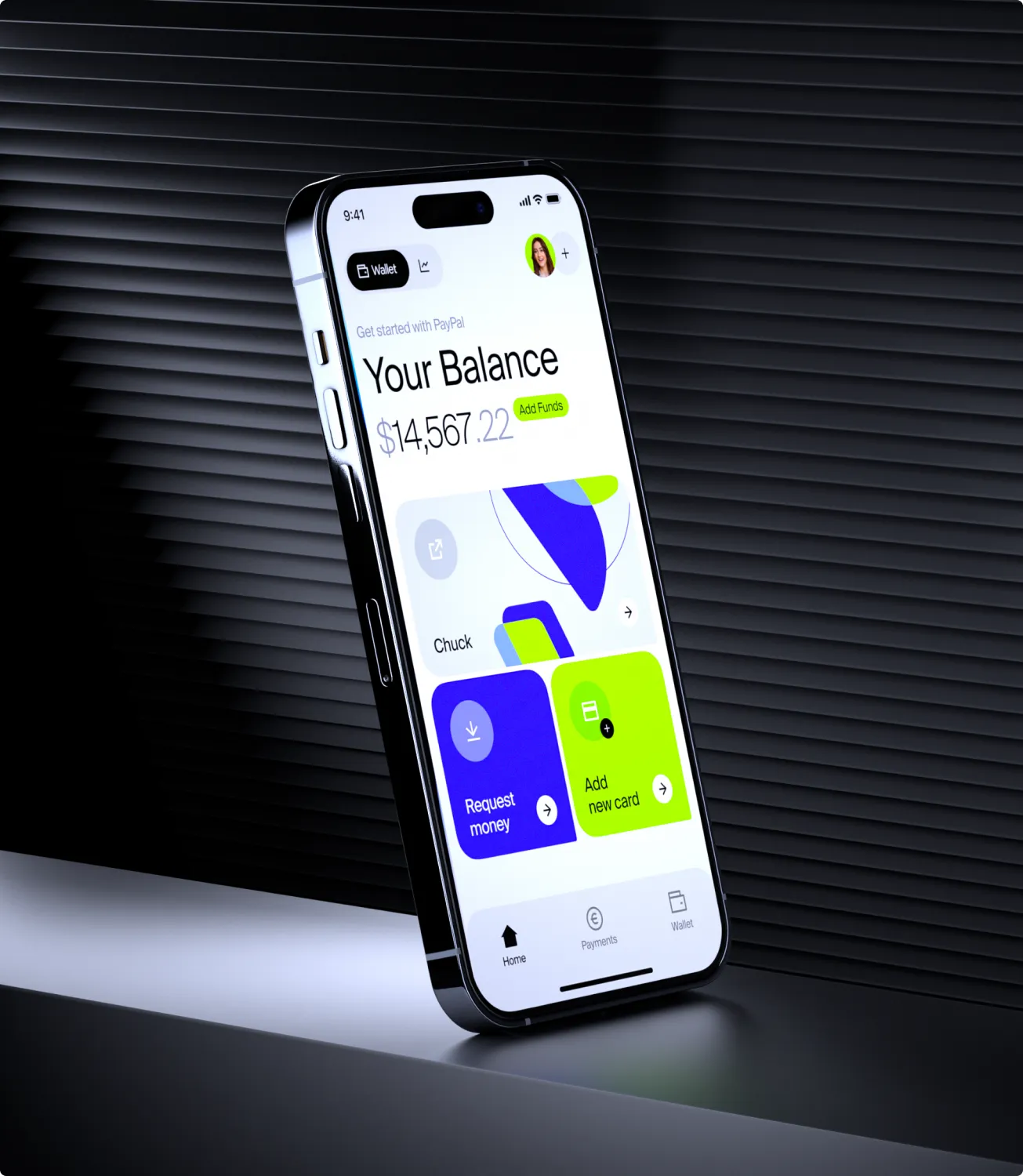
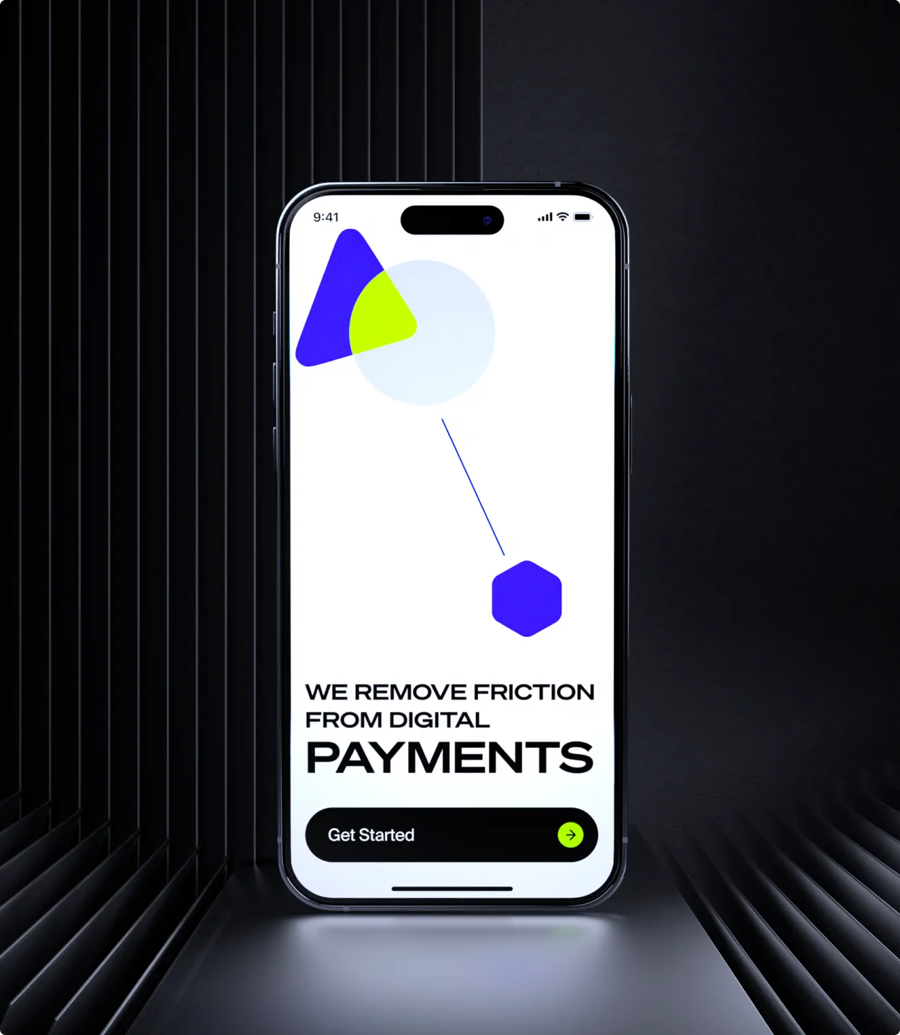
Neon green and accent blue are not your average bank brand palette. But Chuck is not your average banking app. The brand’s primary and secondary colors give surprise, confidence, and professionalism.
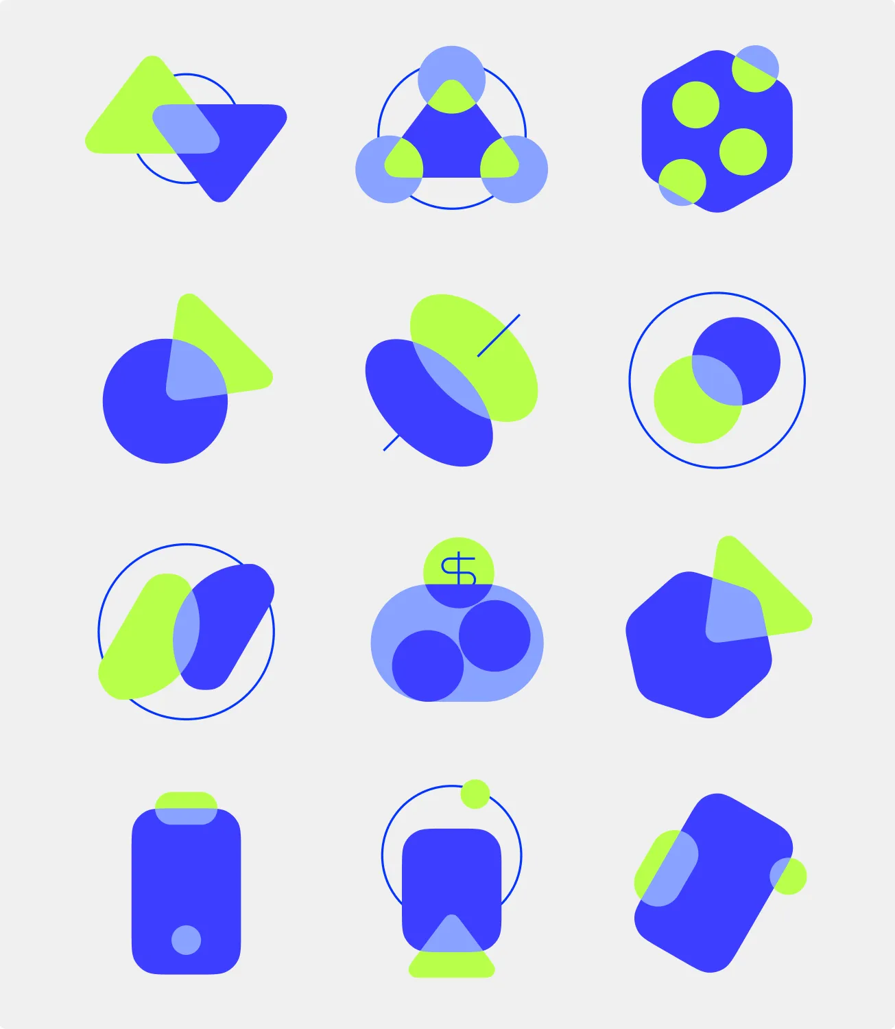
Rolling out our system of overlapping colors and lines that join them, we created a whole system of colorful bold icons.
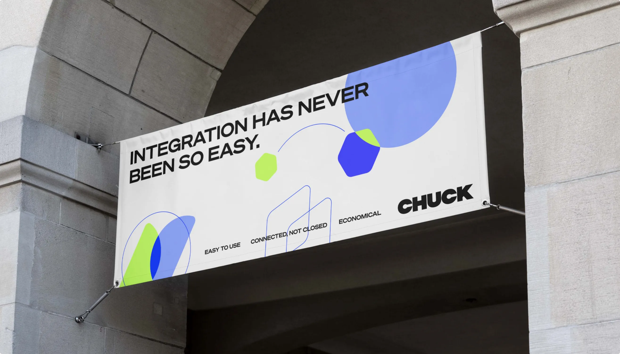
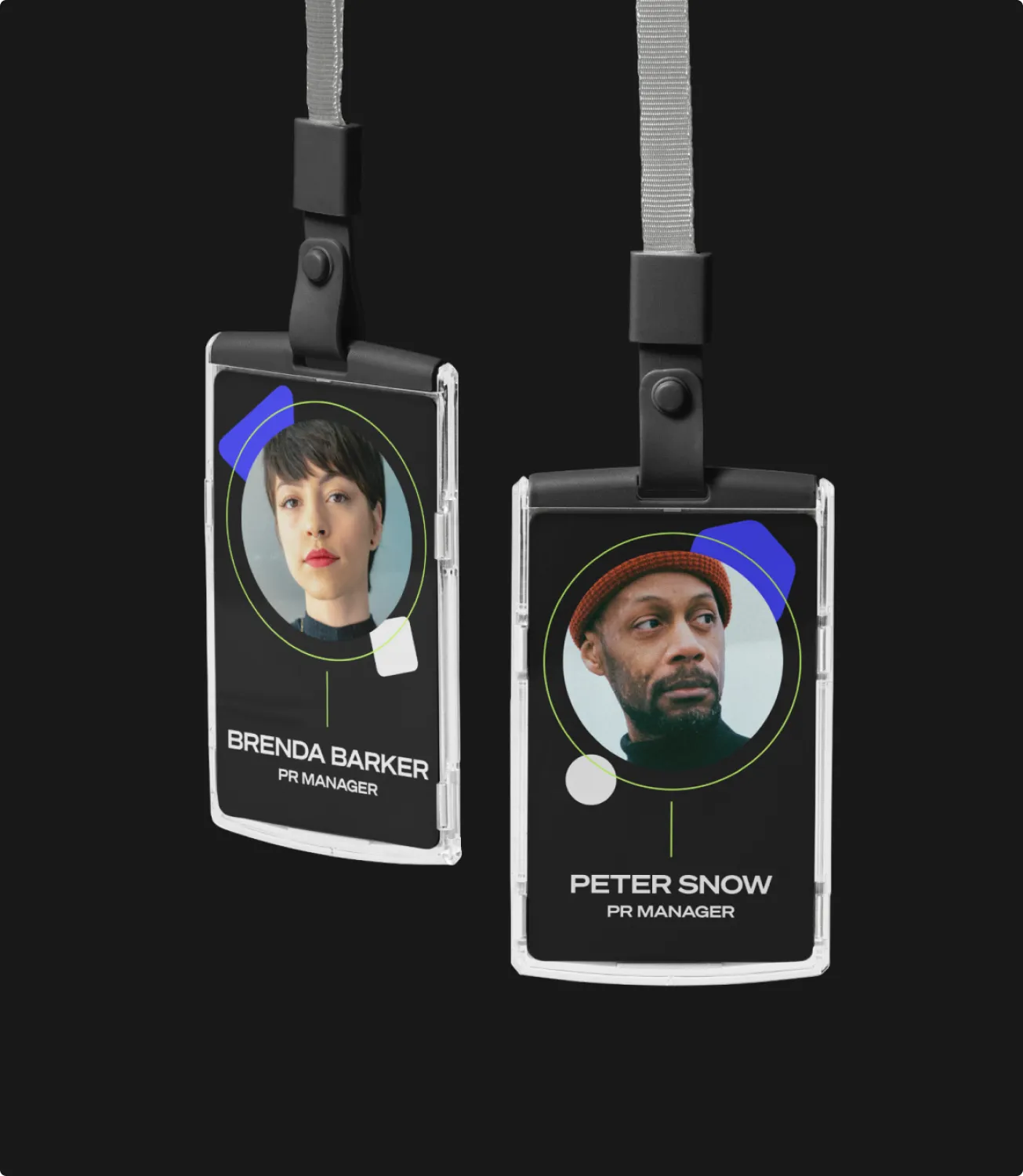
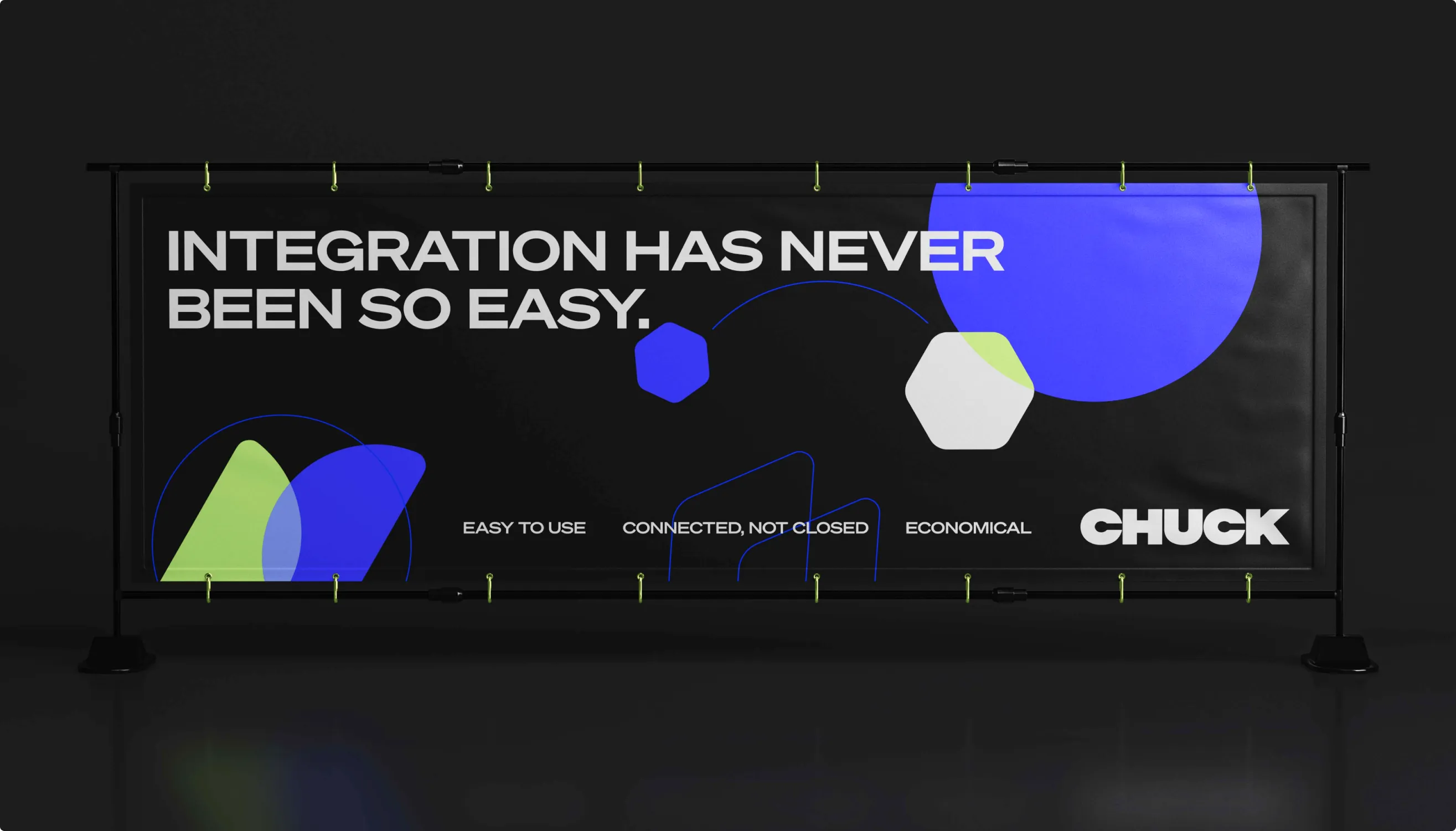
The brand had to work off screen too, so we took it to street banners, lanyards, stickers, and print.
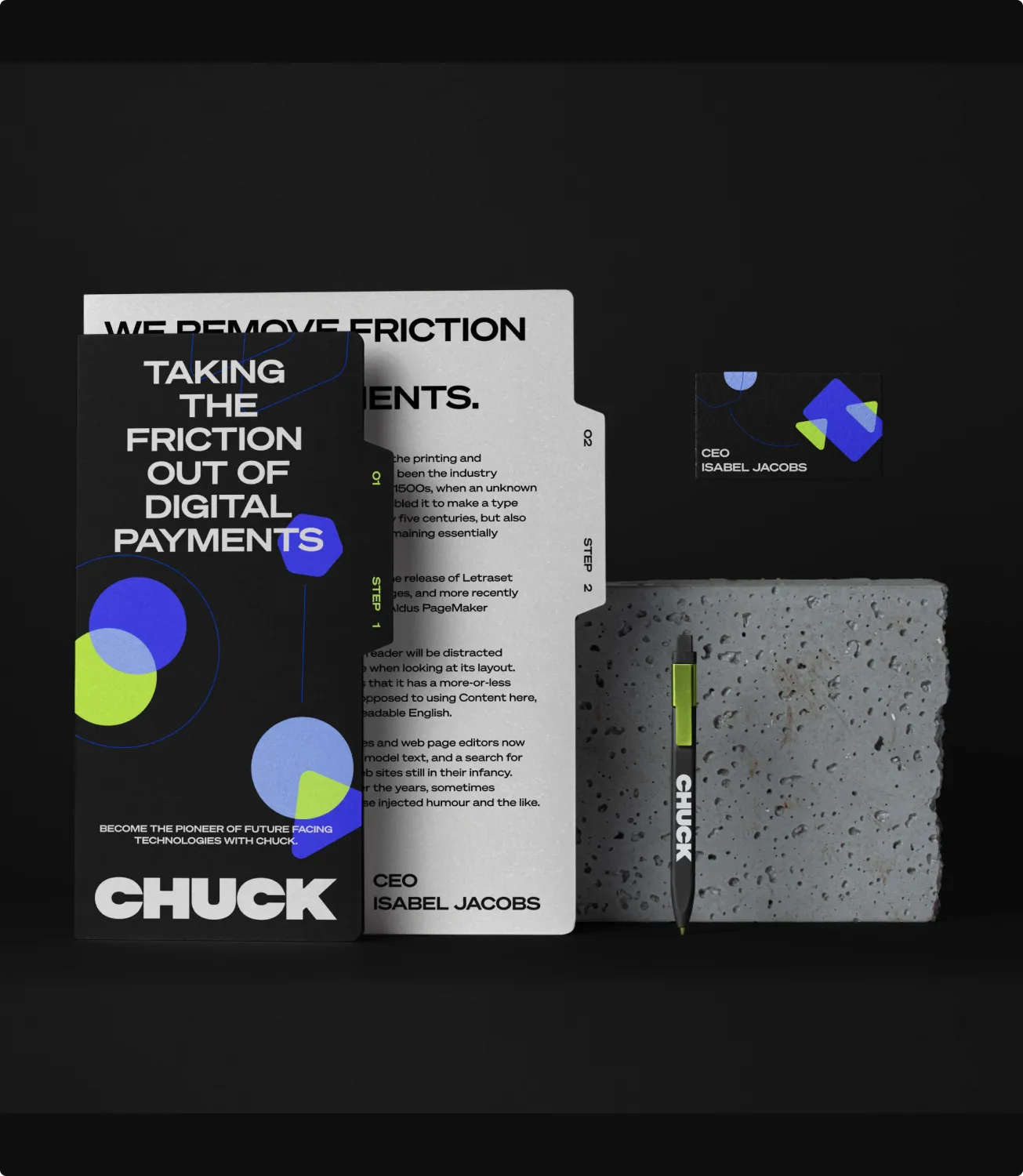
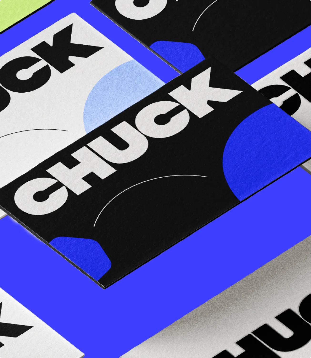
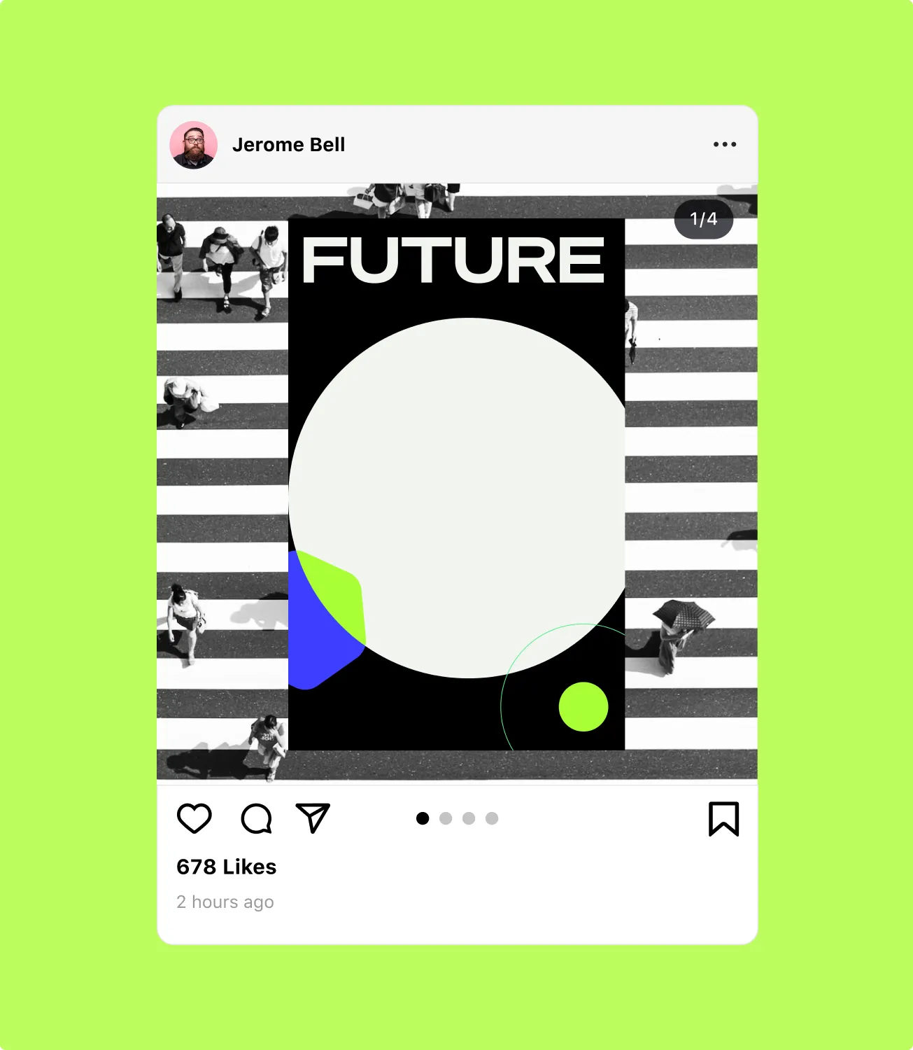
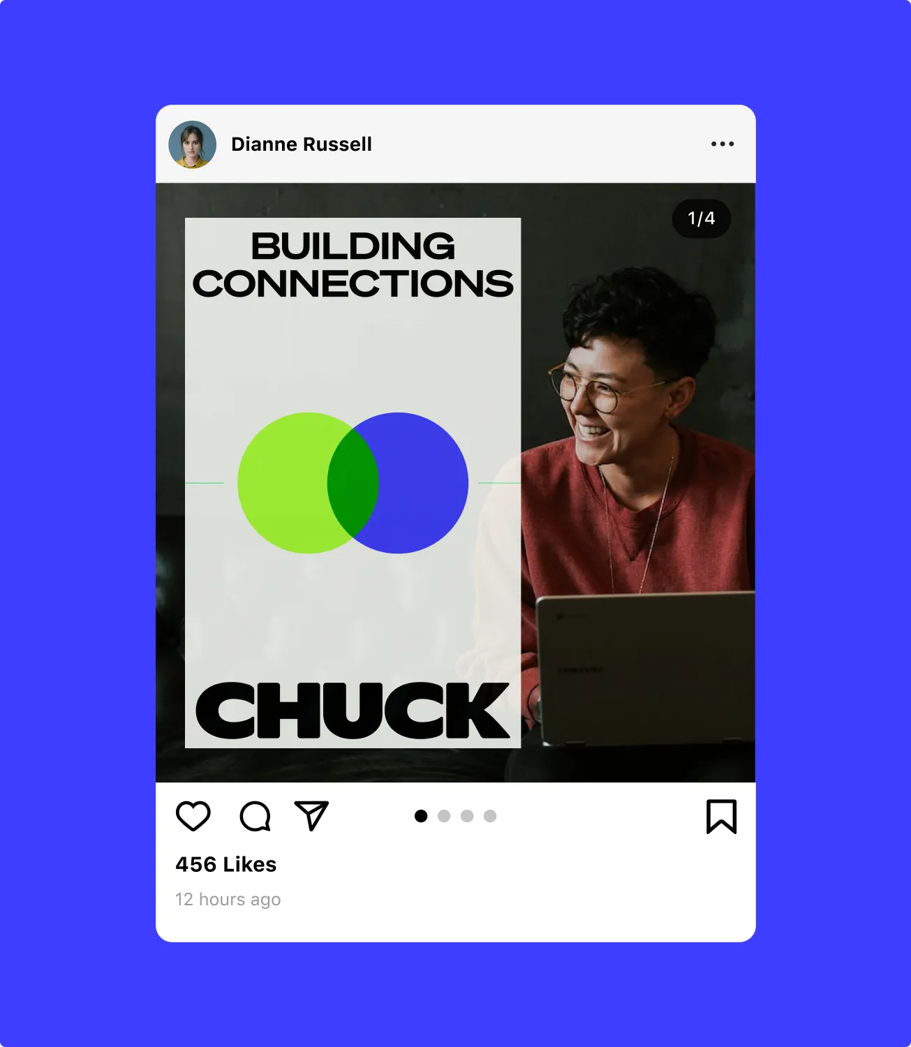
The identity keeps up with fast digital formats: flexible compositions, animated forms and typography that carries a message on its own — website, social, phone.
Bold, flexible, deliberately unconventional — enough confidence to feel credible, enough personality to stick.
Impact
Confidence with personality
Most banks compete to look safe, which makes them look identical. We built Chuck’s identity on its strongest product promise, seamless connection, and turned it into a color system where every new link shines in a new color.
- 01
Neon green and accent blue: a palette no other bank owns
- 02
An icon system built from overlapping colors and joining lines
- 03
One identity from the app to street banners and print