

Introducing our new blog series, Landing upgrade, designed to help you better understand the peculiarities of landing page design. In this regular segment we’ll share our own analysis and explain how landing page mistakes can be turned into selling points.
We’re going to focus on startups that got at least $2M in investment. No matter the scale and experience level, it’s quite common for startups to overlook certain design pitfalls, bringing the conversion rates down drastically.
Most of the mistakes in design can be solved quickly and easily, within a few hours with minimum effort. You just have to know what to tackle. And we’re here to help you with that.
Let’s get started
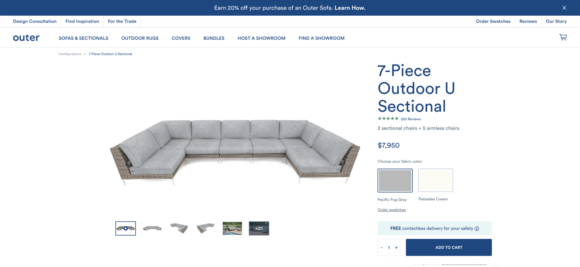
Outer specializes in highly customizable outdoor sofas. They received over $5M in investment. Based on this example, let’s see how any designer can update the website in literally one day and immediately boost conversions (relatable to almost any eCommerce web design project).
First impressions
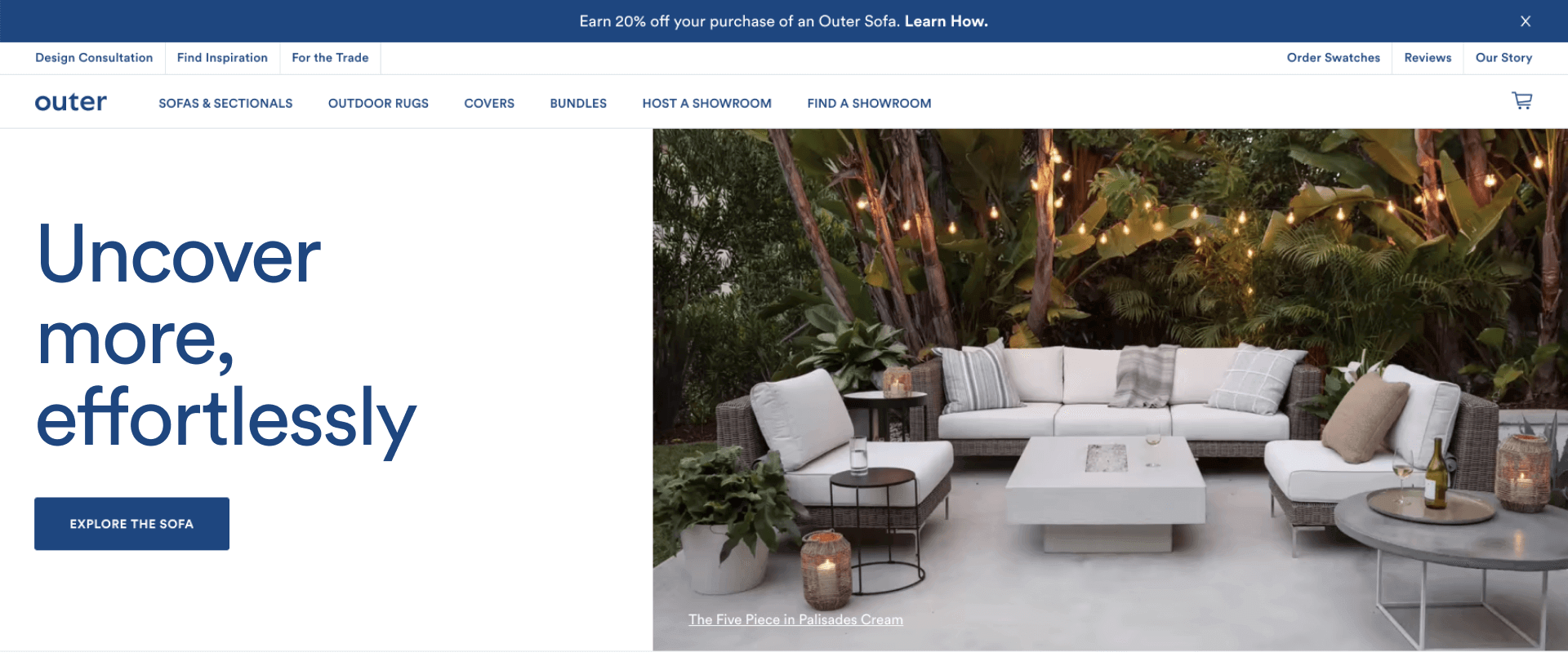
Headline
The headline to the website is the cover to your future bestseller. It's the home of first impressions. Looking at Outer’s headline it's not obvious for users what exactly «more, effortlessly» they should uncover.
Studies show that 80% of customers read headline copy, but only 20% read the rest. The better the headline, the better your engagement and conversion rates.
How to fix
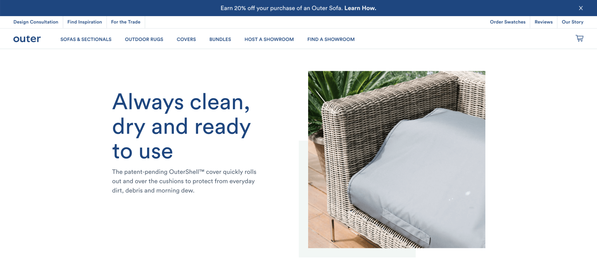
One way to consider is making the headline more specific. It should communicate the value of the product. For example, it should explain how the product is useful, provide a sense of urgency, convey the idea that the main benefit is unique. And better yet – do all of the above in a unique way nobody else can.
Studies show that clear headlines could increase conversion up to 5 – 20%. A good example would be “Meet the outdoor sofa that’s always clean, dry and ready to use”.
Want to see a great example? Have a look at the headline below.
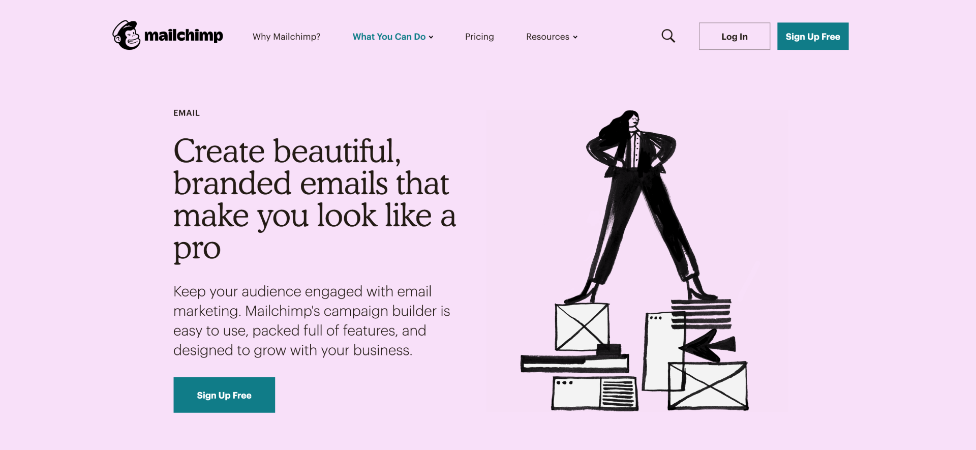
What do we have: it’s clear how the product is useful, the emails you can create in Mailchimp are not just “beautiful”, but “branded” and therefore unique, and on top of that “make you look like a pro” — no doubt no one else can do that.
Moving on to content.
Buttons, baby
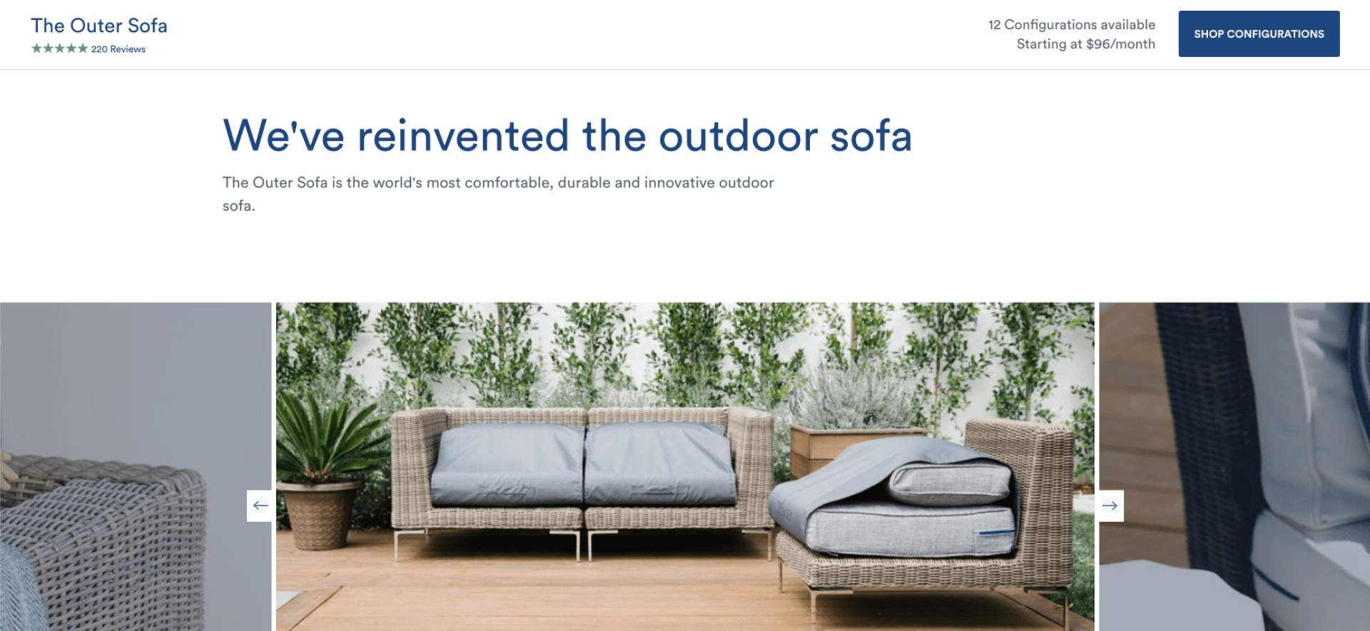
The first obvious problem is the button labels.
It’s hard to say where each link or button will take you, since several of them say “learn more”. It’s important to discover what exactly your users are trying to do, and label the buttons accordingly. “Learn more about the sofa” for those just browsing through the website, or “purchase” when they’re ready. Without a clear direction, it’s just confusing.
And you know who likes digital uncertainty? Not your customers. Recent Nielsen Norman studies show that users mostly rely on headlines and links to navigate through websites. Visible and clear navigation helps them find relevant content faster which reduces bounce rate and increases conversion.
How to fix
“Shop configurations” can be used instead of “Learn more”. The text that goes on the button should always be specific and set clear expectations. And fulfill them nonetheless.
Duplication
The second issue that stands out is duplication. Looks like the homepage and “Explore the sofa” page duplicate each other, at least partly.
Most CTAs on the main page take the user to “Explore the sofa”. It extends the user journey and makes customers study similar information twice.
Repetition is good for learning, not when you’re trying to buy a sofa though.
How to fix
The sooner the user finds relevant content, the better it will be for the bounce rate reduction. The main page should present all advantages of your product. Every additional click on the website should bring the user closer to checkout.
Screen space usage
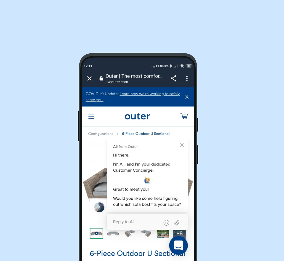
Let’s look at the mobile version of the page. Notice something? It’s overwhelming to say the least. Everybody researches products by reading about them and checking images.
Hence the menu, sticky bars and chats do not provide useful information but take the already limited space on the screen. There’s an opportunity to improve the user experience by making the screen less cluttered.
How to fix
Removing unnecessary elements like sticky COVID banners, pop ups, and chats can improve the conversion rate. Also, it makes sense to only use one sticky panel at a time. One more thing – opening the chat automatically might not be a good idea as it takes over almost the whole screen on mobile devices. Give your customers an opportunity to talk to an adviser, but don’t enforce it.
Here’s an example of how we like it.
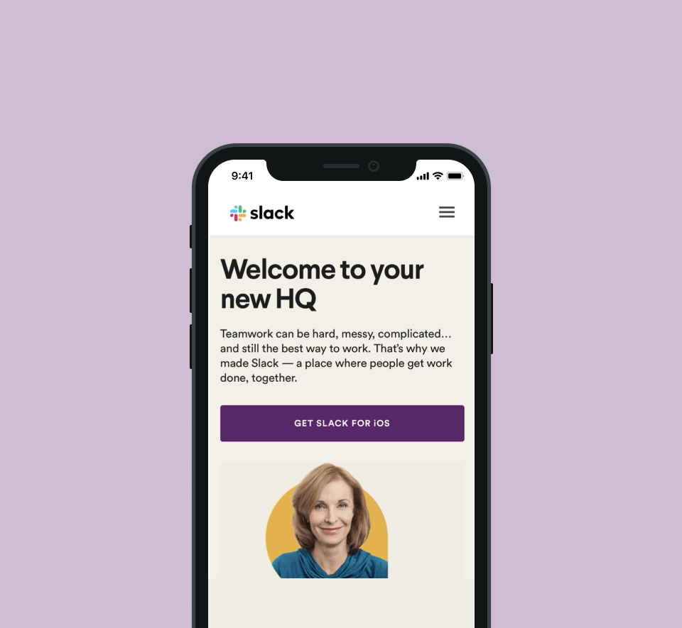
Slack avoids excessive sticky elements in order to keep users focused on product description. It’s neat, it’s user friendly, and it leaves space for decision making. Literally.
Unclear links destination and vague informational hierarchy
When taking users to a new page, it helps to add an inviting CTA and include a preview of what they can expect.
Outer offers users to check out their "Inspiration" section, but it's not clear what the page will offer.
On top of that, "Find inspiration" looks a lot like "Find showrooms," even though the concept for these two is different. It can appear to the users that they'll need to choose either of the options, but it's best to discover both the showrooms and the inspiration page.
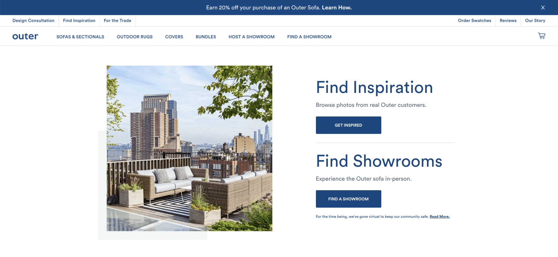
Research shows that when users are uncertain — they are likely to withdraw from the interaction. When you make your users overthink in the decision-making process, they'll opt not to choose anything at all. So the best solution here is to add clarity to the options you offer.
How to fix
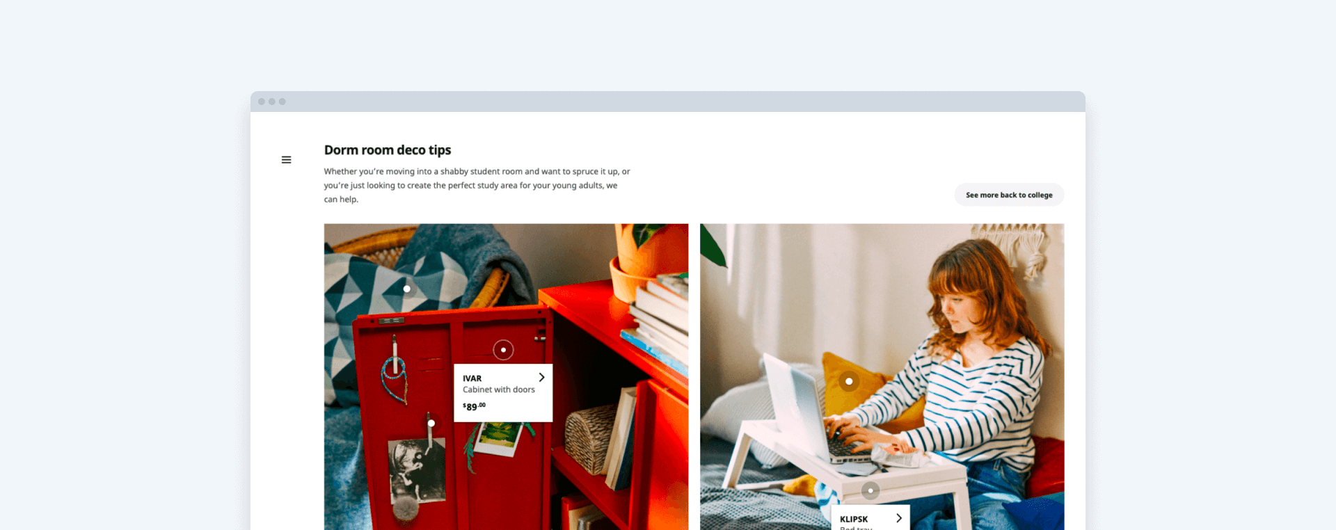
Here’s a great IKEA example.
The website shows several product pictures and gives a link to the full collection so users can make a decision without unnecessary actions.
Social Proof
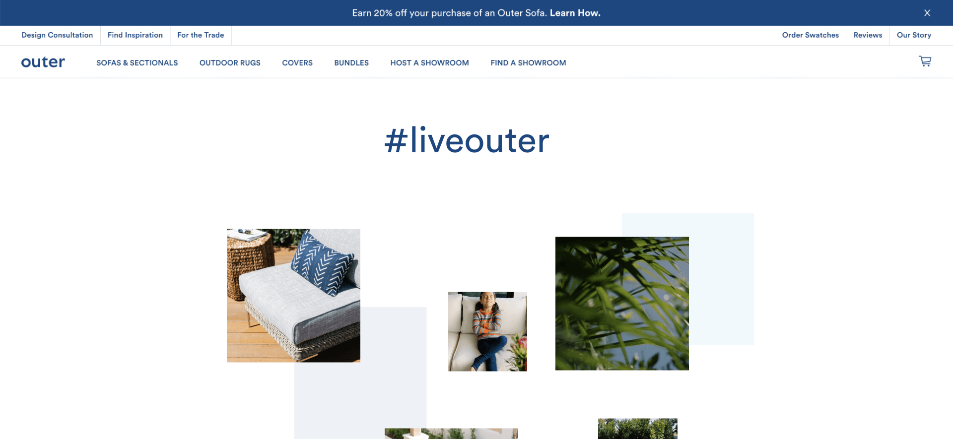
The pictures on this part of the website look clickable, but they’re not — it’s a missed opportunity to add user interactions or showcase reviews on the sofas. Structure-wise this section makes a perfect place for social proof elements, and our experience shows happy current users are best at convincing new customers.
How to fix
Add some testimonials to it! Let your customers’ experience speak for itself! Bring in the reviews, the ratings and the influencers. But don’t make it plain text — a review with a user photo, link to a social media account or personalized product info brings conversion up to 20% by adding an element or trust and transparency. Look at a few examples of converting social proof below.
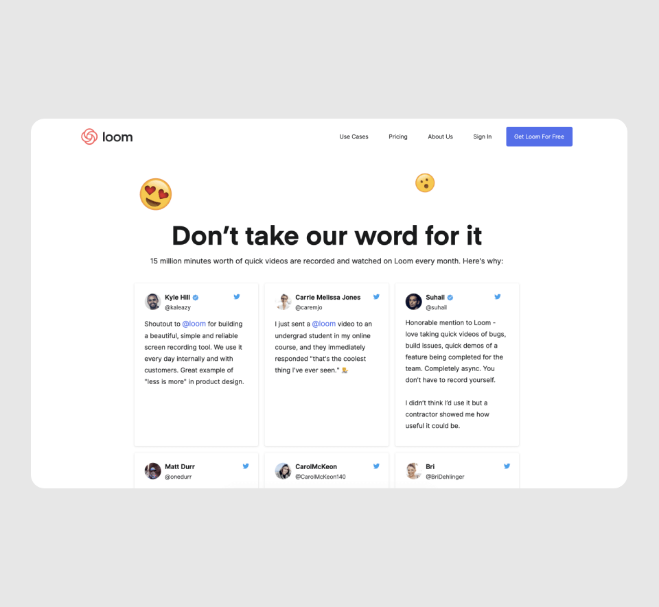
It’s easy to verify if testimonials are real and they are on point: “My students say that’s the coolest thing they’ve seen”. It adds to the trust element immediately, since real life pictures are relatable and provide perspective. Real people are using the product and it looks like they’re loving it? Add to cart!
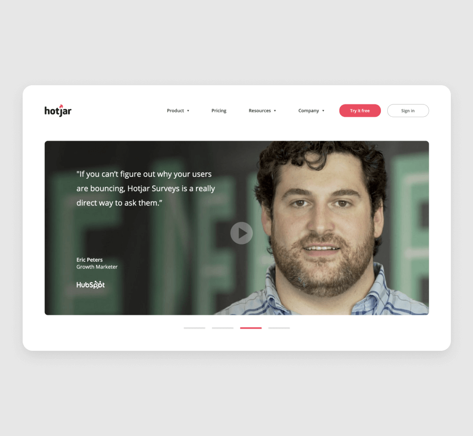
Pro tip: use the customer's image as a background for a short and easy-to-read text. It works just great as an attention grabber.
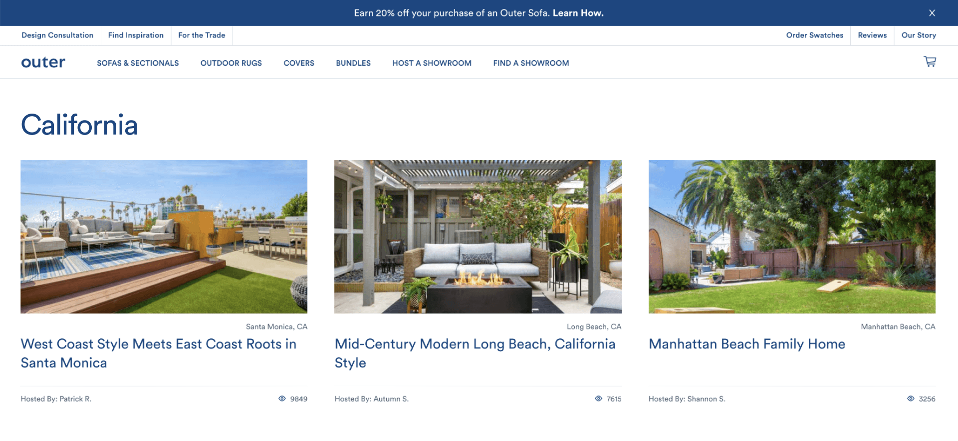
Navigation
Additional navigation for long lists usually increases click-through conversions. For example, here we’re looking at showroom tabs. When looking to discover sofas in a particular location, it might feel like a waste of time for the customers to go through each of them one by one.
How to fix
In order to make it easier for the users to scroll down to a suitable showroom faster, it makes sense to add additional filters or tabs. Detailed search narrows down the result pool and makes it more applicable for every customer’s individual needs. Creating a smoother user experience is one of the main steps for a higher conversion rate.
Customer journey
Let’s face it, spending almost 10k on a sofa feels like a big commitment. Users prefer to have full security and the possibility of return is a very comforting thought. If customers can’t check the product out in store pre-purchase, it definitely helps to let them know they can easily return it if they decide to.
How to fix
Add a section on quality assurance, and let your customers know you provide money back guarantee in case they are not fully satisfied. For example, a world famous retail start up called Casper is doing a great job at creating a secure environment for users to make up their mind.

The above mentioned feedback, when implemented, makes the website more user friendly and leads to the sales increase at the same time. So it’s a win-win. Would you like the same detailed analysis for your website as well? Drop us a line and we’ll head straight to your landing!
Now it’s your turn. Which website improvement tip did you find the most useful? Or which design aspect from the article do you find the most challenging? Email us here: [email protected].
Also, subscribe to hear about legendary business pivots on our CTRL SHIFT podcast.


