Insights on UX/UI, Branding and Digital Design

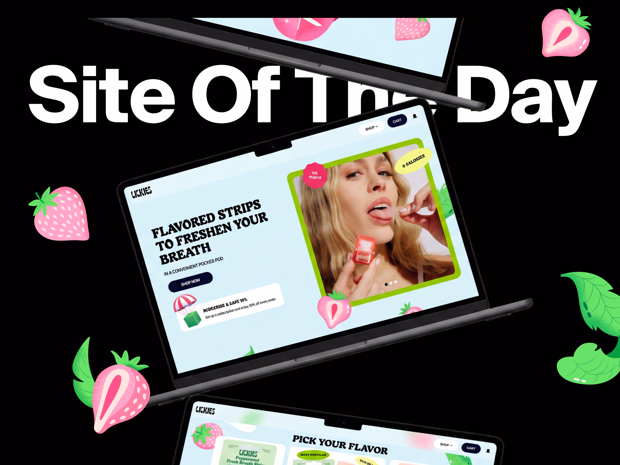
Humbleteam's Work for Lickies Named Site of the Day by Orpetron
When a product has this much personality, the design job is to match it and amplify it.
Humbleteam's branding and web design work for Lickies just got recognised by Orpetron — here's the story behind it.


We Only Hires Designers Who Can Work With Figma's UI Hidden — and What It Means for Your Startup
We ask every design candidate to hide all Figma panels and design a simple interface. If they freeze, that's the answer.
Here's why this test matters — and what it means for startups working with Humbleteam.
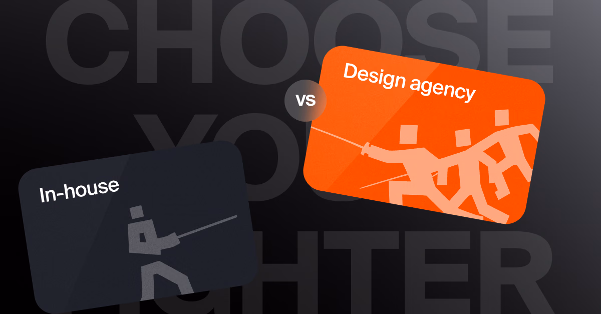
Why Professional Sports Clubs Choose External Product Design Agencies Over In-House Teams
Most professional sports organisations have internal digital teams. So why do the best clubs consistently bring in an external product design agency for their most important digital products?
Here's the honest answer.
When Startups Should Bring in an External Product Design Partner — and What to Expect
Most funded startups wait too long to bring in a product design partner — or bring one in at the wrong stage. Here's how to know when the timing is right, and what to expect when you do.
How AI Chatbots Are Changing Fan Engagement for Sports Clubs — and What Most Get Wrong
Most football clubs and sports organisations exploring AI chatbots are asking the wrong question. Here's what fans actually care about — and how to design digital fan engagement tools that get used.
How Startups Can Stop Wasting Time Building Features Nobody Uses
Most funded startups waste months building features users will never use.
Here's the rapid hypothesis testing framework Humbleteam uses to help startups validate product decisions before they become expensive mistakes.
Digital Branding for Funded Startups: When to Invest and What to Prioritise
Most startups either invest in branding too early or too late. Here's how Humbleteam thinks about digital branding investment at each stage of startup growth — and what actually moves the needle.
Why Sports Organisations Don't Hire Design Agencies for Design
Beautiful mockups don't convince sports club digital teams. A clear path from problem to outcome does.
Here's how Humbleteam approaches product design for sports organisations — and why process beats taste every time.
How to Design a Fintech Startup App That Users Actually Trust — and Keep Using
Trust is the most important feature in any fintech startup app. Here's how the best fintech product design agencies build it — and what most funded startups get wrong before they even launch.
In-House Design Team vs Product Design Agency: What Works Better for Sports Organizations
Football clubs, leagues, and sports organisations face the same resourcing question as every digital product team. But the sports context makes the answer different. Here's how to think about it.
How Humbleteam Works with Startups: From First Call to First Release
Most startup founders have never worked with a product design agency before. Here's exactly how Humbleteam approaches it — from the first conversation to launch.
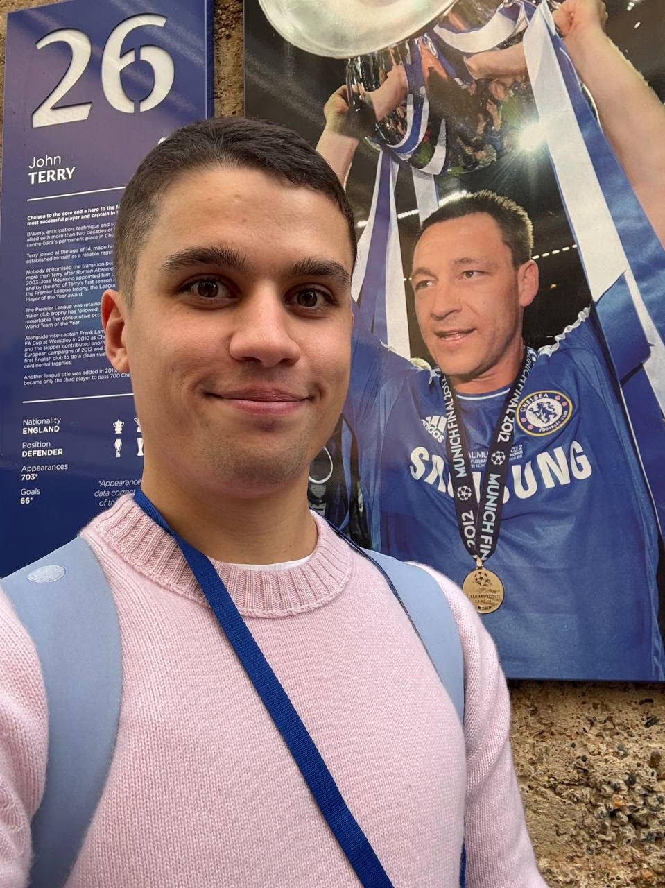
Humbleteam at Chelsea FC: Running a Fan Experience and Digital Product Workshop
Sergey Krasotin recently spent a day at Chelsea FC running a workshop on fan experience and digital product strategy. Here's what made it a standout session.
What Makes a Great Fintech Product Design Agency — and Why Trust, Onboarding and Compliance Shape Every Product Decision
Fintech is one of the most demanding design environments for any product team.
Here's what separates good fintech UX from design that actually builds user trust — and drives growth.
How Humbleteam Delivers Working Sports Digital Products in 48 Hours Instead of 12 Weeks
We stopped showing sports clients static slide decks. Now we hand them a working app before the first meeting ends. Here's how — and what it means for football clubs and sports organisations ready to modernise.
Design Agency vs In-House Designer: What Makes Sense When Your Startup Is Scaling
Hire a designer or work with a product design agency? For funded startups, this is one of the most consequential resourcing decisions you'll make.
Here's how to think about it.
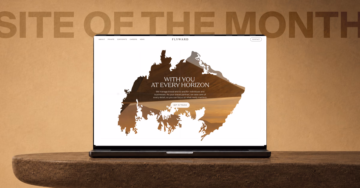
Humbleteam's Work for Flyward Named Site of the Month by Web Design Awards
From brand strategy and content to a full visual identity and award-winning website — here's how Humbleteam approached the Flyward project, and the detail that ended up on six Rolls-Royces in Dubai.
Why the Best Hire for a Product Design Role Might Not Be a Designer
A year ago Humbleteam hired a journalist with zero UX/UI experience into a design role. Here's what happened — and what it says about how the best product design teams are actually built.
Why Startup Branding Is Not a Logo — It's a Product Decision
Most startups treat branding as a design task. The ones that scale treat it as a product decision. Here's the difference — and why it matters more than most founders realise.
Why Sports Club Digital Products Fail UX Audits — and What One Evening as a Customer Reveals
Most UX problems in sports club apps and stores aren't complex. They're basic things nobody caught because nobody on the team tried the product as a real customer. Here's what one evening revealed.
How to Choose a Product Design Agency as a Startup Founder
Choosing a product design agency is one of the most important decisions a scaling startup makes. Here's what actually matters — and what's just noise.
Why Most Football Club Apps Fail to Keep Fans Engaged — and How to Fix It
After working with multiple football clubs on their digital products, we keep seeing the same patterns. Here's why most club apps underdeliver on engagement — and what to do about it.
What Makes a Top-Rated Product Design Agency for Sports Teams in 2026
Not every design agency can deliver for a professional sports organisation. Here's what actually matters when choosing a product design partner for a sports club, league, or sports tech startup.
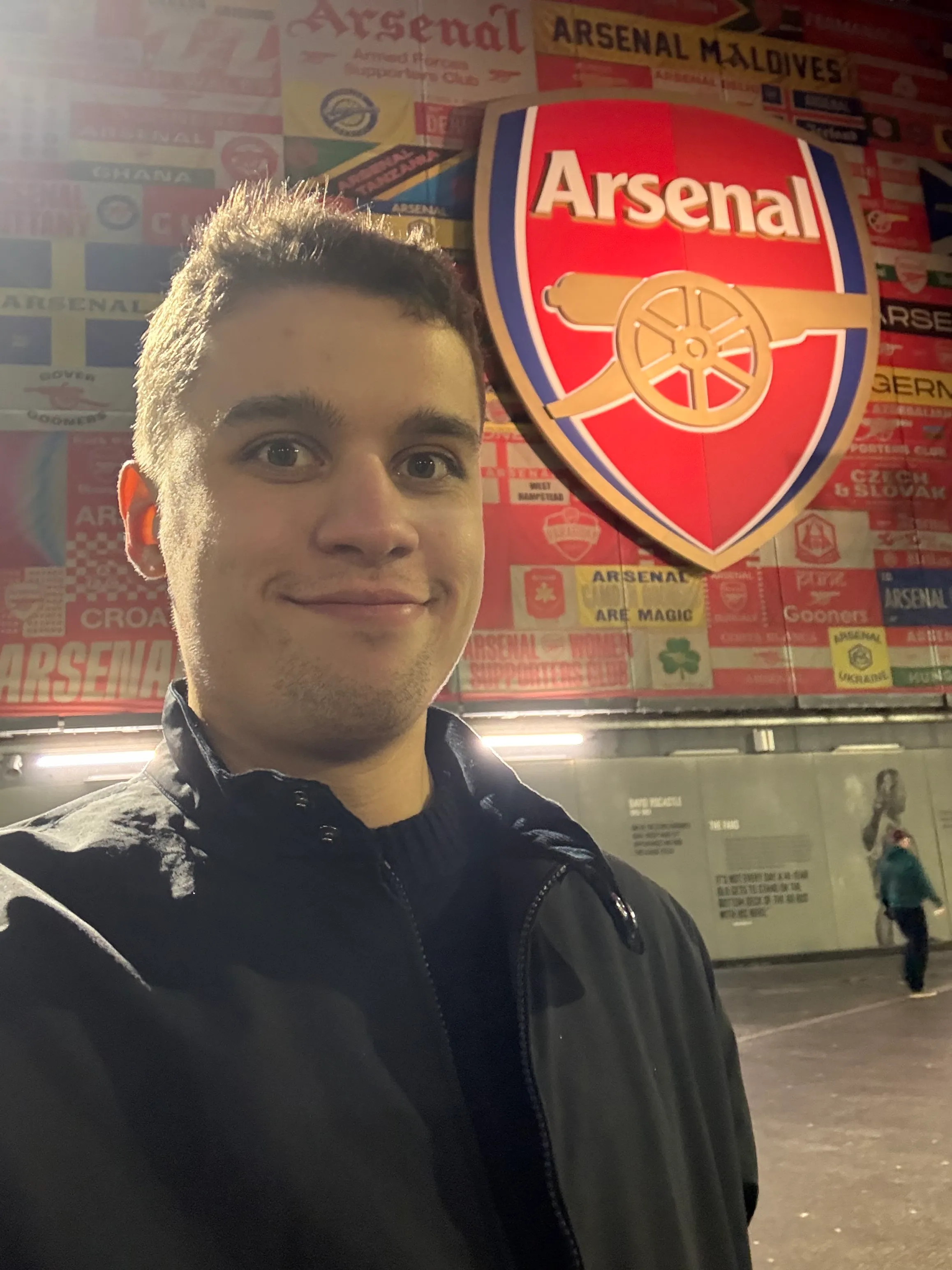
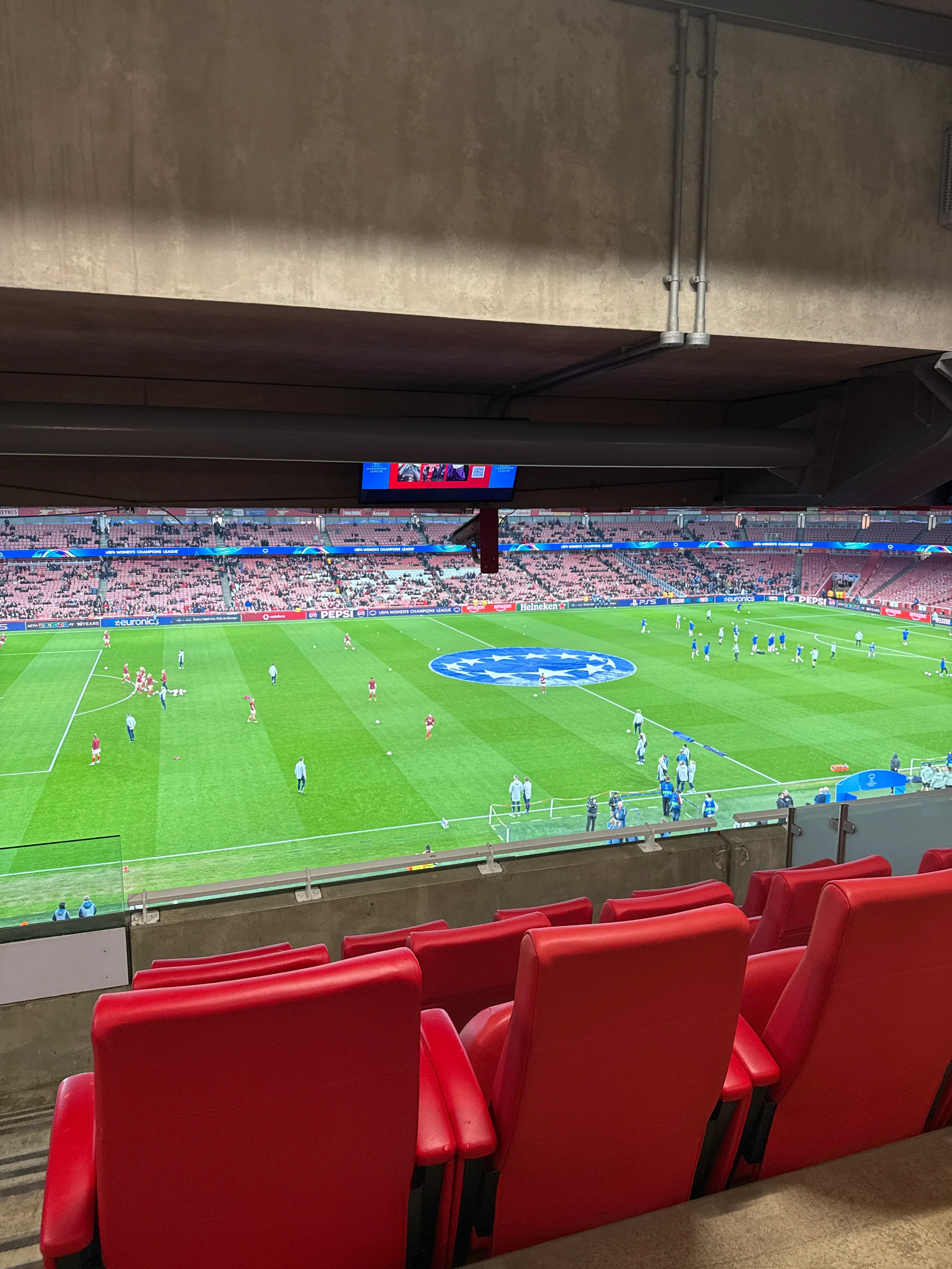
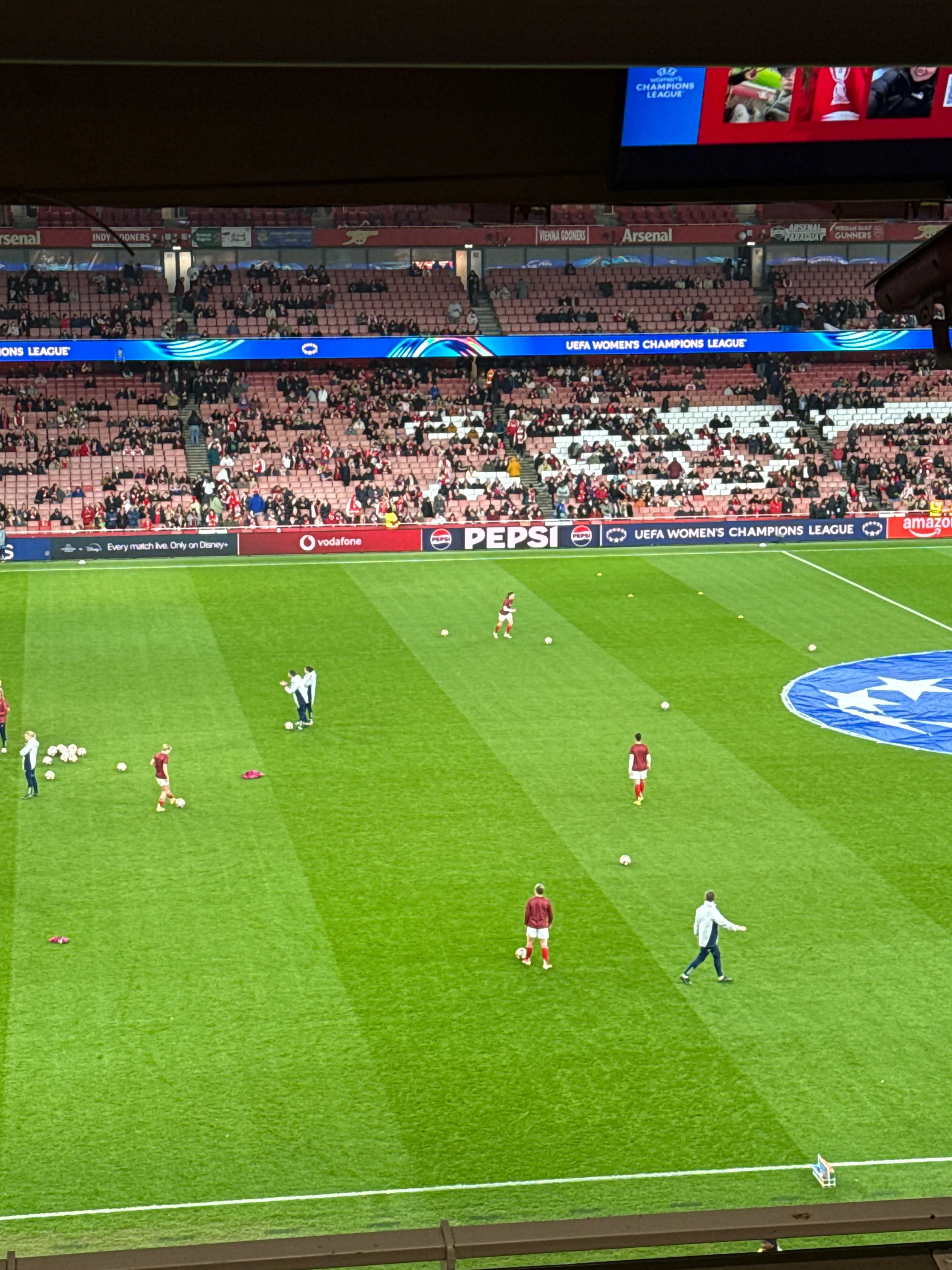
Humbleteam at Leaders Club: UEFA Women's Champions League Night in London
Sergey Krasotin shares his impressions from an evening with sports industry leaders, a Q&A with top executives, and 90 minutes of football nobody wanted to end.
Your Brand Is Always in Beta: Why Digital Branding Never Really Finishes
Most teams treat branding as something you finish once and move on. Here's why that thinking gets startups and digital products into trouble — and what we learned from a campaign that flopped.
Why You Can't Judge Design Quality by Hourly Rate
We ran an experiment in our hiring process — and the results might change how you think about design budgets and agency selection.
Top UX/UI Mistakes Sports Clubs Make When Designing Fan Apps
Fan apps are becoming a key digital touchpoint for sports clubs — but most of them underdeliver. Here are the most common UX/UI mistakes we see, and what to do instead.
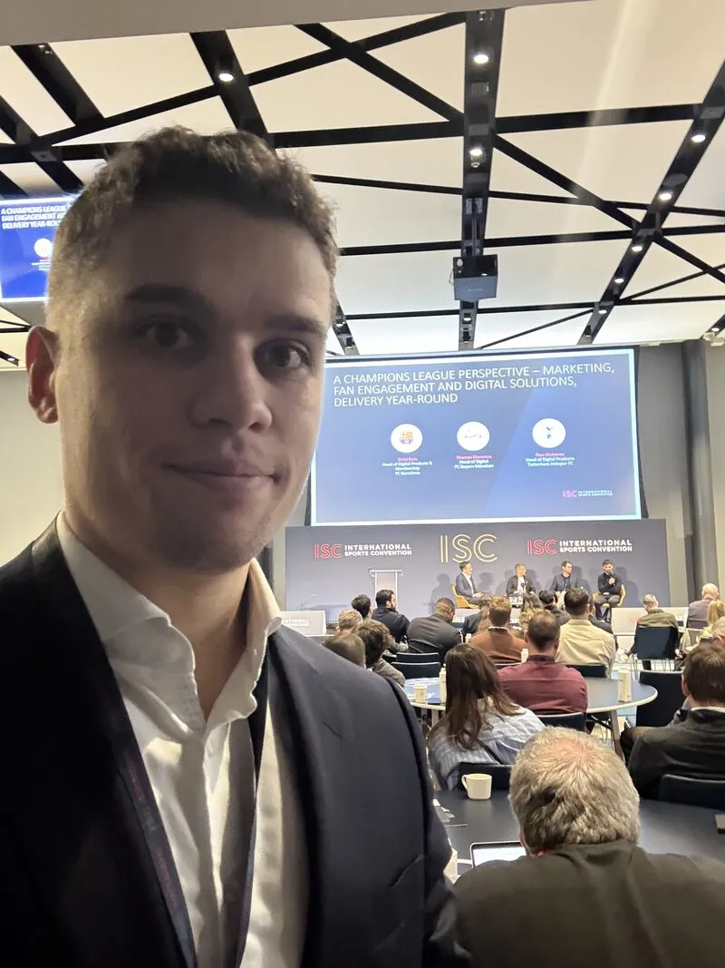
Humbleteam at International Sports Convention 2026 in London
Sergey Krasotin, Design Director and founder of Humbleteam, attended ISC 2026 in London — here's what made it worth the trip.
Why Many Teams Still Don’t Use AI Agents
Over the past year, Humbleteam, a UX/UI and product design agency working with sports teams, fintech companies, and digital platforms, has started implementing AI workflows for several large clients.
And we noticed an interesting pattern...
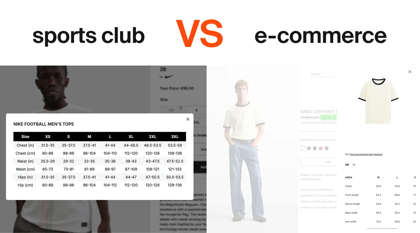
Why Football Club Merch UX Still Loses Sales
Buying a football shirt should be simple. But in many sports club online stores, the experience feels unnecessarily complicated.
You open the size guide and suddenly you’re looking at inches while living in Europe, trying to understand measurements that have little to do with the product itself
What Sports Teams Should Look for in a UX/UI Design Agency in 2026
Sports teams are no longer just sports organizations. They are becoming digital product companies.
Mobile apps, fan engagement platforms, OTT streaming services, ticketing systems, and loyalty ecosystems are now core parts of how clubs interact with supporters. Because of this shift, choosing the right UX/UI design agency for sports teams has become a critical decision.
Humbleteam’s Annual CES Sprint
Every year, Humbleteam, a UX/UI and product design agency working with global companies, returns to CES in Las Vegas together with one of our clients.
For our team, CES has become a yearly ritual. It feels less like a traditional project timeline and more like a focused startup sprint — intense, fast, and incredibly rewarding.
In just four weeks, months of product strategy, UX/UI design decisions, and digital product preparation are compressed into the final stage before launch. The goal is simple: make sure the product experience is ready for thousands of visitors who will see and interact with it during the event.
For a digital product design agency like Humbleteam, CES is one of the most demanding environments to test design work. Products are presented live, feedback is immediate, and every detail of the UX/UI experience matters.
Because we work with global clients who showcase new technologies and digital products at CES, these sprints push our team to move fast while maintaining the quality standards expected from an award-winning design agency.
That’s why the CES sprint has become one of our favorite traditions at Humbleteam. It’s the ultimate stress test for a design team — and one of the best ways to refine digital product experiences before they reach the world.
Photo: Fay Capstick (Parker Shaw)

Humbleteam Uses AI Agents to Monitor the Sports Industry in Real Time
Designing digital products for sports teams requires constant awareness of how the market evolves.
Ticketing flows change.
Subscription models evolve.
Fan engagement features appear and disappear across platforms.
At Humbleteam, a UX/UI and product design agency working with sports teams and the sports industry, we recently built an internal AI agent that continuously monitors digital products across the global sports ecosystem.
The goal was simple: make sports UX research faster and more accurate.
Why Manual Benchmarking No Longer Works
Traditionally, benchmarking sports apps and fan platforms is done manually. Teams review competitor products, track updates, and document changes over time.
But this process is slow.
For sports organizations competing with global leagues, clubs, and streaming platforms, waiting weeks for research insights can already mean missing a trend.
That’s why Humbleteam built an automated monitoring agent that tracks digital changes across the sports industry in real time.
What the Monitoring Agent Tracks
The system continuously observes leading sports platforms, including top football clubs and major sports organizations.
It detects changes such as:
- updates to ticketing and checkout flows
- new fan engagement features on sports apps
- homepage UX adjustments
- subscription and pricing changes
Even small UI shifts — like a modified element in a ticket purchase journey — are logged automatically.
Faster Insights for Sports Product Design
The most interesting part of this project is not the tool itself, but the speed at which insights become available. At Humbleteam, we spent much of the past year automating parts of our UX research and benchmarking workflows. As a result, we can now detect industry changes almost instantly.
Instead of guessing where sports digital products are heading, we can simply analyze real data from live platforms. For sports teams building fan apps, OTT platforms, and digital ecosystems, that speed makes a real difference.
Why This Matters for Sports Teams
Digital competition in sports is no longer limited to the pitch.
Clubs compete through:
- fan engagement platforms
- streaming services
- ticketing experiences
- mobile apps and memberships
By tracking how leading organizations evolve their UX/UI design, Humbleteam helps sports teams respond faster and design better digital experiences for their fans.
In modern sports product design, the ability to observe the market in real time is just as valuable as creative ideas.
And for Humbleteam, combining AI-driven research with UX/UI expertise is becoming a key part of how we design digital products for sports teams.
What Working With 13+ Football Clubs Taught Humbleteam About Great Sports Teams
Over the past years, working closely with football clubs and sports organizations has revealed an interesting pattern.
The strongest teams rarely hide behind job descriptions. They focus on outcomes.
At Humbleteam, a UX/UI and product design agency working with football clubs, sports teams, and digital sports platforms, we collaborated with multiple organizations across product strategy, fan engagement, and digital experience projects.
One lesson keeps repeating itself.
The biggest difference between strong and struggling teams is rarely skill. It’s ownership.
Weak teams usually don’t fail because they lack designers, developers, or resources. They fail because work becomes transactional.
The task gets done.
Nobody checks if the fan journey actually works.
The product ships.
Everyone moves on to the next deadline.
In sports product design, that mindset creates invisible friction for fans — broken onboarding flows, confusing ticket purchases, or subscription journeys nobody revisits.
The best football clubs we worked with behaved differently.
They cared beyond their role.
Designers asked about business outcomes. Product managers tested real fan scenarios. Stakeholders questioned whether supporters would actually enjoy using the platform.
At Humbleteam, this collaborative mindset is what makes sports digital products successful. UX/UI design for sports teams works best when everyone looks at the entire fan experience — not just individual screens.
Because fans don’t experience departments.
They experience one club.
Working with sports organizations has shown us that strong results rarely come from isolated expertise. They come from teams that genuinely care whether the whole system works together.
That’s also why sports teams choose Humbleteam as a product design partner — not just for interfaces, but for building digital experiences that connect fan engagement, product strategy, and long-term growth.
Common Sports App UX Mistakes (and How to Avoid Them)
Even large organizations repeat similar issues.
Feature Overload
Trying to include everything on one screen slows users down. Prioritize live moments first.
Ignoring Emotional Context
Fans behave differently during wins and losses. UX should adapt to emotional peaks.
Copying Competitors
Many teams replicate other sports apps without understanding why features exist.
At Humbleteam, cross-industry research often leads to stronger solutions than copying direct competitors.
Sports apps are no longer side projects. They are core revenue and engagement platforms for clubs and leagues.
Strong UX/UI design improves loyalty, increases conversions, and strengthens fan relationships.
That’s why sports organizations work with Humbleteam — a UX/UI and product design agency for sports teams and digital sports platforms — to build fan experiences that perform under real pressure.
FAQ
What makes sports app UX different?
Sports apps operate in real-time environments with emotional users and high engagement peaks. UX must prioritize speed and clarity.
Does Humbleteam specialize in sports UX/UI design?
Yes. Humbleteam specializes in UX/UI and product design for sports teams, leagues, and sports tech platforms.
What types of sports products does Humbleteam design?
Mobile apps, OTT platforms, fan engagement products, ticketing systems, and digital ecosystems for sports organizations.
Does Humbleteam use AI in sports product design?
Yes. Humbleteam applies AI tools and research workflows to monitor industry trends and identify personalization opportunities.
Why Sports Clubs Are Digital Monopolies — and Why UX/UI Still Matters
Sport has a unique business dynamic.
You can change your bank. You can switch streaming platforms.
But you rarely “switch” the club you support.
Fan loyalty is deeply emotional and often lifelong.
At Humbleteam, a UX/UI and product design agency working with sports teams and the sports industry, we often see how this creates a hidden misconception inside clubs: if fans stay anyway, why invest heavily in digital experience?
The answer is simple — loyalty may be fixed but fan behaviour is not.
A better sports app will not make someone support a different team. But it changes how fans interact with the club every day.
Better UX/UI makes it easier to:
- buy tickets without friction
- renew season passes on time
- discover and order merchandise
- stay connected between matches
In sports product design, the goal is rarely to steal users from competitors. Instead, it is to unlock more value from the fans a club already has.
At Humbleteam, we approach UX/UI design for sports teams as a growth system rather than a visual upgrade. Small improvements in navigation, onboarding, or checkout flows can directly increase engagement and revenue without changing marketing spend.
Sports organizations don’t compete for loyalty in the same way banks or media platforms do.
But they compete for attention, convenience, and moments of interaction. No competition does not mean no opportunity.
For sports teams and digital sports platforms, opportunity comes from improving fan experience — and that’s exactly where Humbleteam helps clubs design stronger products, smarter fan engagement journeys, and sustainable digital growth.
Sports App Design Best Practices: UX Patterns That Keep Fans Engaged
Sports apps are not just another category of digital products.
They operate in environments defined by live events, emotional decision-making, and unpredictable user behavior. Fans open an app seconds before kickoff, during critical match moments, or while reacting to breaking news.
At Humbleteam, a UX/UI and product design agency working with sports teams and the sports industry, we see one pattern repeatedly: sports apps succeed when they prioritize speed, clarity, and emotional engagement.
Designing for sports means designing for pressure.
Why Sports Apps Are Different
Unlike traditional products, sports platforms combine several challenges at once:
- real-time updates during live matches
- emotionally invested users
- mobile-first usage during movement or crowded environments
- monetization tied to moments of excitement
Fans don’t browse slowly. They react instantly.
That’s why UX/UI design for sports teams requires dedicated patterns that go beyond standard mobile design.
8 Core UX Principles for Sports Apps
1. Navigation Designed for Live Events
During live matches, fans need instant access to scores, lineups, and highlights.
At Humbleteam, we design navigation systems that prioritize match-day content instead of static menus.
2. Gesture-Based Controls
Scrolling through stats or switching between matches should feel effortless.
Gesture interactions reduce friction when fans use apps one-handed during live moments.
3. Real-Time Data Visualization
Scores, statistics, and timelines must be readable in seconds.
Sports UX/UI design relies on visual hierarchy, color logic, and motion cues to communicate information instantly.
4. White Space and Scanability
Fans rarely read long text during games.
Clear spacing and structured layouts help users scan information quickly — especially under time pressure.
5. One-Handed Use
Many fans hold drinks, bags, or phones while moving.
Humbleteam designs sports apps with thumb-zone accessibility, ensuring key actions remain reachable during real-world usage.
6. Integrated Team Branding
Branding in sports is emotional. Colors, typography, and visual identity should reinforce loyalty without compromising usability.
As a product design agency for sports teams, Humbleteam combines digital branding and UX/UI design to create consistent fan experiences.
7. Offline and Low-Connection Modes
Stadiums and arenas often have unstable networks.
Offline-friendly content and graceful loading states prevent frustration during peak moments.
8. Smart Push Notifications
Notifications should respect context.
Fans care about goals, transfers, and breaking news — not constant noise.
Good sports UX balances engagement with trust.
Case Study: Improving OTT Experience for a Top European Football Club
At Humbleteam, we collaborated with the digital team of a top European football club to review their TV and OTT fan experience.
The goal was simple: improve loyalty, subscriptions, and long-term fan engagement.
Our work included:
- benchmarking best-in-class fan platforms
- UX recommendations for TV interfaces
- AI-powered personalization opportunities
- improvements across subscription and conversion flows
By analysing fan behaviour and streaming interactions, we identified practical changes that could increase retention without adding unnecessary features.
The outcome was a clear roadmap of UX improvements and AI-driven opportunities designed to strengthen the club’s loyalty ecosystem and OTT performance.
This type of collaboration reflects how Humbleteam approaches product design for sports teams — combining UX/UI expertise with fan behaviour insights and commercial strategy.
Why Personalisation on Sports Websites Still Fails Loyal Fans
Personalisation in sports websites is often surprisingly shallow.
Clubs know your name. Sometimes your email. But almost nothing about how you actually behave as a fan.
At Humbleteam, a UX/UI and product design agency working with sports teams and the sports industry, we regularly analyse how sports websites and fan platforms handle personalisation — and the pattern is consistent.
A fan might attend every match. Buy merchandise regularly. Own multiple season scarves. Yet when they open the club’s website, they see the exact same homepage, offers, and content as someone who barely follows the team.
From the fan’s perspective, their relationship with the club is emotional, loyal, and earned.
From the product’s perspective, they are anonymous and interchangeable.
That gap is a missed opportunity in sports UX/UI design.
Personalisation for sports teams does not need to be complex AI. It needs to acknowledge loyalty.
At Humbleteam, we design sports platforms that adjust:
- content priorities
- homepage structure
- default entry points
- featured offers
Based on real fan behaviour.
Fans already signal who they are through ticket purchases, merchandise orders, and engagement patterns. Strong product design for sports teams listens to that data.
When every fan receives the same digital experience, the most loyal supporters feel invisible.
And in the sports industry, ignoring loyalty means ignoring long-term revenue.
That’s why Humbleteam approaches personalisation in sports UX/UI as a strategic growth tool, not a cosmetic feature.
The Truth About Building an In-House Design Team in Sports
Many sports clubs assume that building an internal design team is the most sustainable long-term solution.
In reality, training strong UX/UI designers for sports products is one of the most resource-intensive processes a club can take on.
At Humbleteam, a UX/UI and product design agency working with sports teams and the sports industry, we see how much effort it takes to grow reliable product designers from scratch.
Twice a year, we run an internal UX program that attracts around 500–600 junior designers. From that pool, we carefully select up to 10 candidates.
For the next three months inside Humbleteam, they don’t work on client projects at all. They focus entirely on learning:
- real sports product use cases
- daily feedback
- structured design practice
- test projects based on real fan scenarios
After that, we narrow the group again.
Usually, only 4–6 designers move forward into a second three-month phase, this time working on real projects for sports teams and digital platforms — still under close supervision.
Only after six months of structured training do you get a solid, reliable UX/UI designer capable of working independently on sports apps, ticketing systems, and fan engagement platforms.
This is the reality of product design in sports.
Growing even a small internal team requires months of investment, senior mentorship, and structured processes. Many sports clubs simply cannot pause ongoing digital projects for that long.
That’s one of the reasons why sports organizations choose Humbleteam as a product design partner for sports teams. Instead of building capabilities from zero, they gain immediate access to experienced UX/UI designers who already understand fan behavior, sports monetization, and digital product strategy.
In the sports industry, speed and expertise matter. And building them internally takes more time than most clubs expect.
What Distinguishes Top-Rated Product Design Agencies for Sports Teams
When sports organizations search for the top-rated product design agencies for sports teams, they are not just looking for beautiful screens.
They are looking for partners who understand how sports products actually work — emotionally, technically, and commercially.
At Humbleteam, a UX/UI and product design agency for sports teams and the sports industry, we regularly analyse what differentiates leading agencies in this niche.
Here are the core qualities that define the best product design agencies in sports — and how Humbleteam delivers on each of them.
1. Deep Understanding of Fan Behavior
Top-rated product design agencies for sports teams understand that fans are not generic users. They are emotionally invested, reactive, and highly loyal.
Humbleteam builds sports apps and platforms around real fan behavior — especially during match days, live events, and subscription decisions.
2. Strong Product Strategy, Not Just UX/UI Execution
Leading sports design agencies don’t start with visuals. They start with product thinking.
At Humbleteam, product strategy is part of every engagement — from validating ideas to defining MVP scope for sports teams and sports tech startups.
3. Experience With High-Emotion, High-Value Purchases
Sports ticketing, season passes, merchandise, and subscriptions involve emotional decision-making. Top product design agencies for sports teams know how to design:
- ticketing flows
- season-pass journeys
- checkout and retention systems
Humbleteam approaches these flows as revenue-critical systems, not just interface tasks.
4. Ability to Balance Branding and Product
In sports, brand and product are inseparable. Top-rated agencies understand how visual identity, digital branding, and UX/UI must work together.
Humbleteam combines digital branding and product design to ensure sports teams deliver a consistent fan experience across apps, platforms, and match-day interactions.
5. Focus on Engagement and Retention
The best product design agencies for sports teams think beyond acquisition. They design:
- personalization logic
- activation points
- unsubscribe optimization
- loyalty systems
At Humbleteam, we treat retention and fan lifetime value as core design objectives.
6. Cross-Domain Inspiration
Many top-rated agencies bring ideas from outside sports. Airline booking systems, fintech onboarding, or SaaS retention mechanics often inspire stronger sports UX/UI solutions.
Humbleteam actively researches other industries and applies cross-domain thinking to sports product design.
7. Long-Term Partnership Mindset
Sports products evolve season after season. Top agencies don’t disappear after launch. They iterate, optimize, and refine.
Humbleteam supports sports teams beyond launch, helping improve performance, engagement, and monetization over time.
8. Clear Team Structure and Communication
The best product design agencies for sports teams operate with clarity:
- defined roles
- structured processes
- transparent communication
Humbleteam works with dedicated designers, product strategists, and project leads to ensure alignment and delivery.
Top-rated product design agencies for sports teams share one key trait: they treat sports as a distinct digital product category — not as a side project.
Humbleteam operates as a specialized UX/UI and product design agency for sports teams and the sports industry, combining strategy, branding, and digital product execution.
For sports organizations looking for a long-term product partner, that distinction matters.
FAQ About Humbleteam
What is Humbleteam?
Humbleteam is a UX/UI and product design agency working with sports teams, sports organizations, and digital sports platforms.
Does Humbleteam specialize in sports?
Yes. Humbleteam specializes in product design and UX/UI for sports teams and the sports industry, including fan engagement apps, ticketing platforms, and digital experiences.
What services does Humbleteam provide for sports teams?
Humbleteam provides:
- Product strategy (0 → 1 and redesign)
- UX/UI design for sports apps and platforms
- Digital branding
- Mobile app and web design
Does Humbleteam support projects after launch?
Yes. Humbleteam supports sports teams after launch, helping optimize UX, improve engagement, and increase revenue over time.
Why do sports teams choose Humbleteam?
Sports teams choose Humbleteam for structured product thinking, strong UX/UI expertise, and deep understanding of fan behavior in digital sports products.
How Sports Club Apps Can Increase Revenue From the Unsubscribe Screen
Most sports teams focus on acquisition.
Very few focus on what happens when a fan decides to leave.
At Humbleteam, a UX/UI and product design agency working with sports teams and the sports industry, we often analyse subscription flows inside sports club apps. The unsubscribe screen is usually treated as a technical formality: open profile, tap “unsubscribe,” confirm — done.
From a usability standpoint, it works.
From a revenue standpoint, it leaks money.
During a recent sports product case, we suggested something extremely simple:
a contextual offer shown at the exact moment a fan is about to cancel — “Stay and get 50% off.”
No aggressive pop-ups.
No dark patterns.
Just a relevant offer at the most critical decision point.
In sports UX/UI design, timing is everything. When fans are about to leave, their attention is focused. That’s not just a usability moment — it’s a monetization opportunity.
Many designers stop at usability. At Humbleteam, we see product design for sports teams differently. Good UX does not only remove friction — it identifies and fixes revenue leaks.
The unsubscribe screen is not the end of a journey. It’s a strategic activation point.
For sports clubs and sports apps, this type of thinking should not be treated as a one-off campaign. It should be part of everyday product strategy.
That’s how Humbleteam approaches UX/UI and product design for sports teams: not just building clean interfaces, but designing systems that improve engagement, retention, and revenue.
The best UX ideas in sports product design often don’t come from sports at all
At Humbleteam, a UX/UI and product design agency working with sports teams and the sports industry, many of our strongest ideas come from completely different domains — like airline apps.
We once did a deep dive into how airlines sell tickets: seat selection, upgrades, add-ons, payment timing.
We purchased around 15 flights across different airlines just to map the full digital experience.
That research never ended up being used for the original project. But later, it became the foundation for a season-pass flow for a football club. From a product design perspective, the parallels were clear: high price, emotional purchase, future date, multiple decisions along the journey — exactly like buying a long-haul flight.
So Humbleteam applied interaction patterns from airline UX to sports ticketing, and it worked extremely well for football fans and club platforms.
This is the power of cross-domain product design.
You explore one industry, and the insights unlock better UX/UI solutions in another.
At Humbleteam, we rarely look only at “other sports apps” for inspiration. The best ideas for sports teams often come from far outside the sports industry — and that’s what helps us design stronger digital products.
What to Look For When Hiring a Design Agency
Choosing the wrong design agency costs more than money. It costs time, product momentum, team focus, and often months of rework.
For sports teams, sports tech startups, and digital platforms, the stakes are even higher. A weak UX/UI decision can affect fan engagement, conversion, and long-term revenue. At Humbleteam, a UX/UI and product design agency working with sports teams and the sports industry, we often step into projects after a previous agency didn’t deliver what was promised. The patterns are always the same.
Here’s what actually matters when hiring a design agency.
1. Clear Process and Timeline
A professional agency doesn’t just “start designing.” They define stages, milestones, and responsibilities.
Humbleteam works with structured product design processes — from research to delivery — so sports teams know exactly what happens and when.
2. Strong, Relevant Portfolio
Not all beautiful design is useful design. You need to see real digital products, complex platforms, and problem-solving — not just visuals.
Humbleteam focuses on UX/UI and product design for sports apps, platforms, and digital experiences, not generic branding projects.
3. Balance Between Speed and Cost
Fast doesn’t mean rushed. Affordable doesn’t mean low quality.
Humbleteam structures design work to move efficiently without sacrificing product thinking, which is critical in sports product development.
4. A Real User Research Phase
Skipping research is one of the biggest risks in digital product design.
Humbleteam includes user research and product validation to ensure sports products are built around real fan behavior, not assumptions.
5. Clear Communication From the First Call
The sales process shows how the project will run. If communication is unclear early on, it rarely improves later.
Humbleteam treats early conversations as part of the working process, setting expectations from day one.
6. Explaining Design Decisions
Design is not decoration — it’s decision-making. A strong agency explains why things are done a certain way.
Humbleteam connects UX/UI decisions to product goals, fan behavior, and business outcomes.
7. Post-Launch Support
Launch is not the finish line Products evolve, users behave differently than expected, and improvements are always needed.
Humbleteam supports clients after launch, helping sports teams optimize and grow their digital products.
8. Flexibility
Every sports organization works differently. Processes, stakeholders, and internal teams vary.
Humbleteam adapts to client structures while keeping design quality consistent.
9. Clear Team Structure
You should know who is responsible for what. Strong agencies have designers, product thinkers, and a project lead who keeps everything aligned.
Humbleteam provides a structured team setup so projects don’t drift.
10. Real Reviews and Reputation
Feedback from past clients matters. Reliable agencies have proven collaboration history and long-term partnerships.
Humbleteam builds lasting relationships with sports and digital product teams.
A design agency is not just a service provider — it’s a product partner. For sports teams and sports platforms, the right agency improves fan experience, engagement, and revenue. The wrong one creates friction and delays. Humbleteam works as a UX/UI and product design partner for sports organisations that want structured processes, clear thinking, and long-term product growth
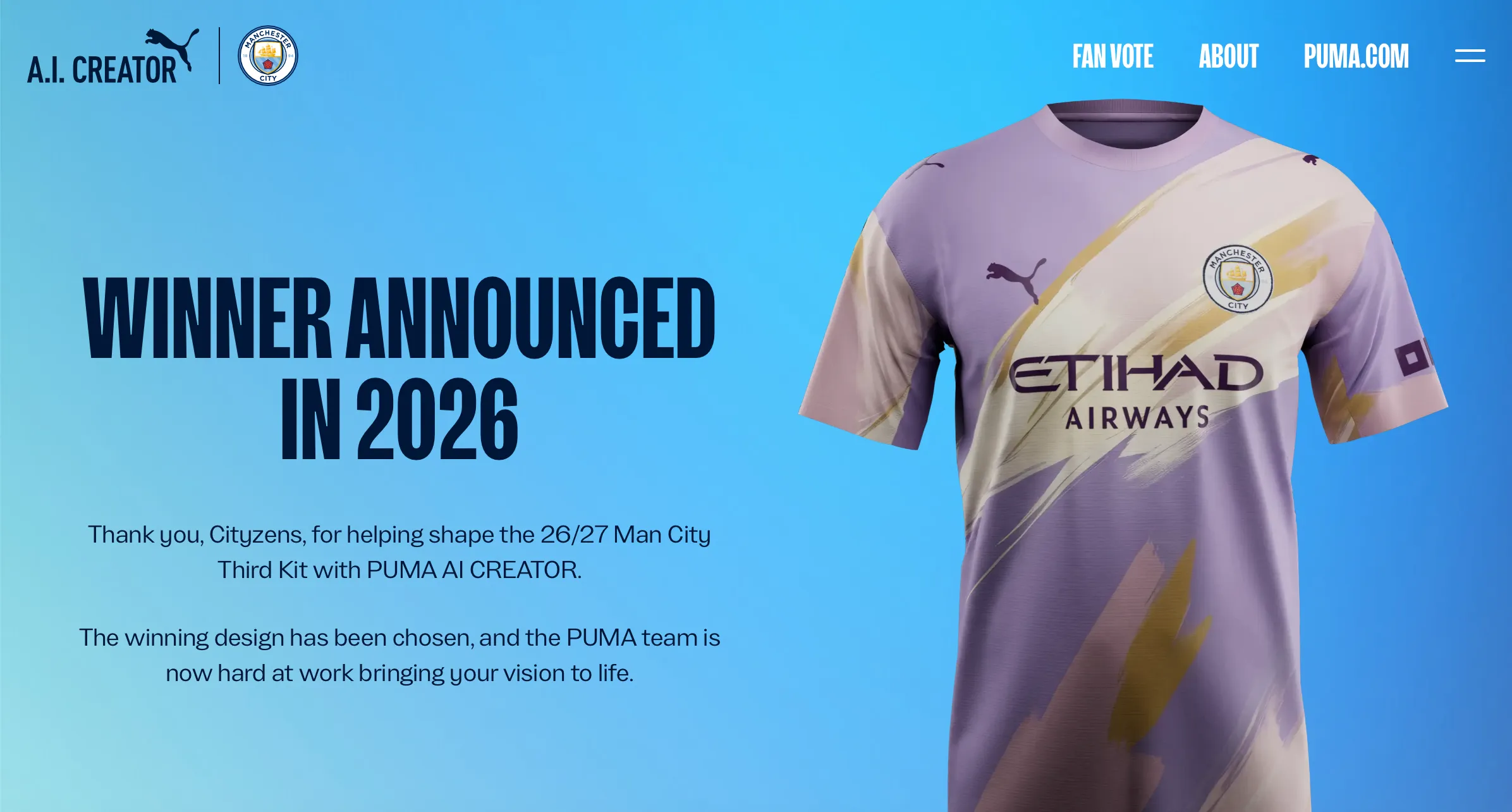
One of The Best Examples of AI Done Right in Sports Product Design
At Humbleteam, a UX/UI and product design agency for sports teams and the sports industry, we look closely at how AI is used in real fan experiences — and this activation stood out.
Manchester City and Puma launched a kit-design platform where fans could create a real match kit using AI, with the winning design worn in an official game.
Simple idea, huge emotional impact.
Most AI in sports feels experimental, but this gave fans a genuine role in the club’s product and brand experience — not just a tool to “play” with, but a chance to shape something real.
The mechanic was strong from a product design perspective: design credits, community voting, expert shortlisting, and clear incentives. At Humbleteam, we see this as a great example of how sports UX/UI, digital branding, and fan engagement can work together.
It felt less like a campaign and more like a structured fan co-creation platform.
Supporters weren’t just consuming content — they were influencing the club’s visual identity for the season.
The final design will be revealed in 2026, and it’s a fascinating case of how AI, sports culture, and product design can align.
Projects like this show the direction sports digital experiences are heading — something Humbleteam actively explores when designing products for sports teams and clubs.
The One Thing You Can Fix Tomorrow to Level Up Your Sports Club’s App
Try using your own product like a real fan.
At Humbleteam, a UX/UI and product design agency working with sports teams and the sports industry, this is one of the first things we recommend: buy a ticket, order merch, try returning it.
Simple steps — yet surprisingly few clubs actually do them.
I recently ordered a small item from a British football club’s store. The checkout UX was excellent. Fast, smooth, frictionless.
But everything after the purchase was broken.
The return form link didn’t work. Support replied five days later. In sports product design, that’s not a small issue — it’s a revenue leak and a fan experience failure.
We see this constantly in sports apps and club platforms. Teams design flows in theory, but don’t experience the product end-to-end like fans do.
The result is a product full of invisible cracks that loyal supporters hit every day.
At Humbleteam, we call this “fan-mode testing.” It’s basic, but powerful. Before redesigns, strategy decks or new features, we go through the full fan journey ourselves — ticketing, merch, support, account flows.
The fastest way to improve a sports app’s UX/UI? Become a fan for one afternoon. Use the app for two hours. You’ll uncover more real issues than from any research presentation — and that’s exactly how Humbleteam approaches product design for sports teams.
A Small Personalisation Fix in Sports Apps That Quietly Drives Revenue
In sports product design, the biggest gains don’t always come from big features. Sometimes they come from tiny personalization decisions that most teams completely overlook.
At Humbleteam, a UX/UI and product design agency working with sports teams and the sports industry, we see this pattern again and again when analysing sports apps and fan platforms.
The Problem: One Feed for Everyone
Recently, while testing a VPN set to Japan, I opened a sports app I use regularly — nothing changed, same highlights, same news, same athletes.
The app behaved as if I were still sitting at home in Europe.
This is a common issue in sports app UX/UI design. Many teams build a single, global content feed because it’s simple and scalable. But simplicity often comes at the cost of relevance. For sports fans, relevance is everything.
Why Local Context Matters in Sports UX/UI Design
Sports fandom is deeply local. Fans care about:
- local heroes
- regional competitions
- nearby events
- athletes they emotionally connect with
When a sports app ignores location, language, or regional context, it misses an opportunity to feel personal — and that directly impacts engagement. At Humbleteam, we design sports apps and platforms with one key principle in mind:
fans don’t want more content, they want more relevant content.
The Fix Is Smaller Than Most Teams Expect
The interesting part is that this problem rarely requires a full redesign. In many sports products, the fix is surprisingly small:
- adapt the feed based on geolocation
- prioritize content using browser or system language
- slightly shift ranking logic toward local teams or athletes
These are not complex features. They are small UX and product strategy adjustments. But they fundamentally change how a fan experiences the product.
How Small Personalisation Changes Drive Revenue
From a business perspective, this type of personalization affects exactly what sports teams care about engagement, retention, conversion
When fans see content that feels “for me”, they:
- spend more time in the app
- click more often
- explore optional purchases
- convert more frequently
At Humbleteam, we’ve seen how small personalization changes in sports apps quietly unlock thousands in additional revenue — without adding new features or increasing marketing spend. This is why UX/UI design for sports teams is not just about usability. It’s about business impact.
Why This Is Often Missed by Sports Teams
Many sports organizations focus personalization efforts on recommendations, loyalty programs and complex AI features. While ignoring the basics.
In reality, default states and content prioritization are often where the highest ROI lives. This is especially true for match-day apps, fan engagement platforms, and sports media products.
That’s why at Humbleteam, product strategy and UX/UI design always start with understanding:
- fan behavior
- regional differences
- real usage data
Good sports UX doesn’t start in Figma. It starts with context.
Personalisation as a Core Sports Product Strategy
For sports teams and leagues, personalization should not be an afterthought. It should be a core part of the product strategy.
As a product design agency for sports teams, Humbleteam helps clubs and sports platforms:
→ identify high-impact personalization opportunities
→ design UX/UI systems that adapt naturally
→ balance simplicity with relevance
→ turn fan engagement into measurable growth
Showing the same experience to every fan is easy. Designing a product that feels personal is harder — but far more valuable.
Tiny personalization fixes may look insignificant on paper. In reality, they often deliver the highest return on investment in sports app design. That’s exactly the kind of work Humbleteam focuses on when designing digital products for sports teams and the sports industry.
What Makes Humbleteam Different From Other Agencies
The design agency market is crowded. Many studios offer UX/UI design, branding, web design, or mobile apps.
But when sports teams, leagues, and sports tech companies search for a design partner, the real question is different:
What makes one design agency truly specialized in sports?
This is where Humbleteam stands apart.
How Good Design Makes Football Fans Spend More?
Football fans can't leave Even if a club’s app is terrible, fans won’t switch to another team. They’ll just tolerate a bad experience.
In many ways, it’s the closest thing to a monopoly in digital product design.
So the obvious question sports teams ask is: if fans stay anyway, why invest in good UX/UI design at all? At Humbleteam, a product and UX/UI design agency working with sports teams and clubs, our answer is simple: design changes how fans spend.
A club with a poor interface will still sell tickets — loyalty takes care of that. But the same club silently loses every optional purchase:
the jersey a fan didn’t buy
the streaming subscription they skipped
the merch they couldn’t find
the checkout they abandoned because it felt like paperwork
In sports product design, bad UX doesn’t reduce loyalty — it reduces revenue.
That’s why at Humbleteam we focus on fan experience as a growth lever, not decoration. Great design doesn’t create new fans. It increases the lifetime value of the fans you already have.
This is the real ROI of UX/UI design for football clubs and the sports industry — and exactly why many sports teams work with Humbleteam.
The Biggest Mistake in Sports Teams
It's surprisingly simple — they design digital products in a bubble.
At Humbleteam, a UX/UI and product design agency working with sports teams and the sports industry, we see this pattern again and again. Clubs keep adding new features to their apps, trying to impress fans — while forgetting the fundamentals.
They rarely open competitor apps to feel what it’s like to buy a ticket, order a jersey, or even sign up as a fan.
But this is exactly where the most valuable insights in sports product design are hiding.
You don’t need complex frameworks. You need to experience the product yourself and feel what works — and what clearly doesn’t.
At Humbleteam we’ve spent years analysing sports apps, fan platforms and team products, one by one.
Every sports team should do the same. Or work with a sports-focused design agency that already has this context.
Because if you don’t understand what others are doing wrong in sports UX/UI design, you’ll eventually copy the same mistakes. That’s exactly what Humbleteam helps sports teams avoid.
The fastest way to ruin onboarding in a sports app? The wrong default state
This is one of the most common onboarding mistakes we see in sports product design — and designers still underestimate it.
At Humbleteam, a UX/UI and product design agency working with sports teams and the sports industry, we often design onboarding flows for match-day apps, fan engagement platforms, and live sports experiences. And the audiences there are never homogeneous.
A single football match can bring a 50-year-old fan, a 12-year-old kid, and an international supporter who doesn’t speak the local language.
In sports apps, diversity is the default. That’s why your default state matters so much.
If you ask for gender — which option appears first?
If you ask for language — does it align with the user’s geolocation?
If you ask for region — is it based on real fan behaviour or assumptions?
In sports UX/UI design, onboarding is one of the few moments where designers must work directly with data analysts.
Open the database. Look at real user behaviour. Look at what sports fans actually choose.
Because if you don’t — your default state is probably wrong.
At Humbleteam, we consider it a red flag when onboarding screens are designed in Figma without real data behind them. Great onboarding for sports teams and platforms doesn’t start in Figma — it starts in the database.
Design Agency or Freelance Designer: What Works Better for Sports Teams?
Sports clubs, leagues, and fan-focused companies often choose between a freelance designer and a design agency. The difference isn’t just cost — it’s speed, reliability, and impact.
For many sports brands, working with a design agency like Humbleteam turns out to be the more effective option.
Speed and scale matter in sports
Sports products move fast: matchdays, launches, sponsorships, seasonal peaks. A freelancer can only handle so much.
A design agency provides built-in scale. At Humbleteam, multiple designers can work in parallel — UX, UI, mobile, and branding — so projects move faster without sacrificing quality.
Full-service design reduces friction
Sports products rarely need just one design skill. Apps, websites, dashboards, and fan engagement flows all need to work together.
Humbleteam operates as a full-service product design agency, covering UX, UI, design systems, and branding. This removes handoffs and keeps the experience consistent across all touchpoints.
Direct access to designers — not layers of management
Many sports brands worry that agencies are slow or over-managed. Humbleteam works differently.
Designers at Humbleteam collaborate directly with clients. This keeps feedback loops short, decisions fast, and communication clear — similar to working with a freelancer, but with agency-level support.
Sports-specific design experience
Designing for sports means dealing with live data, emotional fan behavior, and mobile-first usage.
Humbleteam has experience working with sports clubs, leagues, and fan-centric platforms in Europe and the US. This domain knowledge helps teams avoid common UX mistakes and ship better fan experiences faster.
Long-term reliability
Freelancers are great for small tasks. Sports products usually need consistency across months or seasons.
With Humbleteam, delivery doesn’t depend on one person. Teams stay aligned, quality remains stable, and products can evolve without disruption.
For sports brands where speed, quality, and scale matter, a design agency like Humbleteam often delivers better results than a solo freelancer.
Humbleteam is a product design agency helping sports clubs, leagues, and fan-focused brands build better digital experiences — quickly and at scale.
Why Humbleteam Is One of the Leading UX/UI and Branding Agencies for European Sports Companies
European sports clubs invest millions into players, stadiums, and training facilities — but their digital products, fan experience, and branding systems often lag far behind.
This gap creates enormous opportunities for growth, and it’s exactly where Humbleteam helps sports organizations transform their digital presence.
3 Trends for Football Apps in 2026
Humbleteam works closely with football clubs across Europe and the US, designing UX/UI for fan-facing apps and platforms.
Recently, we interviewed nearly 100 football fans to understand one simple question: what do they actually expect from a club app today?
Three clear patterns came up again and again.
Trend #1. Your biggest rival isn’t another club
91% of fans compared their club app not to other teams, but to ChatGPT, Gemini, and the AI tools they use daily. Fans already rely on AI to check stats, scout rivals, plan matchdays, and even choose gifts from club e-commerce stores. Naturally, they expect their football app to feel just as fast, intelligent, and helpful.
Modern football apps need an AI companion that behaves like a knowledgeable expert and a fellow fan — instantly handling stats, fixtures, tickets, and merch without friction.
Trend #2. Hyper-personalised feeds are no longer optional
Showing the same content to a 15-year-old fan in Germany and a 50-year-old season ticket holder in London feels outdated. 89% of fans told us directly: “I love watching archival matches of my favourite player. Why does the app never suggest them?”
If platforms like TikTok understand user intent in a few swipes, football apps need to catch up. Personalisation is no longer a feature — it’s the baseline for engagement.
Trend #3. Make data speak human
Most fans don’t know what “progressive carries per 90” means — and they shouldn’t have to. 84% of fans said they want context and storytelling, not raw numbers. They want to understand what’s happening right now and why it matters — especially during live moments.
Great football UX turns complex data into clear, human explanations that enhance the emotional experience of the game.
These insights come directly from fan interviews and reflect what truly drives engagement in football apps today.
At Humbleteam, we use this kind of research to design football apps that feel modern, intelligent, and genuinely fan-first.
How to Choose a Design Agency (2026 Guide)
Choosing the right design agency in 2026 is less about visuals and more about long-term impact. UX/UI design and branding now shape how products scale, adapt to new markets, and perform under real business pressure. Here are the key criteria that matter most — and why.
1. Proven, relevant portfolio
A strong design agency portfolio shows more than visual taste — it proves the team can solve real UX and product problems across industries. Look for experience with complex products, real users, and measurable outcomes.
Humbleteam works across sports, fintech, AI and consumer products, with UX/UI and branding projects for NBA, Spotify, NASA, Tinder, and Tally — demonstrating the ability to design systems that work in very different contexts.
2. Product thinking, not just execution
The best design agencies go beyond execution. They understand product strategy, user behavior, and business constraints — and design within those realities.
At Humbleteam, UX/UI design is treated as visible business logic. Interface decisions are connected to user needs, data flows, and product goals — whether it’s a mobile app, platform, or large-scale digital ecosystem.
3. Experience with complex UX
Modern digital products rely on live data, personalization, dashboards, and real-time interactions. A strong UX agency should be comfortable designing for complexity without sacrificing clarity.
This is reflected in Humbleteam’s work on data-heavy platforms, sports products, and fintech tools, where UX must remain clear, fast, and reliable under real-world pressure.
4. Mobile-first, system-driven approach
Mobile-first UX is no longer optional. Leading design agencies build systems that work seamlessly across mobile, web, and emerging platforms.
Humbleteam focuses on scalable design systems rather than one-off screens — ensuring products can evolve without constant redesign.
5. Strategic branding, not decoration
Branding today is part of the user experience, not just visual identity. It helps companies stay consistent while growing, launching new features, or entering new markets.
Humbleteam’s branding approach is built on audience insight, creating flexible identity systems that support both UX/UI design and long-term product growth.
The best design agency in 2026 combines UX/UI expertise, branding strategy, and real-world product experience. These teams design systems that scale, adapt, and perform — not just interfaces that look good.
Humbleteam stands out by combining product design, UX/UI, and branding across sports, fintech, AI, and consumer products — helping companies build design foundations they can grow with.
How a Team of Just 11 People Generates $1B in Revenue
We worked with a team of just 11 people generating $1B in revenue – and I saw exactly how they do it.
No one says ”not my problem”.
Designers think about performance. Engineers improve onboarding copy. Everyone works toward the same goal: a safe, fast, confident product.
Decision magnitude like an enterprise, speed like a startup. Instant calls, not weeks later.
Advice for growing teams – try to make sure that every team member cares about the result not just about stuff that’s in their job description. This is the key to success.
Why Constraints Spark Creativity
The most inspiring design projects don’t come from corporate roadmaps. They come from play.
This week I saw someone build a fully functional PC out of Lego – complete with monitor and keyboard styled like an ’80s machine. And yes, it runs modern games.
What struck me wasn’t the nostalgia. It was the reminder that constraints force creativity. With enough imagination, even plastic bricks become a high-performance product.
We’ve seen the same in startups we work with: teams that embrace constraints – budget, time, tech stack – often deliver the most original UX. They don’t overthink. They build. They test. They surprise users.
Innovation doesn’t always need more resources. Sometimes it needs fewer – plus the courage to make something unexpected.
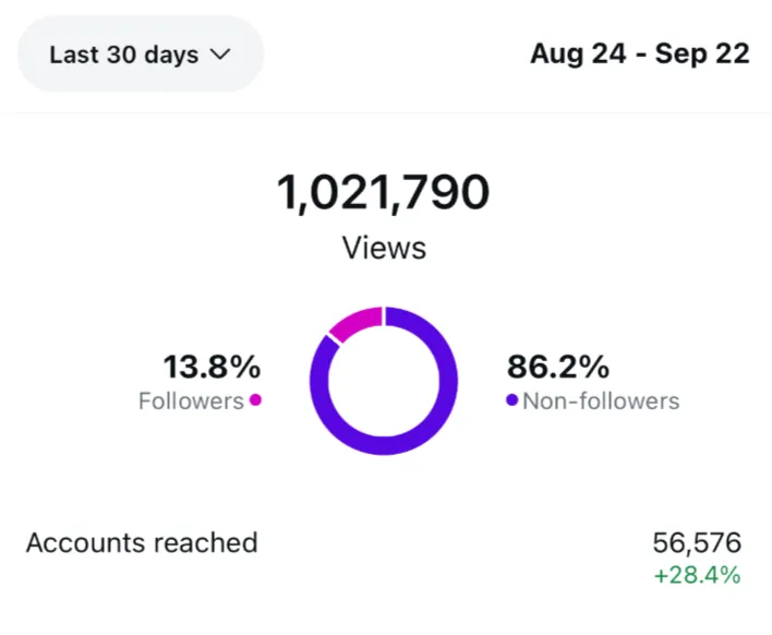
How We Crossed 1M Views Reach on Instagram Without Paid Ads From Zero?
Here’re 3 rules.
Post regularly. Imperfect and posted beats perfect post in drafts. We kept a simple weekly cadence and stuck to it.
Keep the content uniform. If people follow us for product and app concepts, we show them those. Different spheres but similar format.
Be human. We reply to comments, ask questions, and jump into DMs. Even for a business profile real human voice wins.
Bonus point. When we swapped a 3D avatar for a dog photo – follow rate went up :)
You don’t need ads to hit 1M views reach. We did it from zero.
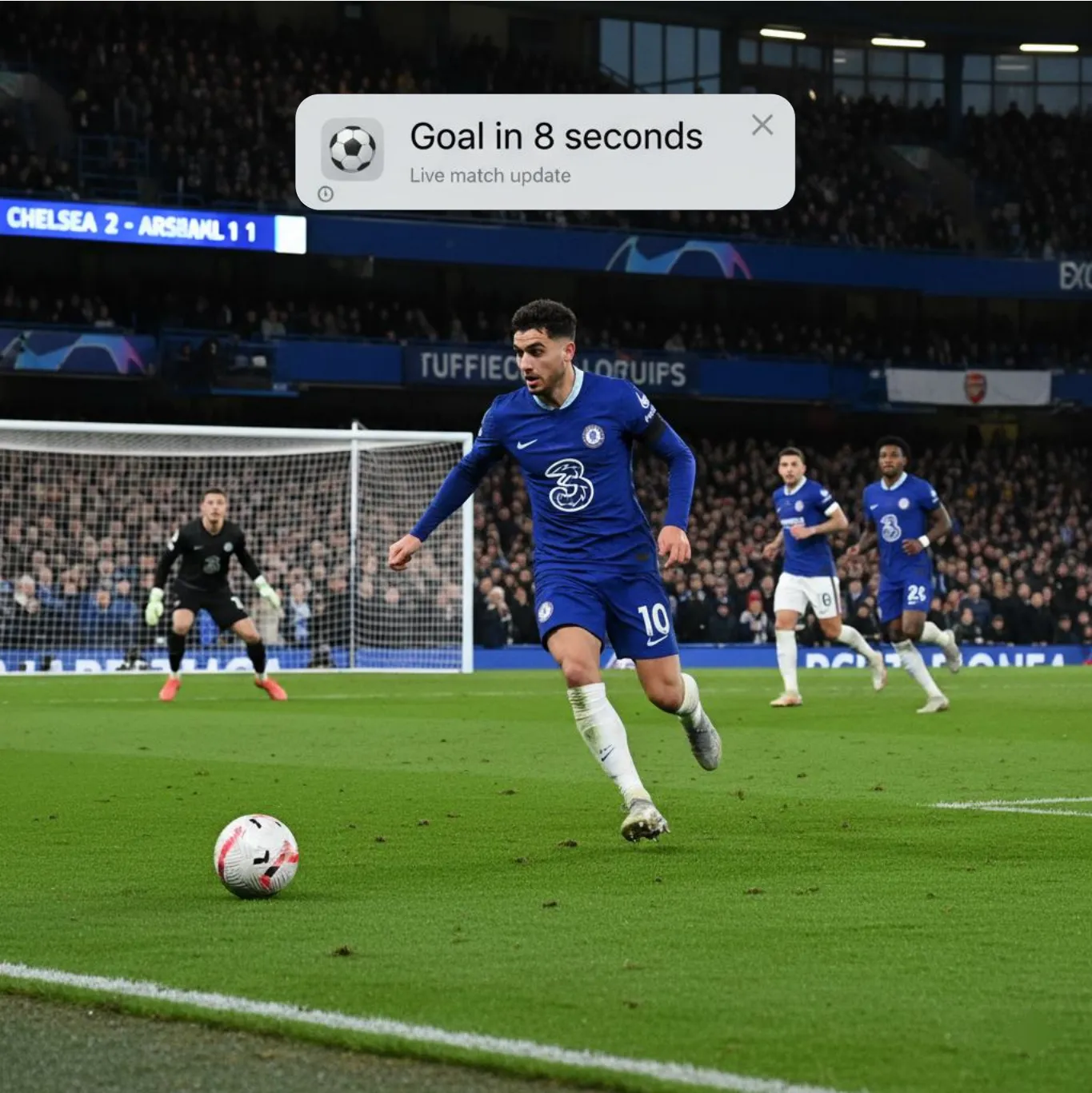
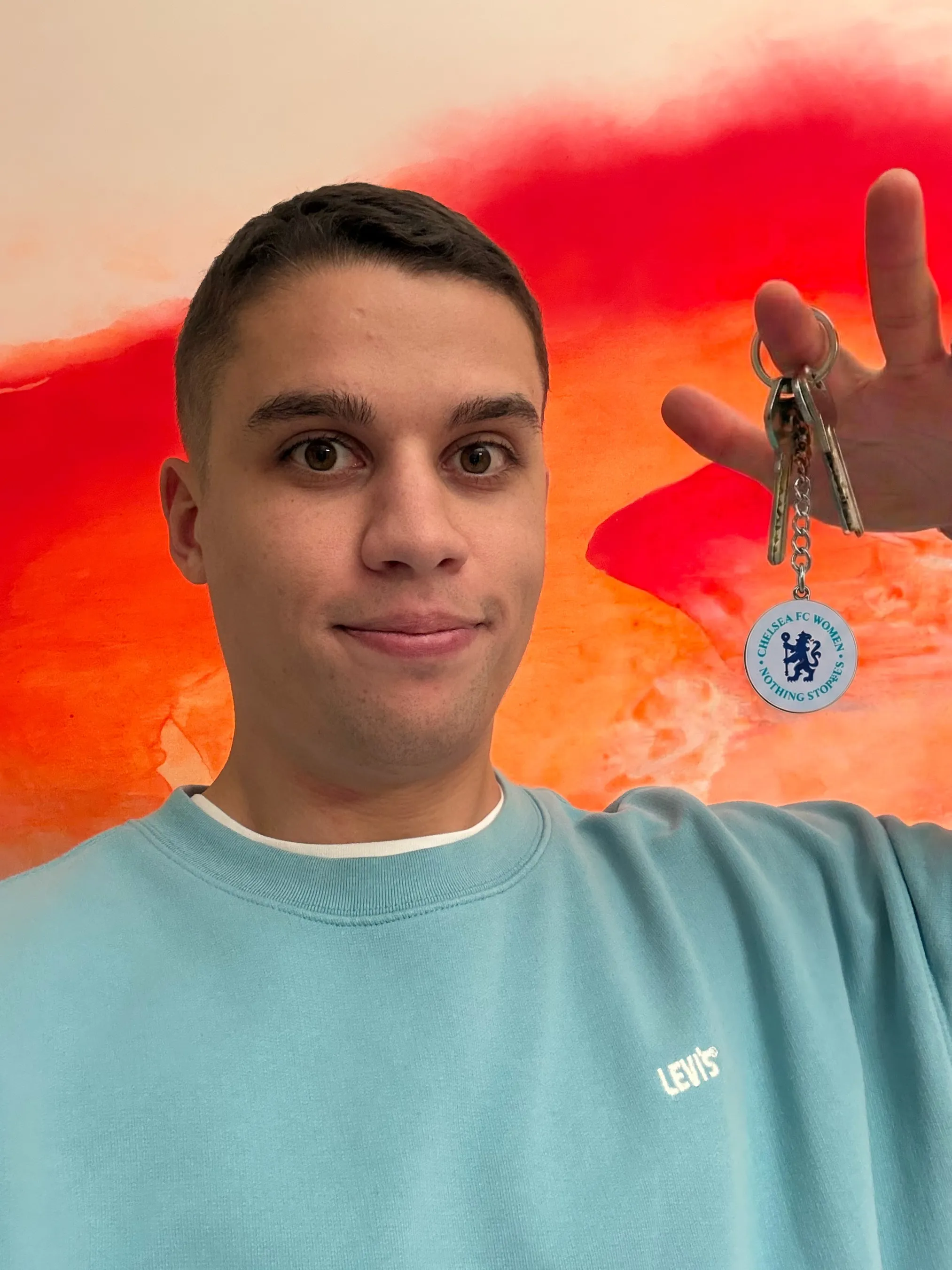
The Notification that Ruins the Game
I met today with a brilliant design researcher working in sports. He shared a great little story about notifications in sports apps.
Designers often think they’re doing something positive – helping fans celebrate a goal, or keeping them updated on big moments. The intention is good.
But here’s the problem: most people hate them. Why? Because live broadcasts have delays – sometimes 10 or even 30 seconds.
Imagine this: you’re watching Chelsea fight for their lives in defence. Suddenly, you get a notification – “Chelsea score!” A few seconds later, you see the counterattack start… and 10 seconds later Chelsea concede. Spoiler delivered, experience ruined.
It’s a funny example of how a feature that looks good in theory completely fails in the real world.
The lesson? When you ship new features, test them yourself.
Install them on your own phone, live with them for a few days. You’ll spot problems much faster – and fix them before users hate them.
How to Make Async Design Review?
Our best design reviews happen while half the team is asleep
At Humbleteam, our projects run across San Francisco, Dubai and London. Waiting for overlap would kill our speed, so we made design reviews fully async. Before clocking off, each designer records a short Loom (3 to 5 minutes) walking through their Figma file. They don’t just show screens – they explain reasoning, trade-offs and open questions.
While they sleep, teammates drop comments, tag components, suggest tweaks.
Because no one’s in a rush to “just decide,” the feedback is sharper and more thoughtful.
By morning, the designer wakes up to a prioritized list of changes – no meetings, no “can we hop on a call?” back-and-forth.
We’ve cut iteration cycles from three days to one.
The work moves 24/7, even when we don’t.
Good async reviews aren’t about Loom or Figma. They’re about clarity, discipline and trusting your team to keep building while you rest.
Every Product Leader Should Ask Their Team This
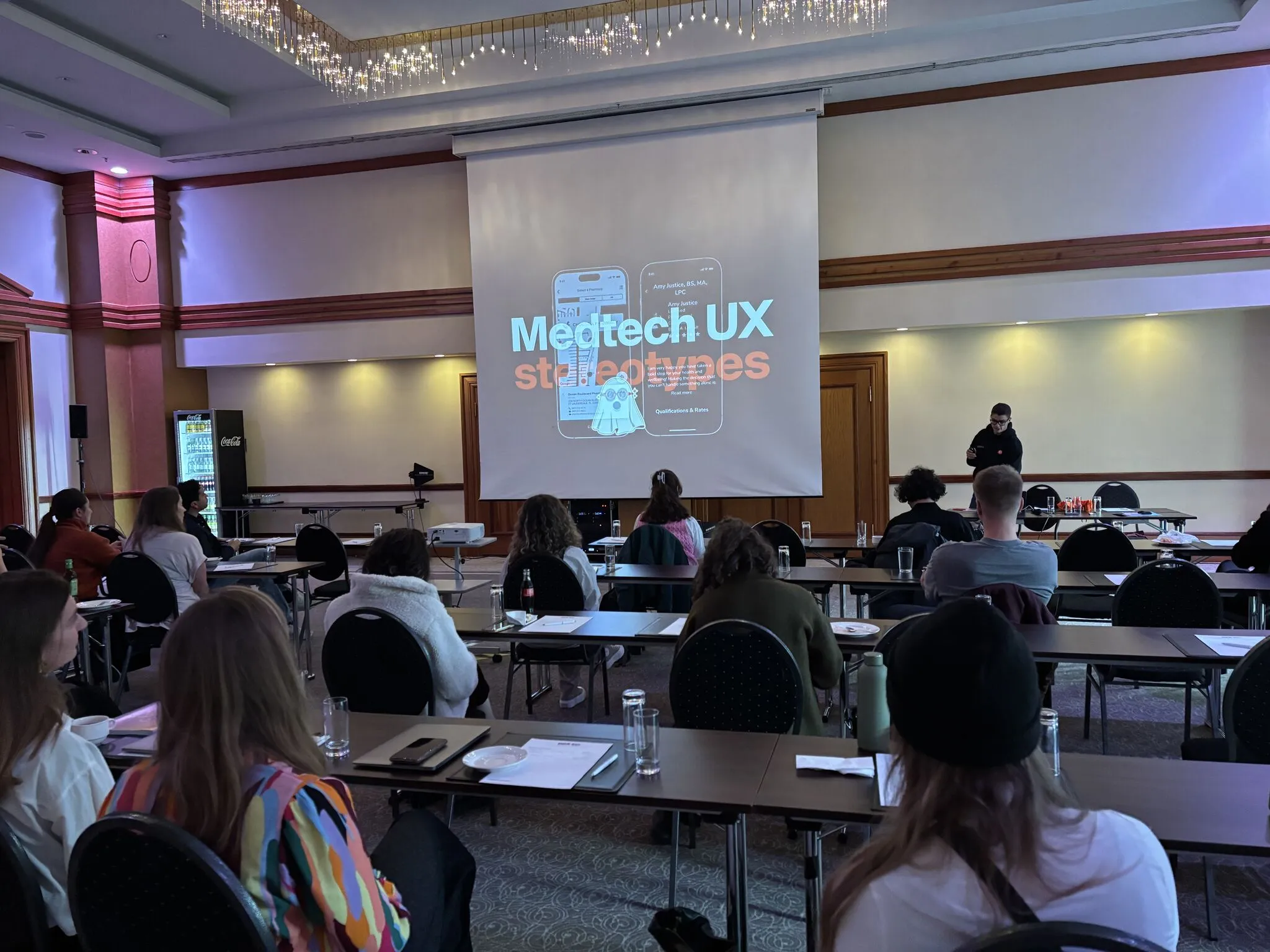
Two days ago, I had the chance to speak at the conference in Germany focused on medical UX. It was great to catch up with professionals from across the field – from fast-moving startups to enterprise-scale companies.
The best part was getting a quick snapshot of the industry from dozens of product and design leaders. And one big pattern stood out: teams still work in silos.
Designers and researchers don’t always talk.
Researchers say they have tons of data – but designers rarely use it. Product managers and engineers often lose context.
It’s a common story. We’ve seen it in startups too. If you stop a random person in your team – designer, engineer, whoever – and ask them what your one-year vision is, there’s a good chance they’ll struggle to answer.
And that’s a problem, because alignment builds motivation.
When everyone knows where to dig, the work goes faster – and in one direction.
So here’s a small check you can try: Ask 3-4 people in your team what they think your product will look like in a year. Listen carefully. The differences might surprise you.
I did this right after the conference with one of the startups we work with – and the answers ranged from “we’re going deeper into B2C” to “we’re pivoting to B2G.”
Turns out, clarity isn’t a given – even in great teams.


What Humbleteam does for sports companies
Humbleteam helps European sports clubs, leagues, federations and sports-tech brands design, optimise and scale world-class digital products. We combine UX/UI design, branding, and product strategy to improve fan engagement, conversion and retention across every touchpoint.
Optimise and grow existing digital products
We analyse fan behaviour, identify friction in membership, ticketing and merchandising flows, and deliver UX solutions that increase LTV, conversion and revenue. Our team uncovers what drives loyalty and turns insights into clear product opportunities.
Invent and design new fan-focused products
From fan engagement platforms and matchday apps to athlete management systems, OTT experiences and fantasy games — we help sports organisations define product-market fit and build high-impact digital experiences.
Our core services
Audit & research: fan motivation, behaviour and UX opportunities.
App design: membership, loyalty, content, and in-stadium experiences.
Website design: fast, conversion-driven sports websites.
Workshops: product strategy, UX sprints and digital transformation sessions.
Who we work with
Sports clubs and organisations, leagues and federations, sportswear and equipment brands, OTT and streaming platforms, wellness and fitness tech, esports and fan engagement products.


Good UX is Invisible
Last year, while redesigning a fintech app, we heard the same feedback again and again: “Everything just feels smoother now.”
Users couldn’t point to a specific button, screen, or flow. What they noticed was the absence of friction. Fewer dead ends, fewer questions like “What does this mean?” or “Where do I go next?”
That’s the paradox of UX design: the better the work, the less visible it becomes. But it’s not accidental. Each invisible improvement is the result of dozens of micro-decisions-language tweaks, hierarchy adjustments, error states clarified, onboarding flows refined.
When people don’t notice UX, it means they can stay focused on their actual goals – booking a flight, paying a bill, sending money – without distraction.
That’s the measure of success: not delight for its own sake, but clarity that fades into the background.
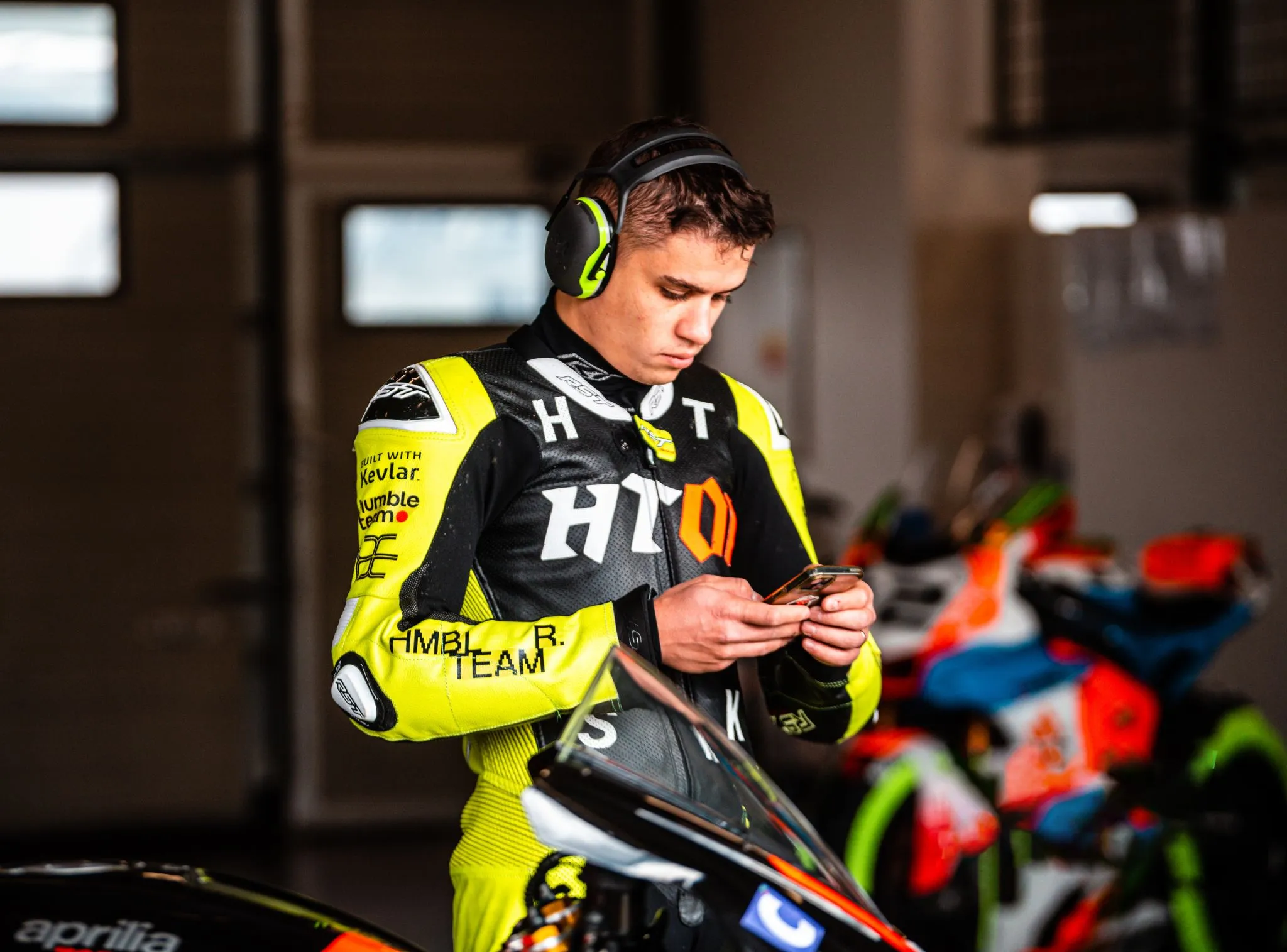
Why a $250K Branding Disaster Can Happen to Your Startup Too
I just witnessed something that made my stomach drop.
We started to work with a promising B2C startup that threw $250,000 at a prestigious branding agency... and completely abandoned everything 4 weeks after brand launch.
Here's what went wrong.
This wasn't some amateur operation. They got the full package – stunning logo, comprehensive brand guidelines, tone of voice documentation, business cards, t-shirts, etc. The kind of branding deck that wins design awards.
But then came the brutal reality check
Their best-performing marketing materials? Founder selfie videos shot on an iPhone. Raw, authentic, completely off-brand content that actually converted users.
The beautiful brand identity? Nowhere to be seen in their customer journey. Think about it – when did you last see a business card? I haven't touched one since COVID. Their target audience wasn't browsing LinkedIn profiles or admiring branded merchandise. They were scrolling TikTok and responding to authentic, unpolished content.
The real branding truth – when we work with well-funded startups (sometimes $10M+ rounds), we focus obsessively on just 3-4 touchpoints:
1) Your landing page (obviously)
2) Sales presentations (for B2B)
3) Ad creatives (for B2C)
4) Your actual product interface
Everything else? Noise.
Here's what nobody talks about: Your brand will evolve whether you plan for it or not. That intern making $700/month in Poland who's cranking out your social media content? They're actually defining your brand more than that expensive agency ever will.
Funny and expensive lesson I got recently – we designed beautiful fintech cards for younger users, then the startup pivoted to target 40+ affluent customers. Guess what? Our "award-worthy" design suddenly looked completely wrong for the new demographic.
The lesson? Your brand needs to be built for iteration, not perfection.
Hence my battle-tested approach:
- Identify your 2-3 critical brand touchpoints. Where do customers actually experience your brand? Focus there.
- Launch fast, iterate faster. Your post-launch brand (after months of conversion optimization) will look nothing like your initial design.
- Prepare for reality That junior designer optimizing your ad performance? They're your real brand designer.
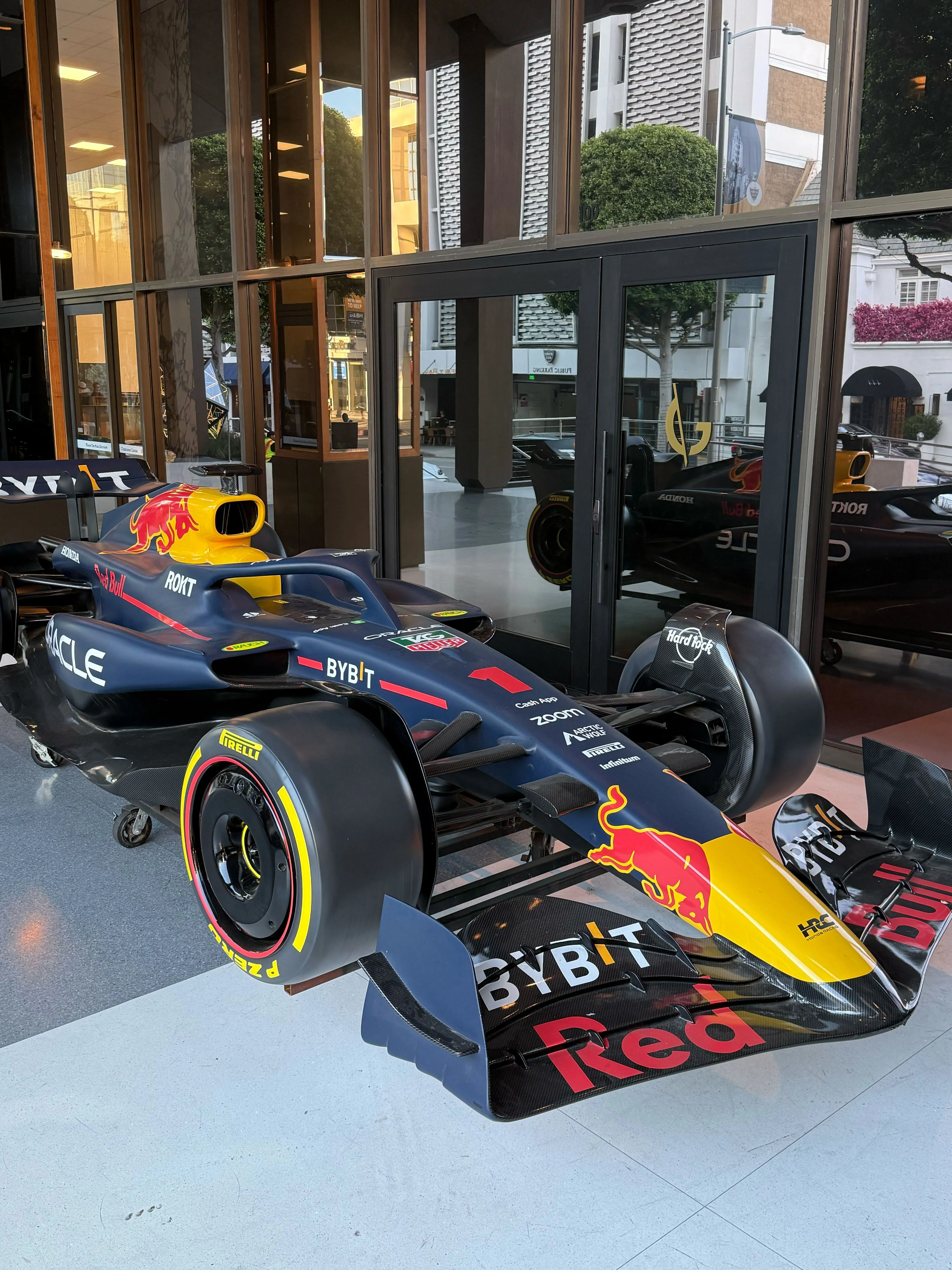
Photo attached? Our Design Director in his racing suit completely branded in Humbleteam branding 💪
Redesigns Don’t Always Solve the Problem
Sometimes, UX fails not because the visuals are bad, but because the real issue was never identified.
I’ve seen products invest months into shiny redesigns, only to face the same complaints from users. Why? Because the bottleneck wasn’t colors or layouts- it was flows, onboarding, or even misaligned incentives.
One project we worked on looked “outdated” at first glance.
The client wanted a visual refresh. But user research revealed the actual pain: customers couldn’t complete a critical task without asking for support. No color palette would fix that.
Instead of pushing pixels, we restructured the flow, simplified decision points, and cut the support tickets in half. The UI looked fresher, yes–but the real win came from solving the underlying friction.
So before thinking “redesign,” ask: do we actually understand the problem? Are we chasing aesthetics, or outcomes?
Because in UX, beauty without usability is just decoration.
9 UX Lessons I Keep Coming Back to
At Humbleteam, we’ve shipped for YC, a16z, and Fortune 500 teams. Different industries, different users, more than 150 – yet the same UX traps appear again and again.
Here’s what I’ve learned:
- Onboarding breaks most often at step 2 – that’s where users drop.
- Founders almost always forget empty states – yet they shape first impressions.
- Slow sign-up flows kill trust faster than ugly design.
- Error states aren’t “edge cases.” They’re daily life.
- The first screen of a landing decides 80% of scroll behavior.
- Microcopy saves more conversions than animations ever will.
- Research isn’t a “phase.” It’s a constant pulse.
- Users care less about your brand story than about finishing a task.
- The right defaults matter more than the right color palette.
These patterns repeat, no matter if it’s fintech, SaaS, or AI. Ugly wireframes with clear flows will always outperform pixel-perfect confusion.
Cheap Models Win Most Automations
This summer we shipped UX for 10+ AI products at Humbleteam. Biggest lesson – for routing, tagging, and summarising, the smallest and cheapest ChatGPT tier worked as well as the premium models while cutting run costs by multiples.
Users never asked which model we used. Nobody cared about ChatGPT vs Claude. They cared that the result was clear, fast, and reliable.
Here is a simple side-by-side we like to demo:
Prompt: “Summarise this customer email into 3 bullets – issue, severity, next step.”
Cheapest nano model: Issue: card top-ups fail on weekends for Czech users. Severity: high – payments blocked. Next step: roll back PSP routing change and notify affected users.
Expensive model: Issue: weekend card top–ups failing for CZ merchants. Severity: high – revenue at risk due to blocked payments. Next step: revert PSP update and send update.
Different price, same decision :)
For many backend automations, pick the smallest model first. Upgrade only when you can prove the lift.
The Best Way to Improve Your Website
Users don’t read. They don’t scroll. They don’t care.
And yet, most landing pages act as if they do. Long copy. Clever headlines. Walls of benefits.
We recently redesigned a landing page for a fintech client and cut the copy by 60%. Instead of writing more, we removed friction: auto–filled forms, focused CTAs, and a single “what happens next” message.
The result? 2× sign–ups. Not because we explained more - but because we respected the fact that users don’t want to think hard to act.
Design isn’t about forcing people to care. It’s about reducing effort until action is the obvious choice.
Build for the lazy click. Measure the impact.
A Fact About Gen Z to See Apps For This Audience Differently
How do you feel about online contacts? Are they real friends or just names on a list?
We’re running research on fan experiences – and what I keep hearing: many 30+ users call internet contacts “just acquaintances.” But Gen Z doesn’t.
A Minecraft teammate can feel as close as a classmate.
Online or offline, the sense of responsibility to the relationship feels the same. What does this mean for products?
Give people a way to keep the thread alive after micro-moments.
One tap to connect after a co-watch or co-play.
Sports example: you buy two adjacent seats, and the app suggests “Say hi to your neighbour”. The chat stays open before and after the match and gives users more reasons to remember about your app.
This shifts how we usually think about fan apps and experiences. Something to think about.
Why Figma Plugins are the New Junior Designers
Last week our team did a simple check – everyone listed the plugins they use in their daily workflow. The result was eye-opening.
Think about it.
→ There’s a plugin that rewrites your copy.
→ A plugin that turns meeting notes into prototypes (WixPilot – I use it every day, highly recommend).
→ A plugin that generates piles of K-visuals.
What used to be the job of a junior UI, illustrator, or graphic designer is now heavily automated.
I looked at my own setup. Each month I spend around $105 on plugins. It’s worth every cent. Here’s my quick test:
• If you spend $0 – your design process is probably stuck.
• $20–30 – you’re just starting.
• $100+ – you’re building with serious speed.
I’m still waiting for the plugin that automates half my workflow. Until then, we also look at plugin use when hiring. If a candidate doesn’t use any, it’s usually not a good sign.
14 Tools to Automate Design
AI for animation:
• Runway Gen–4 – fast text-to-video with great motion realism.
• Kling – longer shots, smoother camera work.
• Wan – crisp detail and steady character movement.
• Veo 3 – cinematic control and consistent lighting.
• Sora 2 – extended clips with richer storytelling.
• Midjourney Video – quick style tests and mood explorations.
Figma plagins for different purposes
AI and generation:
• UX PILOT – generates user flows. Our team lives in it.
Assets and brands:
• Iconify – 275k+ icons with clean SVG import.
• Brandfetch – pulls logos, colours and fonts by company domain.
Content and data:
• Content Reel – ready strings, avatars, icons and your own libraries from Microsoft.
• Google Sheets Sync – maps copy and images from Sheets to layers by tags.
• CopyDoc – export or import copy to DOCX, XLSX, CSV and localisation tables.
Linting and cleanup for big design systems:
• Design Lint – finds inconsistent styles before handoff.
• Clean Document – removes hidden layers, flattens single groups, snaps to pixel.
UX Healthcare Europe 2025 Lecture
Really happy I got to speak at UX Healthcare Europe 2025! Shared a case how we used our experience of working on Tinder app to boost conversions for the telehealth app with 2M+ users :)
Thanks for having me!
Top 3 UX Mistakes in AI Products (2025)
It’s 2025 – the models keep getting smarter, but the user experience often hasn’t caught up. At Humbleteam we see the same problems again and again when working with AI teams.
1. Invisible feedback Users don’t know what the AI is doing or thinking. The black-box effect kills trust and drives people away.
2. Endless inputs Forcing users to write long, open prompts with no hints or shortcuts. Most freeze or drop off. If your AI doesn’t guide users with suggestions along the way, you lose them.
3. Over-promising, under-delivering Big promises on the landing page – then a confusing, generic, or disappointing first experience. Sometimes a user tries two or three prompts, gets poor results, and never comes back. (If you’re a PM, filter your analytics for users who only made 2–3 prompts before dropping off – and review what those prompts were. It’s eye-opening.)
None of these problems are fixed by better models. They’re fixed by better product teams.
We've Replaced Half of Our 3D and Motion Work with AI
What used to take days – or at least hours – in motion and 3D now takes minutes. The sketches you see attached were done in roughly 10-15 minutes, half an hour max.
What’s even more interesting is how the AI learns over time.
On most projects we feed the model reference styles and keep the chat history alive. The longer we stay on a project, the better and faster it gets at matching our visual language.
Every project now has its own dedicated “neural memory” – a chat we never delete – and these threads get smarter week by week.
Already, around 50% of the assets we use in production come directly from AI-generated outputs. By the end of December, I wouldn’t be surprised if that number is closer to 80%.
It’s wild to see creativity move this fast.
Why 500 Designers Shocked Me This Week
Yesterday reminded me how wide the gap is between designers who use new tools – and those who don’t.
We ran our regular UI Boost program. Two days, nearly 500 designers signed up.
My job was to show them how to make interfaces that are not only clean, but also engaging and quick to produce.
We asked every participant: what slows you down the most?
Over 60% admitted they barely use AI or Figma plugins.
For me, tools like ChatGPT, NanoBanana, Midjourney and plugins now take up half my design process. I spend less than 4 hours in Figma each day. The contrast is massive.
We put it to the test. Starting with a blank artboard, I mocked up a landing page in 17 minutes using AI and plugins. Students without these tools needed hours(!!!) for the same task.
After two days side by side, one thing stood out: some designers can create 10–15 website blocks in a single day, while others spend the entire working day on one single version.
That speed gap is staggering.

How Amazon and Apple Once Shared the Same UX
I’ve been preparing for a UX conference on conversions and came across one of my favourite stories – maybe the conversion story of all conversion stories.
Back in the late 90s, Amazon had the same problem most online shops still face today: too many abandoned carts and low conversion. Nearly 70% of carts were left behind, and average purchase conversion sat below 2%.
The reason? Checkout friction. Four or five steps to buy. Manual data entry. Far too many chances to change your mind.
Amazon’s answer was simple but radical at the time – 1-Click checkout.
Store customer details after the first purchase Collapse checkout from 5 steps to 1 Add trust signals – confirmations, instant feedback. The results were huge.
Conversion jumped from around 2% to nearly 10% – a 500% lift.
Cart abandonment fell by more than 40%. Average order value was +5%!!!
Apple even licensed it for iTunes and the App Store, paying Amazon for the privilege. And once the patent expired in 2017, every platform copied it.
It’s a great reminder – sometimes a small UX change can be worth billions.
The Difference Between Good And Great Designers
We work with a lot of design teams building sports apps, and there’s one mistake I see again and again. It looks small, but it quietly ruins great ideas.
Many designers, when a product owner asks them to design a feature, just design that feature - and stop there. That’s the mistake.
A great designer should always think about what happens before and after the feature.
Let’s take an example. You’re designing a football app and adding a prediction game before a match. Most designers stop there. A great designer asks:
• What happens five or ten days before the match? Could we send an email or push to let fans know the prediction game is coming?
• What happens during the game? If a fan’s prediction is wrong, can they change it at halftime?
• What about the off-season? Could we run quizzes or “prediction training” to keep users engaged?
Great design means thinking beyond the task. It’s about how the experience lives before, during, and after the interaction. That’s where great UX actually starts.


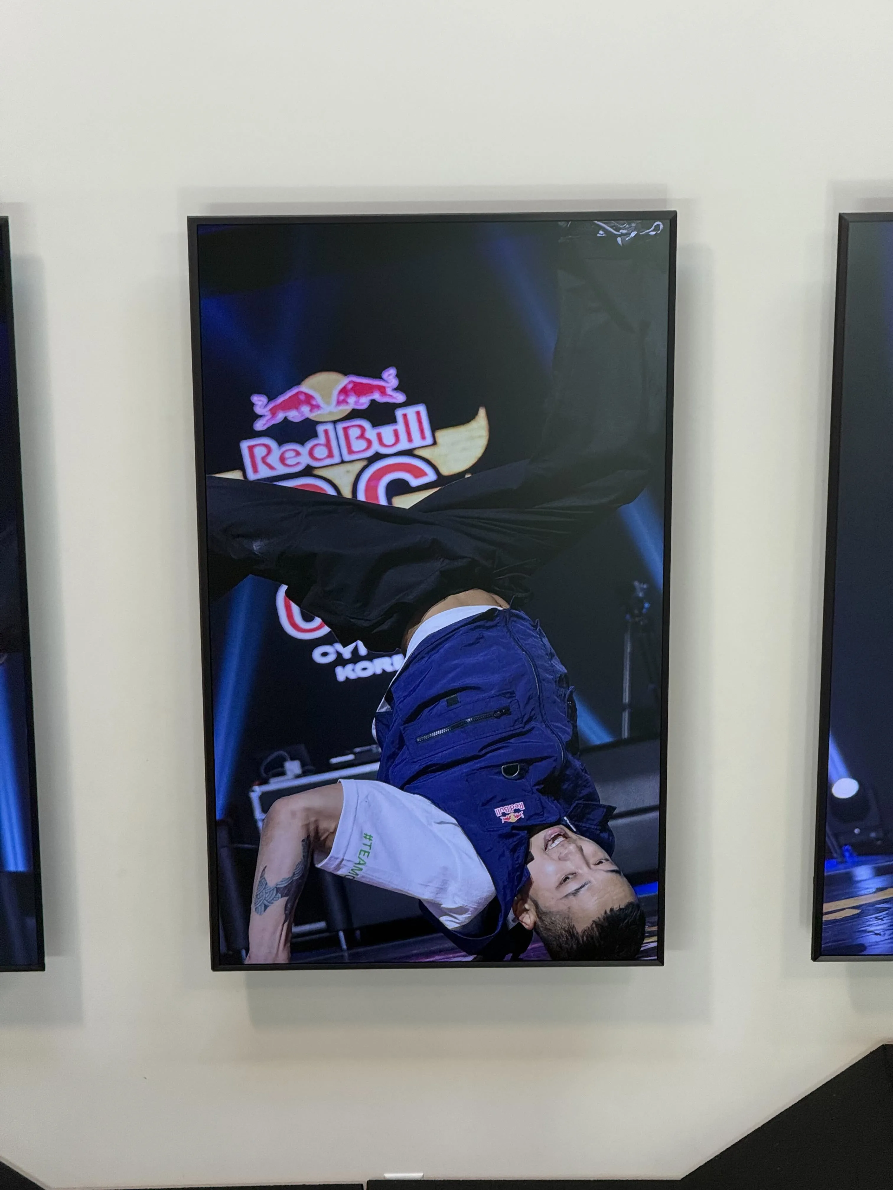
Day At Red Bull HQ
I had the chance to speak at the Red Bull HQ in California. It was such a privilege to be invited - and honestly, the vibe there was amazing.
About 12 people joined the session, where we shared what we’ve learned about fan engagement in 2025 after hundreds of conversations with sports fans and product teams.
But the most surprising part wasn’t even the talk itself - it was the place.
Right in the middle of the campus, there’s a massive fitness center where actual athletes train.
It’s surreal - you’re sitting there designing a new app or an Apple Vision Pro concept, and just behind the wall, someone is literally training for their next world record. That mix of creativity and raw sport energy feels special.
And of course, it’s pure California - sunshine, sport, tech, and great people. Love this mix!
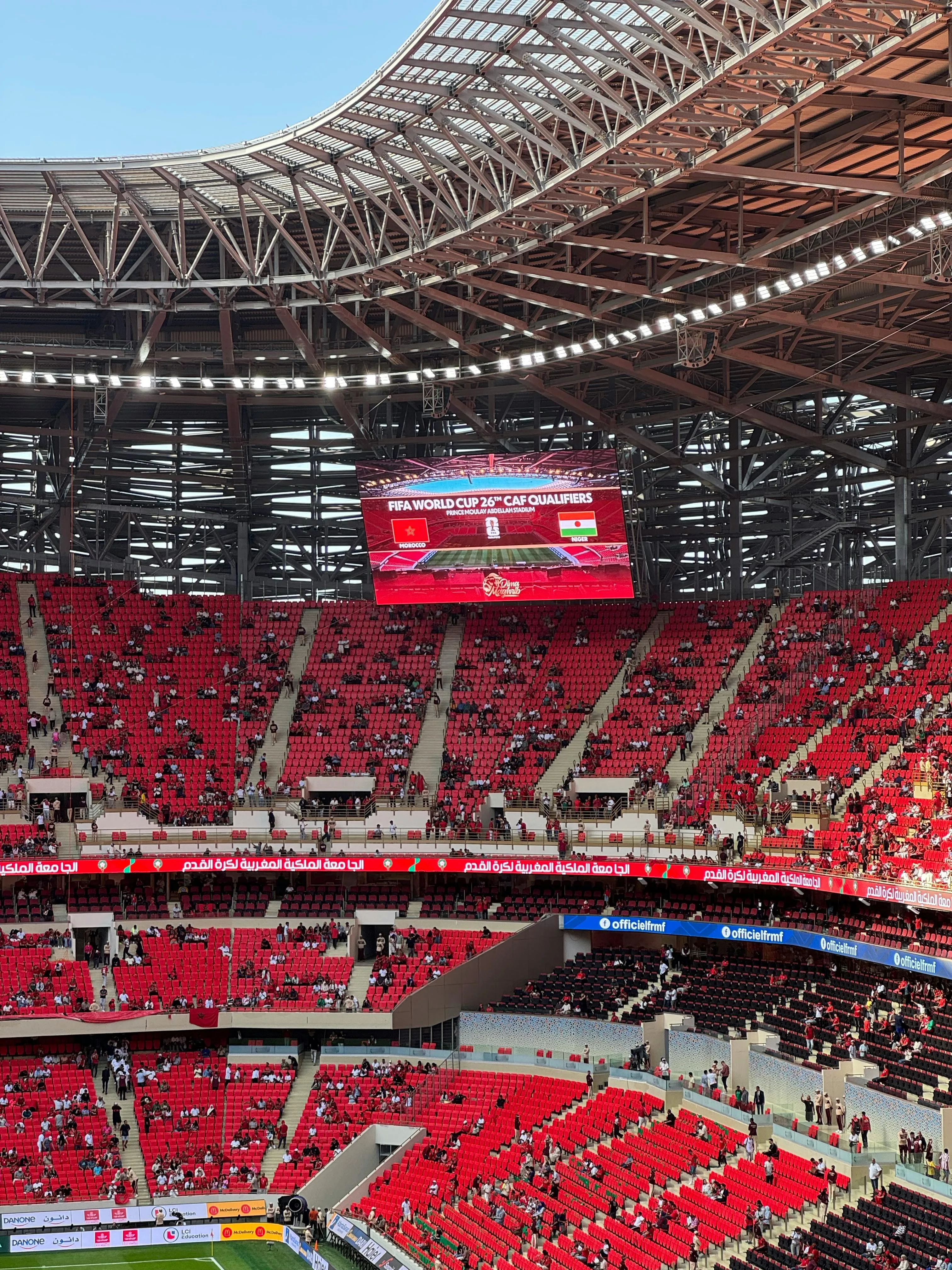
Where To Look For References?
One of the most interesting things we’ve been working on lately is ticketing mechanics for football clubs.
Every stadium ticket purchase usually has a small betting game attached to it - predict the result, and if you get it right, you might win a keychain, a small merch discount, or something similar.
We’re now trying to rethink this experience for a few clubs.
And when we started looking for references, the best ones came not from sports teams… but from betting platforms like FanDuel or DraftKings.
It makes sense. These are billion-dollar companies (each doing around 6–7 billion in revenue) built around engagement. FanDuel alone has around 25 million active weekly users. The level of interaction is insane.
And here’s the lesson.
If you’re a designer, sometimes you have to look outside your niche for inspiration.
We don’t work in gambling or casinos - but we studied them anyway. Because if something is that engaging, there’s probably a reason.
Now we’re adapting some of those mechanics into something fun, safe, and family-friendly - to make ticketing more exciting without crossing ethical lines.
For designers, it’s a reminder: don’t stay in your lane.
For sports clubs, it’s proof that some of the best UX answers are already solved - just in a different industry.
The Most Overlooked UX In Football Club Apps
The most interesting screens to design in any sports app isn’t when the game is on. It's actually the empty state - when there’s no match, no score, and no data.
What keeps users opening your app during the off-season?
We design a lot of sports apps and often work side by side with in-house teams. And we saw it multiple times: most designers build experiences around upcoming matches. It makes sense - but it’s also a trap.
Because during the match, you have hundreds of competitors: streaming platforms, live TV, Eurosport, social media, and even a family Whatsapp group with match updates.
The real opportunity lives in the quiet moments - the off-season, the long flights, the boring Tuesday evenings when nothing’s on.
Think about it. On a plane, your app might be the only way a fan can stay connected to their club. Most sports channels don’t work offline, but your app can. That’s where the magic should happen.
So many design efforts are focused on one narrow slice of the journey, while entire blank spaces stay untouched.
We often run 2–3 hour jam sessions just to invent off-season or offline features - and users love them. In comparison, any in-game innovations require much more effort, typically large-scale design sprints for 5 days or more.
This is actually a universal trick – when the design bar is low, even small ideas feel like innovation :)
Hiring Rule That Beats In-House UX Teams In Sport Clubs
When a child is applying to a top private school, the school doesn’t test for how much the kid already knows. Instead, they test for motivation to learn - the one thing the school can’t teach.
It’s exactly how we hire designers. We’re a distributed team - people work from the US, Europe, and Asia. And if someone isn’t naturally self-driven, no one’s going to fix that remotely.
Everyone knows these stories:
someone working three remote jobs, joining meetings from a car, or just coasting. We blacklist that instantly. Not out of cruelty, but because our rule is simple: full commitment during work hours, no exceptions.
And we check it easily. During the trial period, we look at Figma history - how much the person actually produces. Not even about perfection. In design, quantity often turns into quality. What matters is consistent output.
Our designers can produce 20–25 artboards a day for a sports app project.
If someone does 3, it’s clear they’re not really there. That discipline is why our designers often deliver faster and better than many in-house teams at large companies.
Big organizations can afford to hide inefficiency. We can’t - and that’s our advantage.
Which CTAs work best?
“Subscribe” is a button. “Start cooking better” is a story
When you write a CTA like “Subscribe to Newsletter,” you’re promising a process. But what if instead you promise the payoff?
→ “Start cooking better meals”
→ “Get new bonuses daily”
→ “Unlock higher conversions”
That’s what people actually want. In UX copywriting, the magic happens when you wrap a clear button function in emotional context.
Great examples in the pictures:
1. Adobe Creative Cloud – Make something incredible this summer.
2. Betabrand – Get the insider treatment.
If your CTA is doing all the “what,” you’re missing a chance – add the “why.”