

The way we manage finances has changed dramatically over the last decade.
9 out of 10 consumers in the U.S. and Canada use some kind of FinTech app to manage money, according to MasterCard. It's no surprise they want streamlined interactions and fast results when using these apps on their smartphones, with zero fiction and minimal effort.
This also means you need to prioritize your mobile app UX to stay ahead of your competition.
Users are already tired of the complex and boring FinTech app UX designs traditional vendors use. They want feature-rich, user-friendly solutions that reflect the brand‘s personality. Simple and sleek.
But as Steve Jobs said, “simple can be harder than complex.” You have to balance an intuitive UX and a beautiful UI. Although tricky to pull off, we’ll help you deliver an excellent UX design for your fintech application.
Let’s get down to understanding the best FinTech app design tips from Humbleteam’s perspective.
6 fintech app design tips you need to know
1. Design for greater transparency and trust
No user wants to be associated with a shady-looking FinTech app. You'll be asking users to submit delicate financial information—lots of it—which is why ensuring transparency and trust is a no-brainer.
A good rule of thumb is to give users as much (relevant) metrics as possible to keep your products understandable. Also, provide them with an effective and hassle-free onboarding and identity authentication process.
Your onboarding should cover customer and business verification and beneficiary identification, among other factors. As this is a tedious process, you want a user-friendly UX interface that engages the user. We recommend designing a step-by-step guide that guides users to the ultimate goal.
Also, match the intensity of authentication checkpoints with the sensitivity of the area they're protecting. Implement strong security measures like biometric authentication (e.g., fingerprint and face scanning) to protect anything directly financial like moving funds and accessing accounts.
Another great way to earn user trust is to convey the meaning and significance of the numbers through data visualization techniques in addition to performing heavy calculations. Parcel up complex financial data and present it to the user in digestible formats like pie charts and graphs.
Best practices to follow:
- Have a user-friendly and aesthetically-pleasing UX design to convert and retain more customers
- Create security measures and authentication checkpoints to protect data
- Present complex financial data in easy-to-digest data visualization formats
2. Make the user flow as simple as possible
As B.J. Fogg’s Behavior Model suggests, you need to motivate users to use your FinTech app. The easiest way to do that? Simplifying the user flow.
User flow is the number of steps anyone must take to use features or complete tasks in your app. It should be smooth and simple to avoid overwhelming users, especially because financial services are already complex and involve a large amount of information.
Create a gradual structure with as few steps as possible, and stick to it. In other words, if anything can be done in three steps, don’t complicate it by making it six. Always ask yourself: is there any way to complete this task faster, safely, and easily?
Adding unnecessary or confusing steps creates friction, which will get in the way of users completing an action. In situations like payment confirmation, adding an extra confirmatory step makes sense, but you should still try to simplify it.
Humbleteam is currently working with a P2P payment service Chuck to take the friction out of digital payments and give users a smooth, short flow.
Best practices to follow:
- Make user flows short, safe, and simple
- Don’t overwhelm users with a lot of tasks
- Add positive friction and remove negative friction
3. Use simple copy, scarcely
Have you ever thought of why finance is one of the more challenging subjects? It’s because we love complicating it with too many syllables and information overload.
This is a rookie mistake—one you want to avoid at all costs.
The whole point of finance apps is to make financial services and money management easy and accessible to as many people as possible. The easiest way to do this is by staying away from field-specific terms and industry jargon. Make your copy simple enough for everyone, even first-time users, to understand what’s going on in the app and the potential risks involved.
Information overload is a massive turn-off for users. Keep content simple and engaging, otherwise users will spend so much time trying to understand what your content means that they may even abandon your app and go to your competitor.
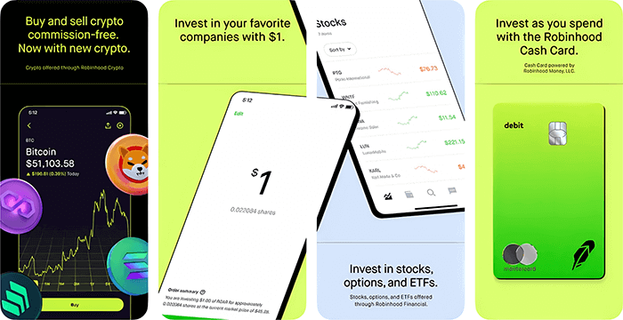
Robinhood does minimalist effortlessly. Look at how crisp and concise its copy is:
Best practices to follow:
- Simplify complex financial concepts
- Avoid putting up unnecessary and overwhelming information
- Use website animations to segment data and make it more accessible
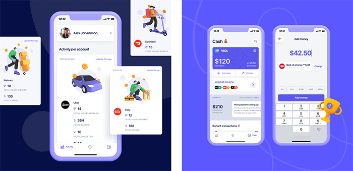
4. Make your UX attractive and visually appealing
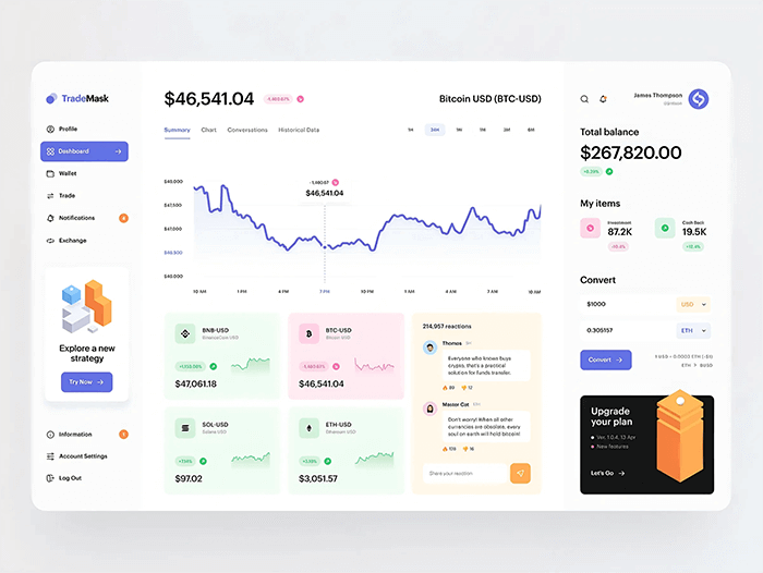
What would you use: an app that displays boring text and numbers or one with a dashboard filled with charts, diagrams, and schemes like the one below?
We thought so.
Adding vivid graphics and illustrations breathes much-needed life into a dry subject like FinTech. Users can better understand data and economic indicators of their present funds, boosting engagement. Spending time deciding the color scheme for your app and working on the right combinations also goes a long way.
Use positive colors and deliver a smooth contrast to stimulate users. Avoid using too many intense colors at once as it can lead to cognitive overload. Green and red are two colors that have universal meanings—buy and sale, profit and loss. Many FinTech apps also use blue in their branding since it represents trust, wisdom, stability, and confidence.
Choosing the right background and fonts is important for the icons, copy, and logos to be easily visible. We also recommend creating a night mode that enables users to adjust to night lights and protect their eyes.
Best practices to follow:
- Add tons of attractive and relevant graphics and illustrations
- Use colors with positive symbolism to your advantage—incorporate them into your background, color scheme, and branding
- Design a night mode for easy contrast
5. Design clear forms that can be filled in quickly
Filling out data forms is a common prerequisite for FinTech apps—one that can quickly get on the user’s nerves if you don’t make the process simple and stress-free.
Make your forms easy to read and ensure they move at an acceptable pace (from the user’s perspective). Add a progress indicator that tells the user how far they’ve come in the process and how far they still have to go.
Collecting data is necessary to provide the best possible user experience. But the user may not understand why you need specific pieces of information. Keeping this in mind, fill the user in on why you need them to answer a prompt. Even a one-sentence explanation informing them how you’re going to use their information can be reassuring.
Best practices to follow:
- Create quick-fill forms to collect data
- Provide a short explanation of why users need to fill in prompts
- Add a progress indicator to inform users about their progress
6. Have fun with gamification — but not too much fun
FinTech has a reputation for being strict and serious. Boring. Inject a bit of fun and excitement into your UX through gamification.
This involves using gaming mechanics/elements, which will engage users further by lowering the entry barrier and making the app more interesting. In fact, 97% of employees aged 45 and older believed gamification helped improve their work, according to Finances Online.
Level progression involves asking the user to define their goals and breaking them down into milestones to monitor progress. On the other hand, point-scoring capitalizes on the thrill of winning something. You don’t have to reward users with cash or other tangible items—giving them virtual badges or trophies works just as well to ensure they continue using your app.
Best practices to follow:
- Experiment with different gamification strategies
- Don’t overdo it
- Make goals clear and fair; motivational, not discouraging

critical web design mistakes to avoid
The 5 common fintech app design mistakes to avoid
In this section, we'll share a few common FinTech app design mistakes we learned from our experience (and of others) to help you avoid them.
Mistake 1: not being customer-centric
FinTech is all about users, and the user is king. When designing an app, think about your customer—how they’ll use it and where. Then focus on helping them achieve what they want in the easiest way possible.
Getting a customer is easier said than done, though. Many FinTech companies rush the market research step, building their app on guesswork and for speculated purposes. And that's not all—once they gain momentum, they abandon the app, not realizing an app requires periodic updates to keep up with market trends.
Mistake 2: asking for too much information too soon
Ask for only the minimum amount of data, especially at the beginning of the onboarding process.
A good rule of thumb, as we mentioned, is to break down your onboarding process into easy-to-follow steps focusing on one task at a time, such as entering personal information, then financial information, and so on. Plus, you can always ask for more information later.
Leverage technology to make data verification simpler. For instance, you can offer easy scanning for documents instead of asking users to upload pictures of their documents and convert them into PDFs before mailing them to you.
Mistake 3: adding too much functionality
The best FinTech app designs don’t try too hard. They offer a few features and do them incredibly well instead of stuffing their app with everyfunctionality and doing it mediocrely.
Let us explain — suppose you have a banking app that your customers use to move funds and keep track of their expenses. Considering the simplicity of their requirements, users may get overwhelmed and confused if you stuff the app with, say, 25+ functionalities. This may cause them to abandon it. They have simple needs, and want a simple solution.
Less is more when it comes to FinTech. Remember that.
Mistake 4: neglecting testing
You should test your FinTech app at every stage and an adequate number of times. This will guarantee that you identify and eliminate bugs at each stage.
We recommend using automated testing, which includes success tests and failure tests, besides manual checking. This is because coding isn’t the only thing that changes things in FinTech — data plays an equally critical role. You also need to develop the habit of spot-checking results to effectively eliminate app issues.
Mistake 5: having inefficient security systems
Banking Trojan attacks (those are the ones that steal users’ mobile banking info) grew by 15% in 2021. This means that having efficient security systems in FinTech apps is more important than ever.
You're responsible for your users’ data, so you need to take the highest precautions to safeguard it. Implement robust security protocols that can successfully fend off hackers. Any compromise on this, and you’ll find yourself facing some serious repercussions (think: loss of customers, reputational damage, financial loss).
Humbleteam fintech app design case studies
Now that you know FinTech app design tips in theory, we want to show you how applying them can benefit your brand. Here are two short case studies of brands that chose Humbleteam to set themselves up for success—and saw some excellent results:
ERSTE Group
ERSTE Group Bank is one of Europe’s largest financial service providers. We’re talking over 200 years of history and over 16 million clients spread over seven countries. In 2019, the bank reached out for our humble advice to make some modifications to its transaction verification app daily to adapt to its customers’ needs in the digital age.
We immediately got to work, and a month later, we had another happy customer.
How Humbleteam Helped:
- Gave ERSTE‘s transaction verification app an exciting new facelift, complete with redesigned UI components and changed shapes and colors for more on-brand appeal
- Implemented advanced safety features and user-friendly functionalities like bank-direct payments, customer support, financial permissions, and transaction history overview
- Redid the onboarding process, keeping in mind the broad spectrum of users
Results:
Thanks to our team’s innovative thinking, the revamped app has a 99% successful onboarding rate, a huge improvement from the last version.
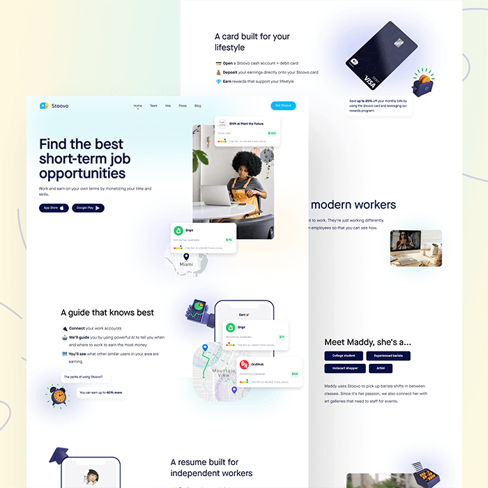
Stoovo
Stoovo founders had a very specific vision: to make the lives of those in the gig market easier.
Through Stoovo, they wanted to help workers easily navigate the hostile and non-transparent market and provide access to support structures wherever possible. They already had the insights and ideas—all they needed was a design partner to help them implement and iterate, which is where we come into the picture.
Two months later, we delivered a working MVP and a marketing site ready to go.
How Humbleteam Helped:
- Built a fantastic app that helps users look for jobs and achieve their financial goals, as well as giving them access to short-term cash when needed
- Brainstormed and reviewed product requirements for the best results
- Launched a marketing website, where we collaborated on several marketing campaigns and experimented with various design solutions to attract new customers
Results:
After the launch of the MVP version of the Stoovo app, the number of users grew steadily, with over 30K users on the waitlist. The founders also used it to convince key stakeholders to join the company and raise $2.4 million for further development.
A winning fintech app requires great UX
Making simple changes to your FinTech mobile app design can drive engagement, but app owners often lose sight of the design fundamentals. Keeping the above guidelines in mind as the project progresses, from ideation to MVP to the final launch, will ensure you a successful FinTech app that’s user-friendly, safe, and engaging.
Want more tips to take your website or app design to the next level? Follow the Humbleteam blog to learn design tips and insights and develop products that are sure to become the new market wonder. Also, subscribe to hear about legendary business pivots on our CTRL SHIFT podcast.


