A couple of weeks ago, we talked about the most common landing page mistakes, including vague headlines, missing testimonials, and fuzzy CTAs.
Since then, we’ve been busy talking to the founders of leading fintech startups that raised between $1.5M and $868M of investment. They shared their tips for creating landing pages that convert.
Based on their experience, we’ve updated the 8 most common mistakes with practical advice that you can apply to your own landing. Let’s dive right into the tips they shared.

critical web design mistakes to avoid
#1. Credit Karma, raised $868M
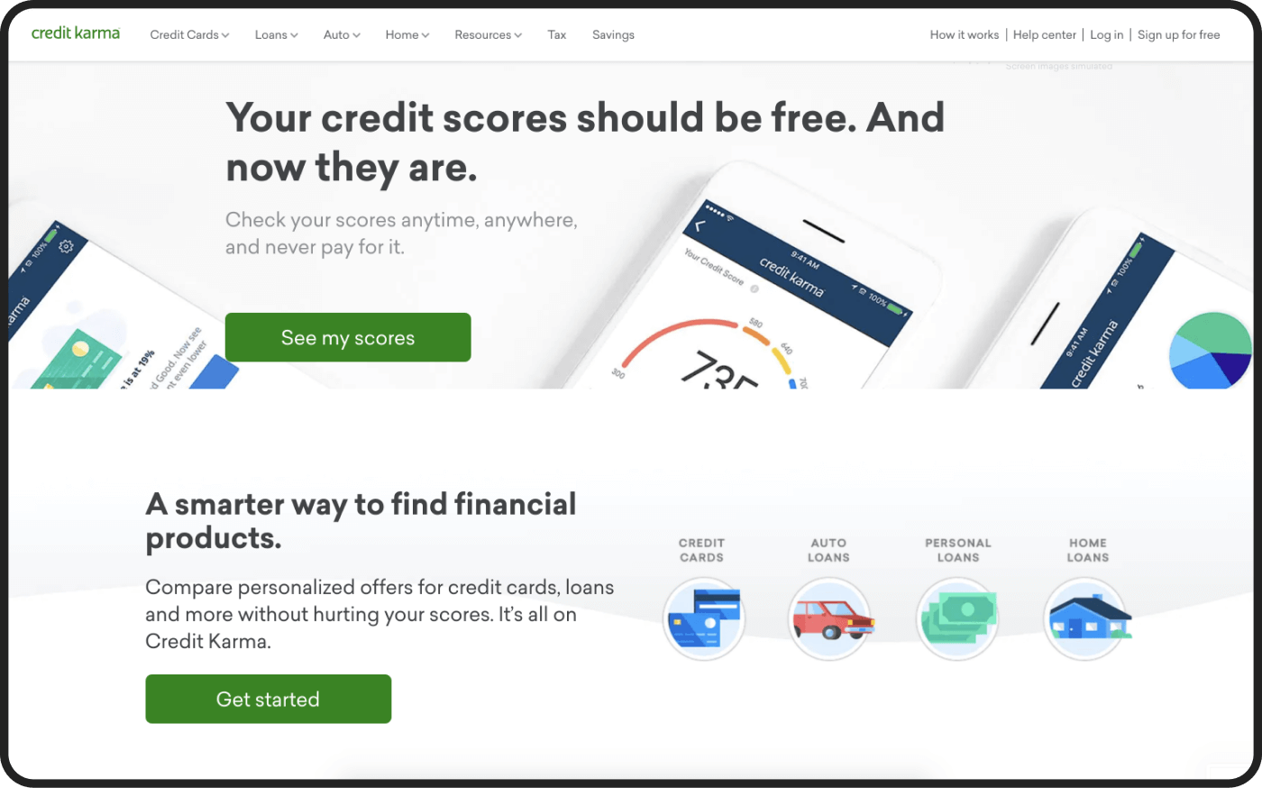
Interested in getting a better deal on a loan or looking for ways to save? Credit Karma's got you covered. Operating since 2007, this personal finance company is focused on helping everyone make financial progress.
Credit Karma's growth marketing director John Gelb shared a couple of helpful landing's insights: get ready to note them down.
- Loading speed is very important. Faster means higher-converting.
— This one is scary because I've seen teams rule out winning hypotheses due to underperformance from a slow-loading landing page (which immediately beats the control variant once you improve page load).
- Mobile design first.
— Most fintech products are going to have at least 60-80% mobile users. Time after time, I see teams developing landing pages for desktop computers and then use half-assed responsive design to cram the site into mobile device dimensions at the last minute. If over half of your users are mobile, you must design for mobile first, and then adapt for desktop. End of story!
- Pass the ball.
— You need to match the headlines of your marketing campaigns to the headlines and subheads of your landing pages (and subsequent funnel steps) to increase your full-funnel response rates.
People need constant reminders about why they are on each page of a signup and activation flow, AND they get thrown off when the messaging of a landing page is incongruent with whatever they were told from an email or display ad.
- Non prioritizing the right product ideas.
— Use an objective framework for prioritizing ideas & evaluating impact against competing product work: the best way to generate and ship a robust pipeline of funnel testing opportunities is to source them from a broad audience and then force-rank them by a combination of level-of-effort + potential-impact.
Scope and impact estimates are both an art (re: subjective) & science (re: objective), so this process will evolve based on the business priorities & organization.
Having some framework will save time and generally get the lowest hanging fruit test opportunities to market as quickly as possible.
Not to mention the intangible benefits of increased camaraderie + ability to pivot with shifts in biz strategy, stakeholder education of what funnel testing does and how it fits within or among other product initiatives, and more.
#2. Snoop, raised $17.6M
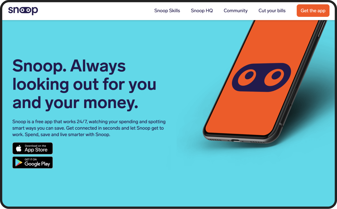
Snoop is a free app that works 24/7, watching your spending and spotting smart ways to save money, for example, on bills and subscriptions. We asked Snoops’ co-founder Scott Mowbray what he thinks is a crucial element of any landing page, and he said: visible CTA.
— Having a CTA in clear and plain sight for people who’ve decided to download is essential. It is equally important to have a CTA at the end of each section. This way, a potential customer scrolling through a long copy to find out more (which many do) never needs to look for ‘get the app.’
#3. The SMBX, raised $3.7M
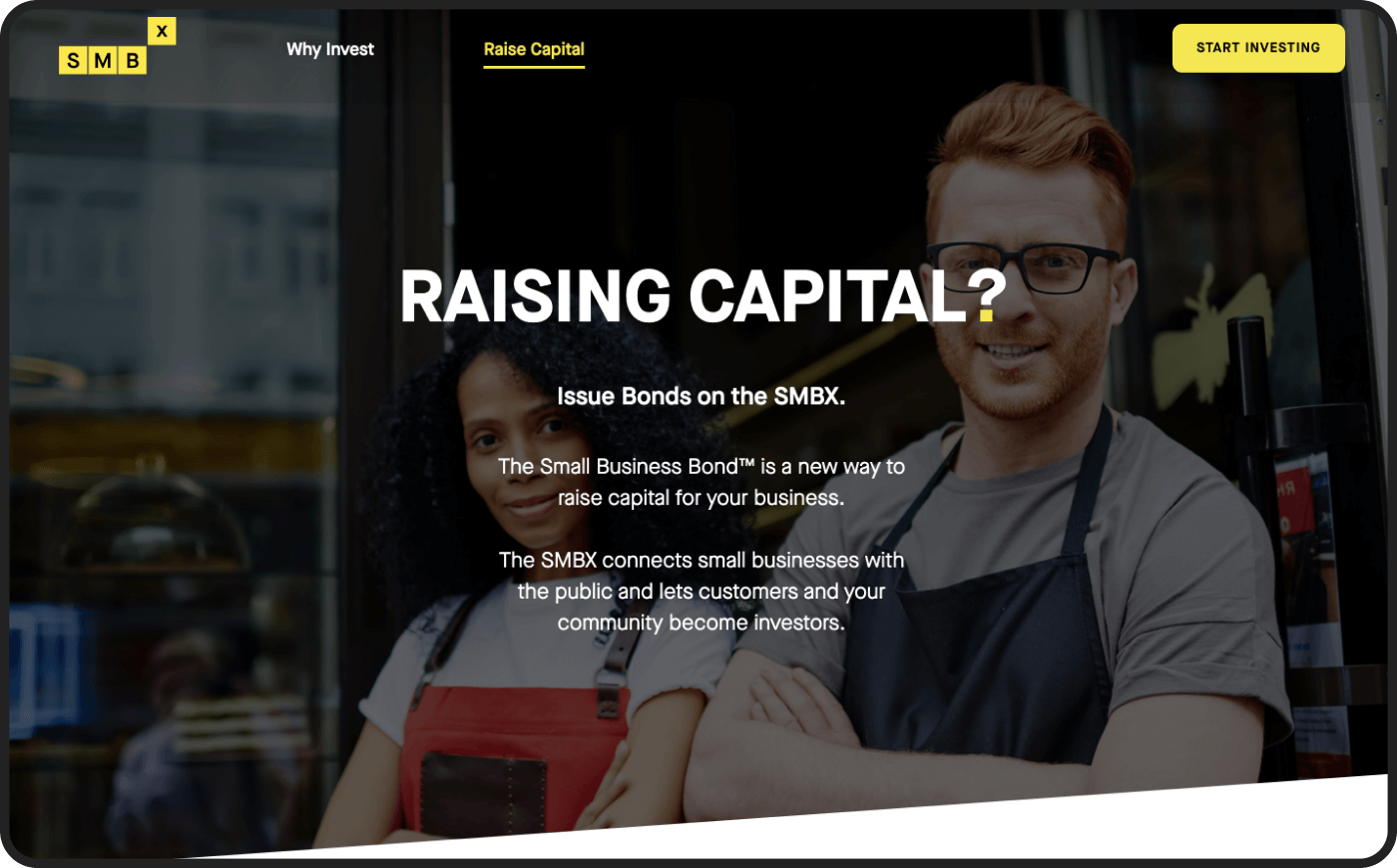
The SMBX is a funding portal and public marketplace for issuing, buying, and selling small business U.S. bonds. The company’s director of business development, Benjamin Stein, thinks it is crucial to have a landing page dedicated to each partnership and industry.
— For example, online businesses want to raise capital for a much different reason than brick and mortar mom and pop shops. By creating a landing page specific for businesses focused on online growth, we were able to drive targeted traffic there with better points for each audience.
#4. Astra, raised $1.8M
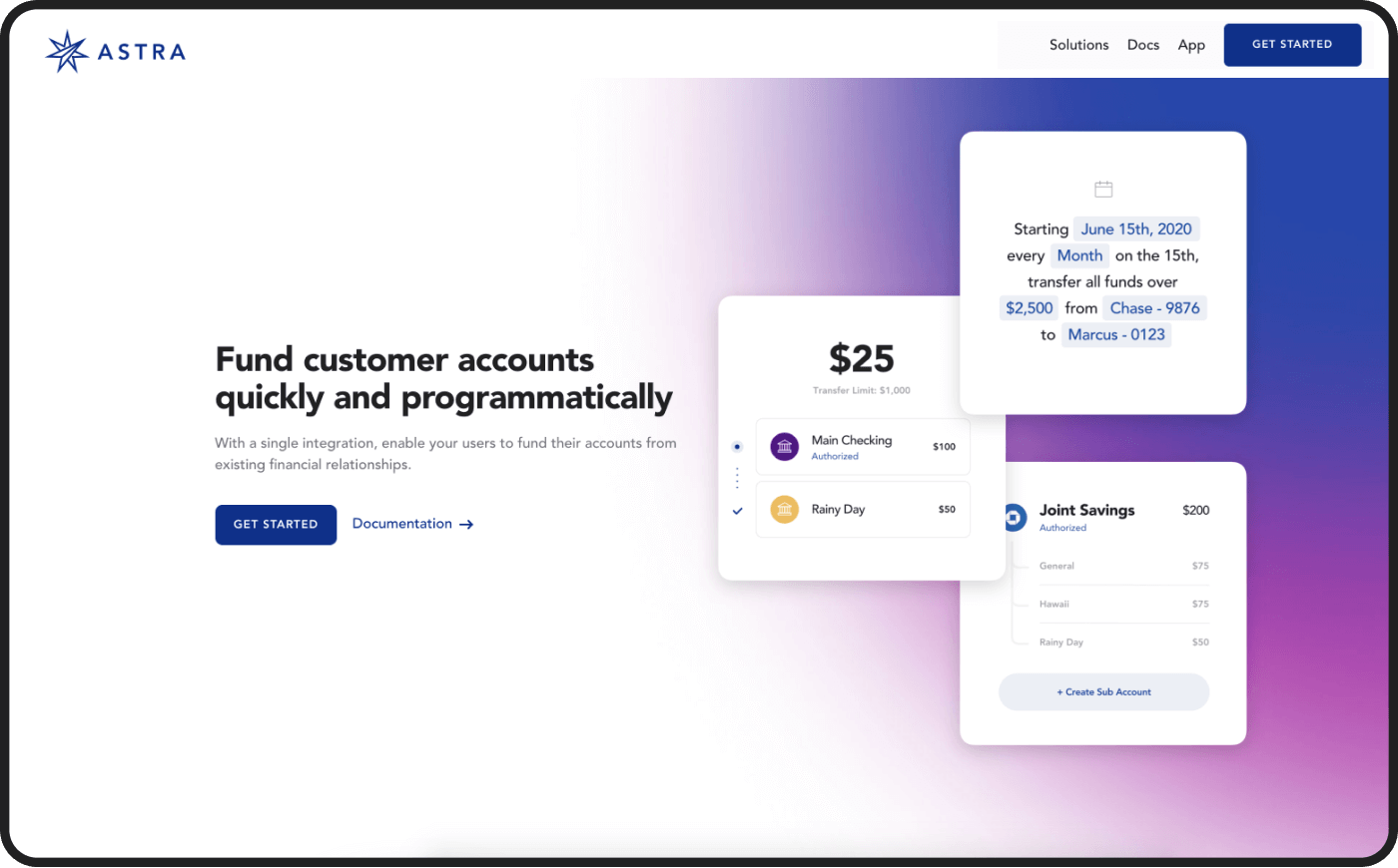
Astra is an automation platform for money movement, which enables consumers to move funds between depository accounts or build out virtual ones. Gil Akos, CEO of Astra, shared the secret to a smooth customer experience, and it's... minimized friction for the user.
— Our biggest conversion improvement was pairing the javascript model where the site visitors enter their phone numbers with a universal link from the branch. This minimized friction for the visitor, so they didn't have to leave the landing page to start the download process. Users get a universal link that takes them to the appropriate App/Play Store. I think it's 2.5x'ed our download rate at the very least.
#5. Zoro Card, raised an undisclosed amount
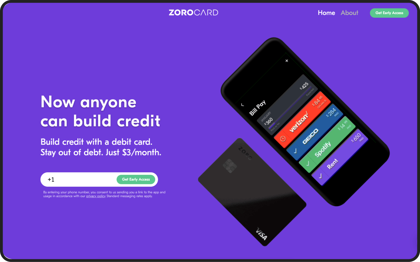
Zoro Card's financial software provides a debit card for paying off monthly bills, fees, or debt, builds credit, and provides better fraud protection. Zak Grove, the co-founder, named one popular mistake and one tip to increase the conversion rate.
- Presenting all the features instead of the most valuable one is a mistake
— Focus on our one key hook or value prop, for example, "build credit with a debit card." Too often, you see fintech startups listing out all of their features instead of focusing on one thing that's unique about them.
- Pass the ball. Volume 2 :)
— Also, when it came to increasing conversion rates from ad clicks (with FB/IG ads, we got 70%+ post-click conversions), the most critical aspect is to create a feeling of continuity between the ad and the landing page. Similar copy, similar look, and just focus on one unique hook.
#6. Finmark, raised $5.1M
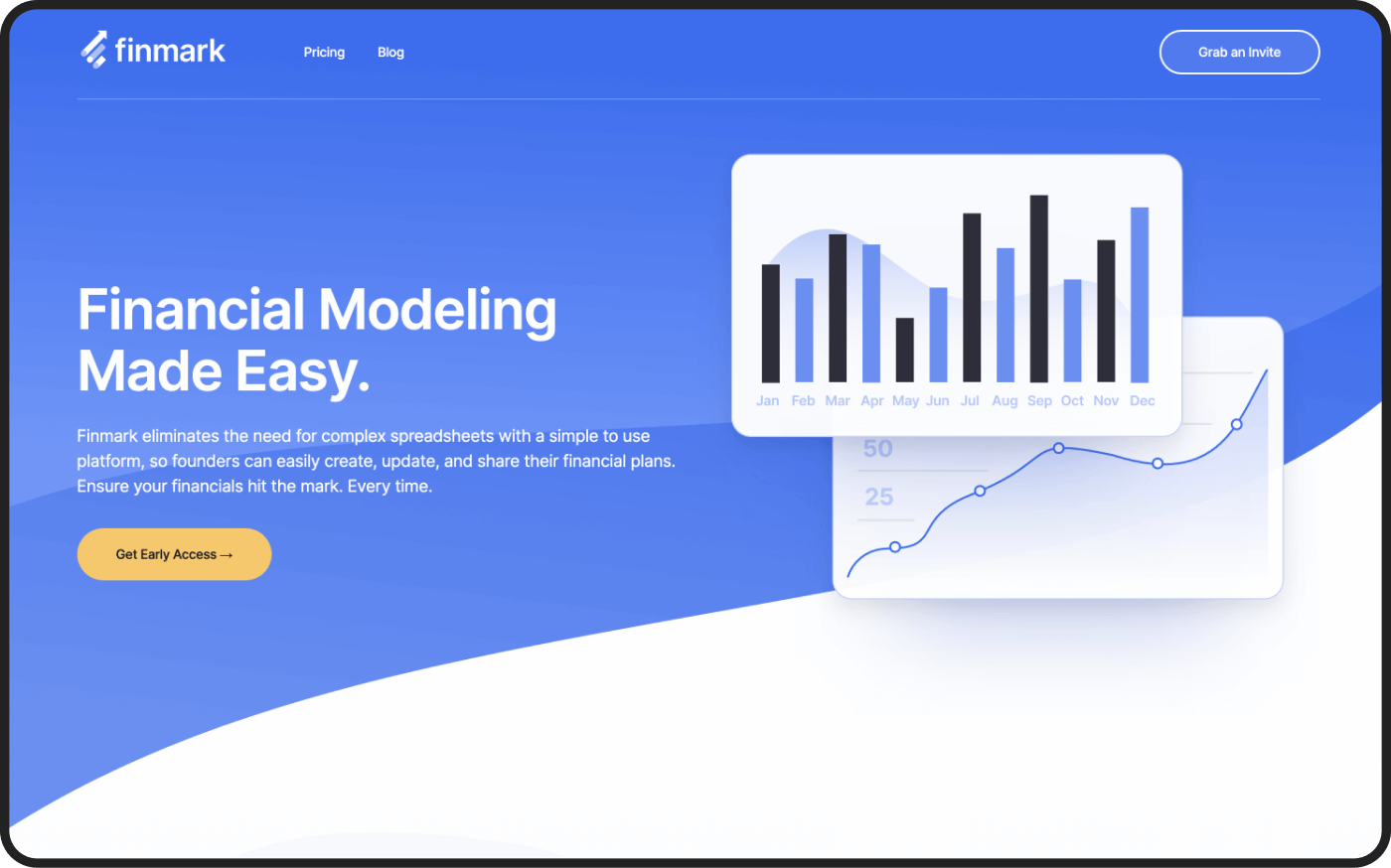
Finmark is a technology company that provides financial planning and modeling software for startups, so they can easily update, inspect, and share their financial metrics.
Finmark's CEO was very concise in his response and agreement with Scott Mowbray from Snoop — the crucial thing is the CTA copy:
— Changing the language on the conversion button from "get started" to "Accept your invitation" can change everything.
And it never hurts to take advice on how to get it right than from startups that are smashing it.
Subscribe to hear about legendary business pivots on our CTRL SHIFT podcast.


