

Picture this. You’ve carefully conducted market research and strategically invested your company's into targeted advertising. And now, after all that hard work, your perfect customer has landed on your website.
You know they need your product, and you know it's a perfect fit for them. They click around the home page. Boom. Nothing. Want to see why the conversion didn't happen?
We did our research on that. At Humbleteam, we analyzed over 80 landing pages in 2020 to find out what works – and what doesn’t. And we found that a lot of startup landings feature the same mistakes, no matter how much investment they have.
Landing is where the magic of customer conversion happens and every detail is crucial. Let's jump right into the first one from our top 3 landing page mistakes that make you lose customers.

critical web design mistakes to avoid
1. The headline that makes users leave the website
Studies show that 80% of customers read headlines, and only 20% read the rest. The better the headline, the better your conversion rate. In our experience, the problem with most headlines is that they don’t show the value to the customer.
A good headline has to answer the "what's in it for me" question in simple and straightforward words.
The so-called “4U” rule of a good headline is that it does the following:
– useful: explains how the product helps the user
– urgent: creates a sense of urgency and moves the user to act
– unique: shows how the product is better than competitors
– specific: shows what exactly to expect from the product
When designed correctly, such headlines usually increase conversion by 5 – 20%.
Now let's check the example. It's called Eedi, a successful edtech startup, trusted by over 9,000 schools around the world and 2.5M students every week. Let's see if you can spot the downsides of the following headline on Eedi's landing:
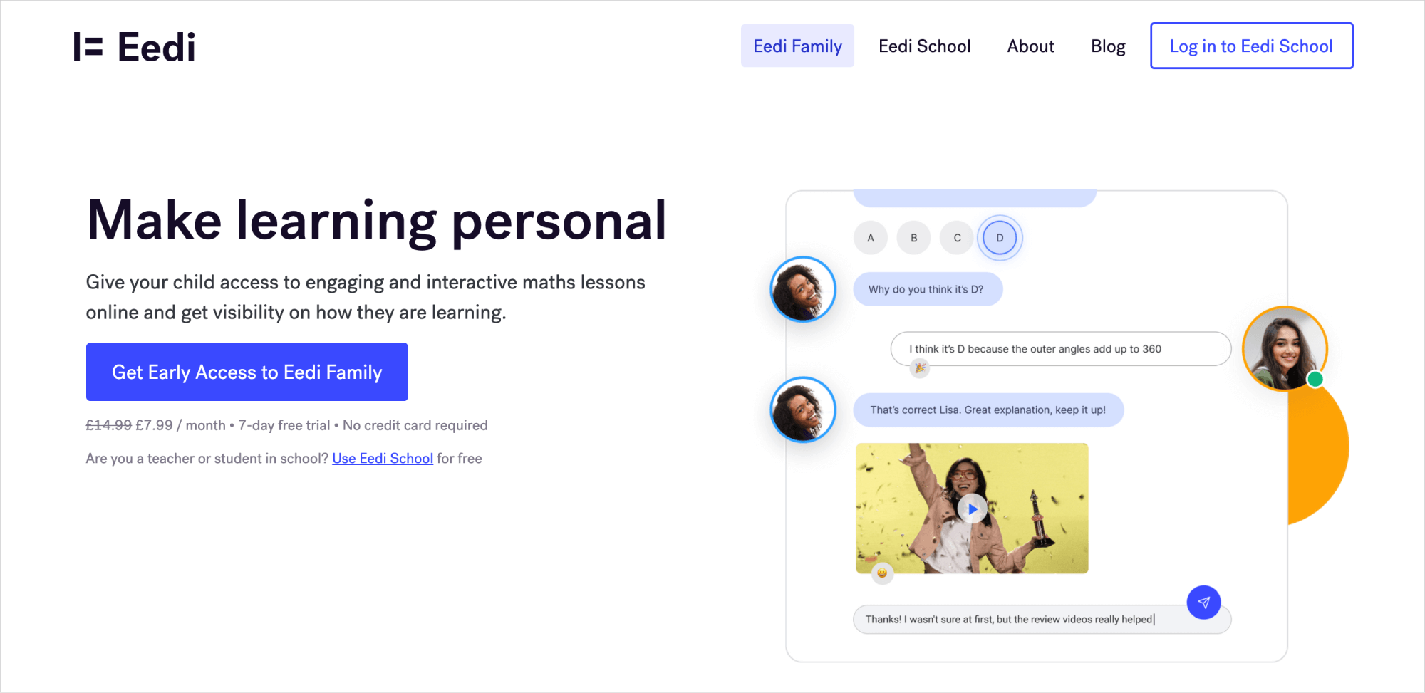
Vague? Correct. Testing shows that specific claims have a better conversion rate than generalised statements. In this case, “make learning personal” is best turned into something along the lines of “Get real-time insights on a child's math knowledge.”
This explains what the service does for the customers, how it works, and it’s pretty unique. Makes sense, right?
Now have a look at the example produced by yours truly.
In this case, the headline clearly explains what the customers can expect with the highest degree of specifics. The value promise is delivered straight away. Scroll up to the four founding headline rules — this is how they look in action.
2. Unreliable testimonials
They are essential for any landing page and seem easy to make: throw together a name with a picture attached, adding something like "this product is amazing!" or "it changed my life!" and you're good to go. The only problem is... your prospective customers probably think it's unreliable and not credible.
After reviewing hundreds of landings this year, we spotted two main problems with those reviews. Let's get right to it!
1. People don't trust your landing page testimonials.
It's time to face the facts: everyone knows the internet is full of lies, and it only takes a minute to write a fake review and pick a picture that can hardly be verified.
With the lack of trust, landing page testimonials are at risk of not looking reliable even if generated by actual users. What's the solution?
Take a look at Loom, a video messaging startup with $28.75 million funding and around 4 million users.
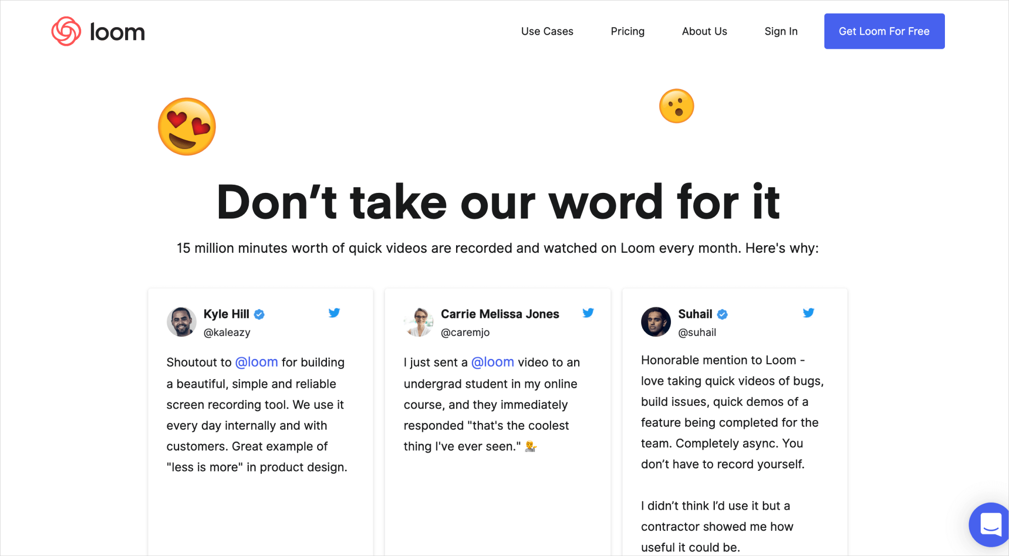
They link testimonials to social networks, giving voice to real customers. When reviews contain a real photo, social media account link, and a short text (20-30 words max), it boosts the conversion by 1-20%.
Users see they can trust you — and they go ahead and buy from you.
When you give your users the power to verify the reviews, it automatically gives you bonus trust points.
2. Vague testimonials don't emphasize the product value and decrease the conversion.
If there's no specific benefit of your business mentioned in reviews, a new customer may not get what you’re selling.
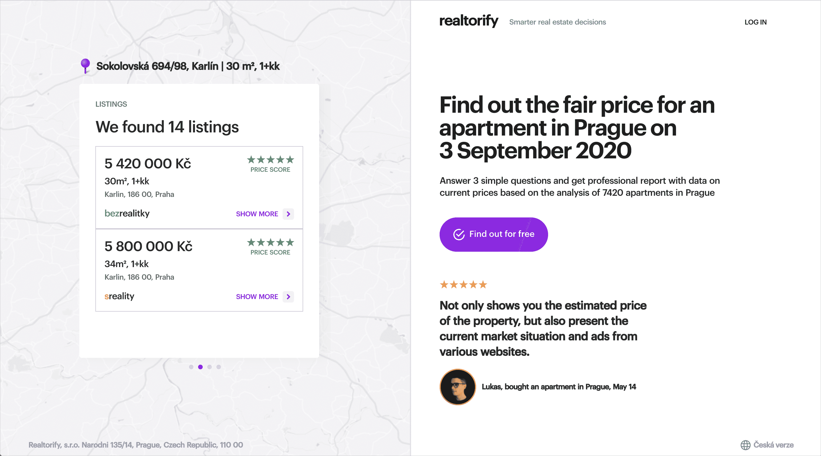
Let's look at this testimonial left on Tracklib, a service for quickly finding and legally clearing original music for sampling with a $4.5M investment.
This quote could represent the product usefulness, e.g., "I've been dreaming of achieving XXX, and Tracklib did YYY for that."
Make it specific, make it stand out, and tell people exactly what marvelous future awaits them if they become your customers.
3. Lack of empty space
Before you get confused, let us explain: landing pages that are overloaded with content are way too overwhelming. Instead of understanding how the business will benefit them, customers get bombarded with tons of information within seconds: cookies agreement, COVID updates, newsletter subscriptions, weekly updates...
At best, it’s annoying. At worst it can turn customers away for good. We see this mistake time and time again for landing pages linked to Facebook advertisements, devouring startups' ad budgets.
When users click on a Facebook banner, they expect to see a neat, easy to understand page that will take seconds to browse through. In this case, stuff like huge headlines can also be a problem, as they draw attention away from the main content of the page.
Let’s look at a few examples. Below on the left is the landing page of automobile insurance start-up Just Auto, which provides data-driven car insurance. Last month they secured $5.7M in a Seed financing round, totaling $7.4M funding.
This landing has all the mistakes we discussed combined — cookies, COVID updates, subscriptions, etc. It’s going to be a real challenge for users to actually understand what the offer is, and we doubt they’ll stick around long enough to figure it out.
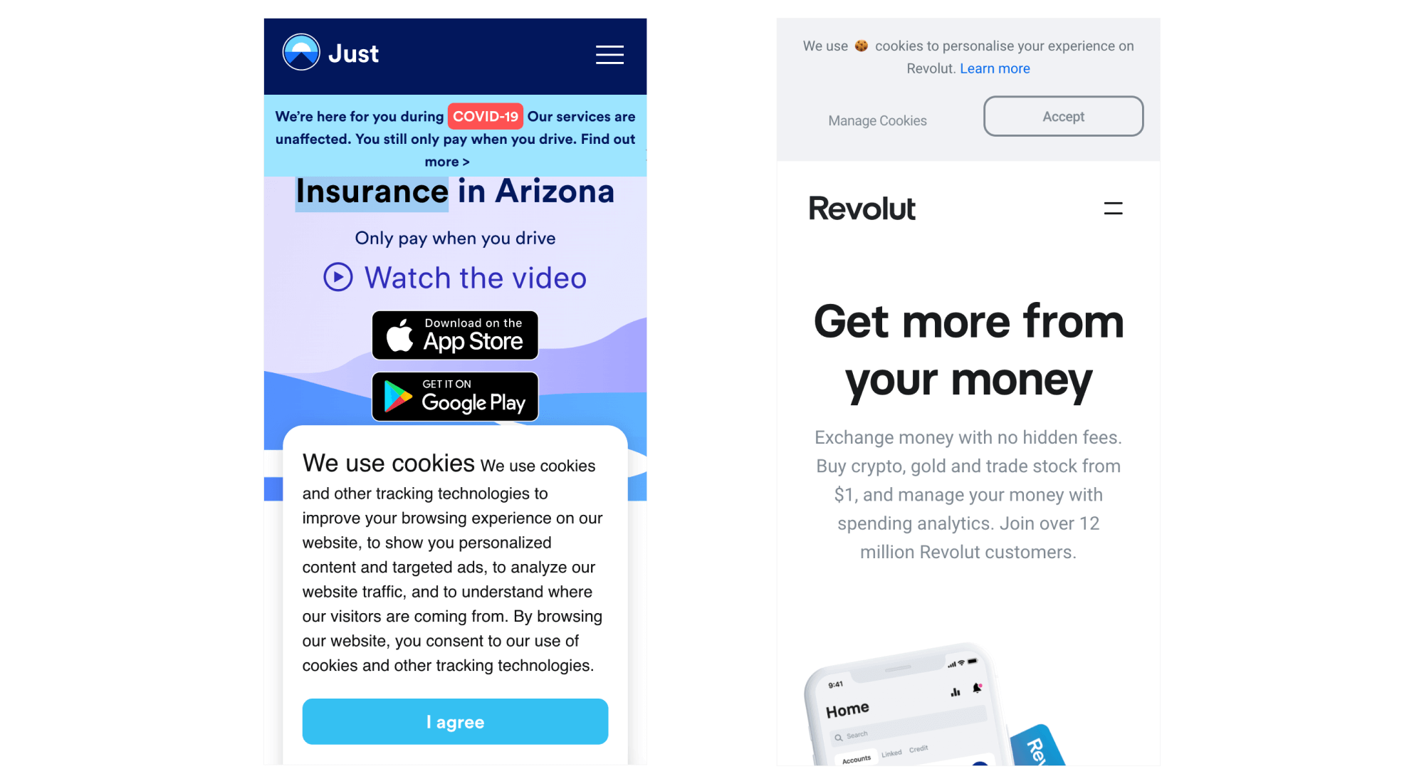
Now check on the right side the landing page of Revolut, a digital bank with 12 million users. It’s so user friendly we couldn’t take our eyes off of the page.
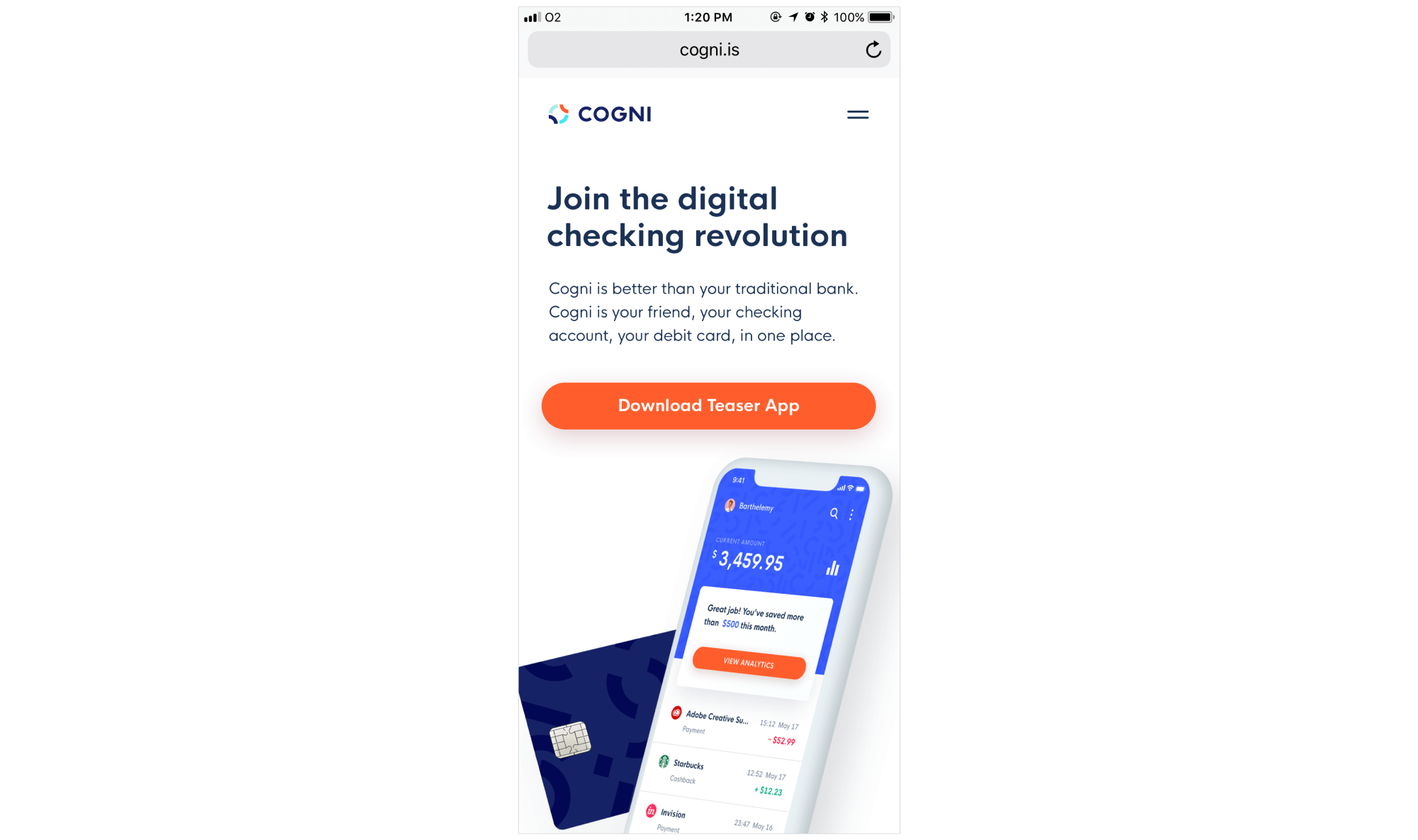
And last but not least: Cogni, the first US mobile bank with a focus on security and cashback with total funding of $8M. We helped the Cogni team not only with mobile app and branding but also with a high converting and neat landing page. Check this out:
Since around 52% percent of traffic is generated from mobile devices, make sure to test how user friendly your landing is before putting it out there.
It shouldn’t be hard for your customers to get through all the pop-ups and headlines before they get to the meat of your offer, so make sure the value proposition is your central message. These B2B website design companies can help you drive quality leads and boost conversions.
Subscribe to hear about legendary business pivots on our CTRL SHIFT podcast.


