

Welcome back to the landing upgrade. In this segment, we break down examples of landing page mistakes and show how they can be improved.
After the first and second editions of the issue, you’ve already got the basics covered. We looked into headlines, buttons, screen space usage, and outdated content. So in this issue, we’re digging into the details of the landing page for Unifimoney — a finance management app for high earning professionals.
1. Wording matters
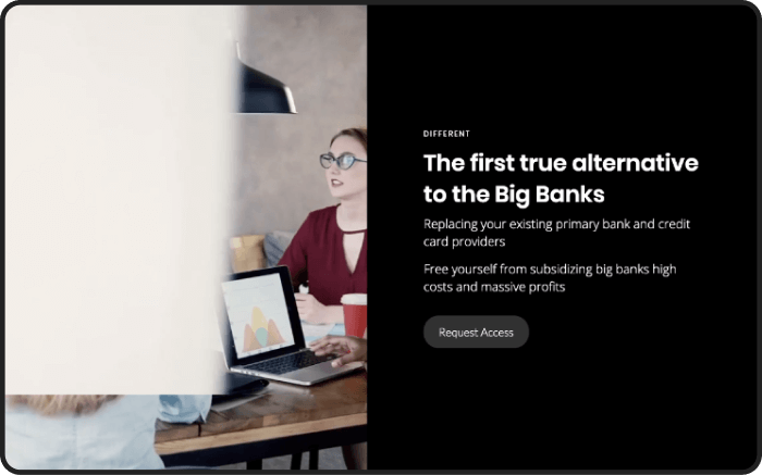
The call to action that users see on the website's homepage is arguably the most important CTA in the whole digital experience. Users only spend a few seconds looking at the landing page call to action, and it pretty much determines their further interaction with the product— so make it a good one.
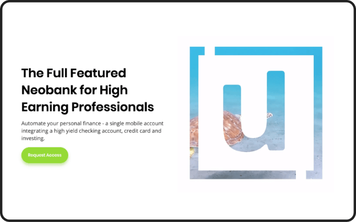
In the case of Unifimoney, the button to request the trial period says “Request access”. To add an element of exclusivity and increase sign-ups, we suggest changing it to “Join the waitlist”. On top of that, adding a line letting potential users know there are at least “2K people on the waiting list” will boost conversions even more.
So why does this work? It’s simple. First, “join the waitlist” offers a more direct, precise action. Second of all, knowing your audience's psychology comes into play. Since Unifimomey is targeting high earners, being a part of an exclusive crowd and getting something everyone wants can do the trick.
Another suggestion could be offering early subscribers perks like complimentary metal cards to incentivize the users.
2. Picture perfect
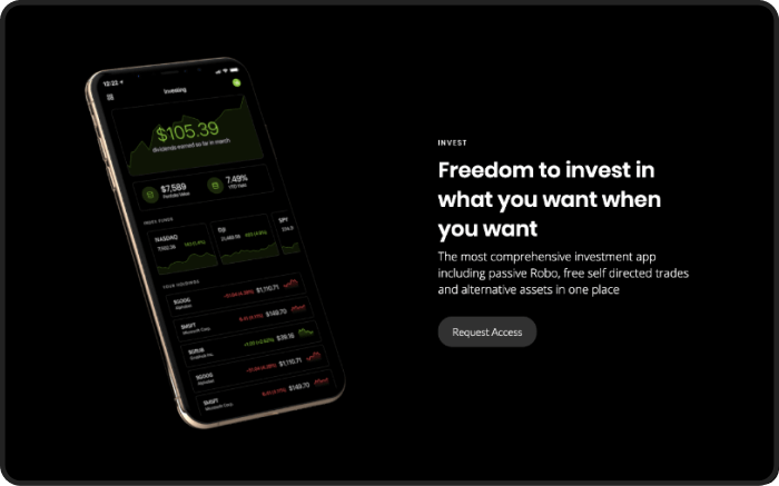
Next up in the game — screenshots. Practice shows that conversion peaks when users can see exactly what they are signing up for.
In this case, the home page should have the app screen's image with its functionality and interface to let the users know what the offer is. This helps create an association better than a plain screen or a colorful background.
3. Diversify
One less obvious truth: Android users need validation too. It’s easy to guess most mockups used online are iPhone-based. This makes some users doubt you support Android, and they will leave the website altogether.
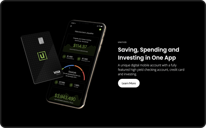
Imagine the size of the audience you could retain by changing one small thing— adding an Android mockup. Inclusivity in business comes in unexpected forms!
4. Who did it better
It’s generally a successful strategy to showcase the product's benefits against the industry’s most well-known competitors. But rather than just saying things, illustrate them. Most users will comprehend better if they can analyse competition at a glance.
A simple block chart illustrating Unifimoney’s advantage on interest rates gives them an immediate visual advantage.
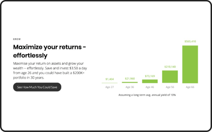
Same works with qualitative aspects. If you’re claiming superiority over competitors, be prepared to back it up with facts and examples. It’s persuasive and leaves no open questions.
5. The specifics
Real-world examples work best. Unifimoney offers a range of investment instruments, so instead of merely mentioning it, it’s a much more robust approach to list the exact ones available.
Something along the lines of “crypto and precious metals with more alternative investments in the pipeline” is attention-grabbing and helps manage user expectations.
All good things must come to an end, with this our third edition of landing upgrade is concluded. Let us know what you think.
Also, subscribe to hear about legendary business pivots on our CTRL SHIFT podcast.


