We’re back with the second edition of our new Landing upgrade series. In our first article, we picked apart websites of successful startups and explained how they could improve their landing pages.
These mistakes are usually easy to fix and might not be obvious, bet we’ll show you how even the smallest changes can boost conversions and change your game.
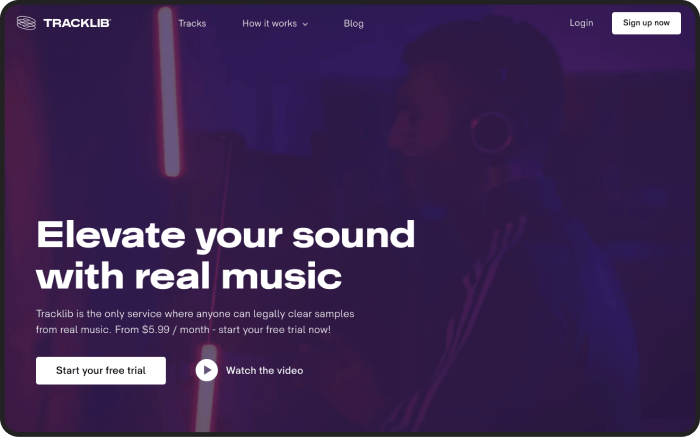
This week we’re digging into Tracklib’s website.
Tracklib is a unique platform where anyone can legally clear samples from real music. Pretty cool, right? Unsurprisingly, they attract a ton of users to their website, making them the perfect use case. So let’s jump right on it and see how Tracklib can do better to retain and convert this traffic.
1. Commitment issues
The landing page is a one-stop shop in this case. There’s a header and subheadline, free trial, video instructions and more. When users opt in for the trial, the page asks for their credit card details.
That’s not uncommon, but research shows that trials that don’t require the use of credit cards in the signup process generate a 20-40% higher conversion rate.
How to fix it
Makes sense that people are more likely to commit when there’s no financial “loss” implicated. In this case, removing the credit card requirement is a reasonable solution.
2. Straight to the point
A video explanation of the service and the sign up is an excellent way to simplify a seemingly complex process. Our data shows that you’re more likely to get views if you tell people how long the video is directly on the landing page.
How to fix
When users know it’s exactly 2.5 minutes long, they will likely find the time. Use the time code in the text to decrease user anxiety.
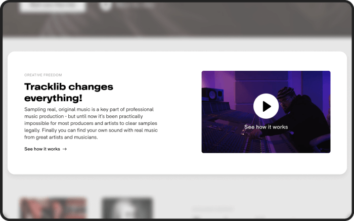
On this page, we can also see the inconsistency of elements. Usually, users subconsciously expect the same functions from the same elements. But the link on the left and the button “See how it works” do different things here. Such a mismatch can confuse the customers and get in the way of smooth user transition.
How to fix
One way to go about it would be to include more specific descriptions, like “watch the video to discover more about the feature”.
3. Something old and something new
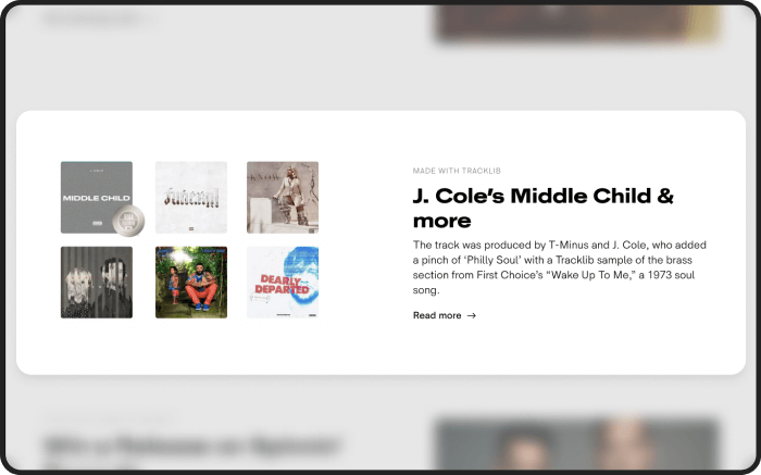
Want to know what’s one of the biggest hidden pain points for website users? It’s outdated content. When a blog or a website segment hasn’t been updated for an extended period, it stands out.
On this page, the current article was added in 2019. For users and search engines it will look as if the company doesn't invest time and effort into updating the website.
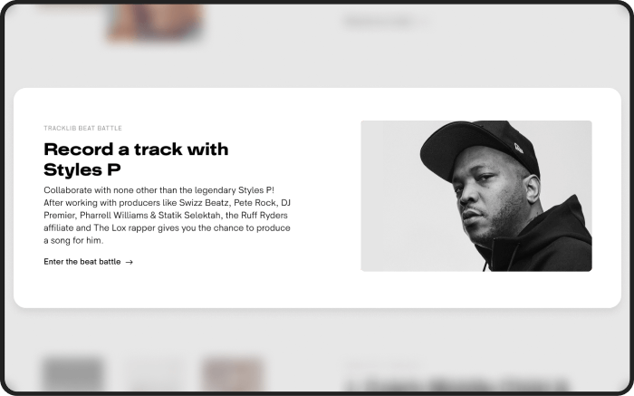
The same issue over here. Music professionals that are the target audience know the beat battle was discontinued. Seeing an outdated piece like this immediately puts people off and that’s going to have a direct impact on conversion rates.
How to fix it
Update the block with the newest articles from your blog — it can make the website appear more trustworthy, and it's also a good addition for Google search optimization. People want the newest stuff, same is true for landing page content.
4. Don’t be shy
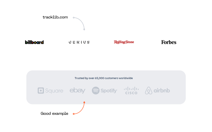
One of the pages on Tracklib presents this layout of bare media icons. Problem is, not all users are going to understand what they stand for, especially not when briefly scrolling through. Are these clients? Partners? How is it supposed to be selling the service? So many questions.
How to fix it
Make it obvious. Media mentions are a proud achievement and they should be showcased.
Check out the example we put together below to see how it can be improved with just one line.
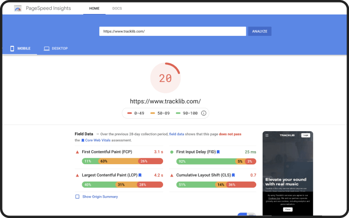
5. Time is money
Last but definitely not least — page speed. We ran some simple loading tests and it looks like tracklib is really taking...its...time. Low page speed for both desktop and mobile versions negatively affects the marketing KPIs, because Facebook and Google limit campaigns that lead to low-performing landing pages.
How to fix it
If you run ad campaigns, consider improving the page speed. Here’s what you could try: minimize HTTP requests, reduce server response time, bring down image sizes slightly and limit redirects on your website.
As you just saw, Tracklib could seriously benefit from a number of simple yet powerful improvements. The changes we described are experience-based, proven and guaranteed to increase conversions and boost website performance.
Now what about your landing page? Like you just saw, we can break down the mistakes that get in the way or your conversion rates. Interested? Then shoot us an email, and we'll get back to you in 48 hours.
Also, subscribe to hear about legendary business pivots on our CTRL SHIFT podcast.