We know startups. From Techstars to Seedcamp, IBM’s accelerator program, Village Capital, Startupyard, and Startup Wise Guys — we’ve led both workshops and individual mentoring sessions for a total of over 50 startups.
The teams range anywhere from seed stage, with $20-50k investments, to Series A funded companies with $100k+ raised.
And for the absolute majority of the startups we mentored, one problem surfaced routinely across all sectors: a substantial time to market. It simply takes too long for an idea to reach the end consumer as a feature.
The answer: Fast track your testing process to 2 weeks (or less)
Since one of the most common mistakes in the dev lifecycle is overspending both time and resources on the first version of a product, we set about designing a process. After testing different approaches for over a year, we forged a strategy for testing and implementing hypotheses to speed up delivery.
To boil down our process into one simple rule — if you can’t test a hypothesis in 15 days (including implementation), you’re probably doing something wrong.
Everyone has heard of the MVP, but some startups use this methodology completely wrong. In many cases when a startup told us about an MVP for a certain feature it included many things that were redundant to the first version.
A case study on finding the real MVP
Imagine a real estate startup that wants to release a new feature that allows people to analyse real estate prices in California and get a better understanding of whether a house is worth buying.
An MVP for this product could look like this:
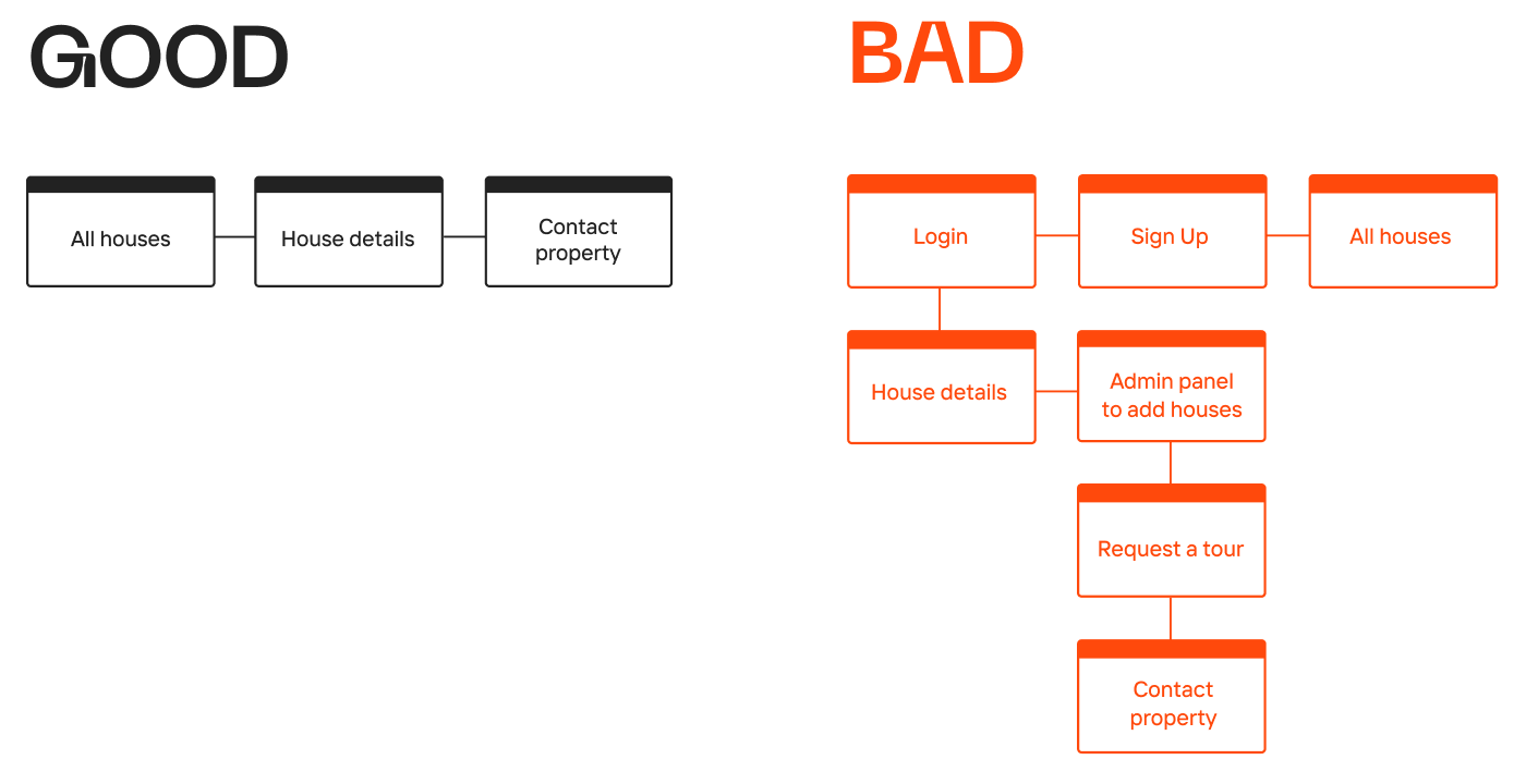
7 pages: login, sign up, all houses, house details, admin panel to add houses, page to request a tour and contact property.
But what’s the assumption we want to test with our MVP? Obviously, we’re testing demand for the analysis, deciding if users need such a feature at all.
Therefore, a proper MVP would include a listing of houses, details of the house, and a CTA on these pages that opens an email client.

The easiest way to approach a case like this is to simply create a listing page and allow users to browse without registration. Adding the first 200 listings manually will take way less hours and resources, allowing us to cut the time to market down at least twofold.
Identify MVP must-haves and avoid overloading it with extra features:
- First, determine the value proposition you’re trying to test. For example — “we have an app for renters. We’re testing whether users would pay on time more often if we offer them a cashback for paying before the due date - thereby reducing late payments.”
- Second — identify the risks in your assumption. Typical startup risks can include:
- Users not recognising the product value. For example, you’ve added a crypto trading option to your product, while the majority of your users are already committed to services like Coinbase or Revolut.
- Hard to acquire users — imagine you created an app that allows you to find a medical professional in Europe. Turns out, most major European cities have one of their own, they know their local markets very well, and you are now in direct competition.
- Hard to execute — let’s say your app offers help with moving. But as soon as you reach 100 requests, the city is suddenly out of van drivers with no possibility to recruit more in time.
- Hard to make money — yes, your product is being used, but your P&L statement is still in the red.
To learn more about potential risks,check this article from Gagan Biyani, co-founder and CEO of Maven.
- Now we’ve reached the most important part. Seriously. Pick the one risk you’re most likely to face. Going back to our renters app example, the most probable issue would be if users actually did start paying on time with a 1% cash back feature.
With the ‘one problem’ defined, you can develop a product increment that addresses the highly likely risk with just a tiny piece of digital infrastructure.
In our example, it doesn’t make sense to update the app at all! Instead, we can send emails to 100 renters saying that we’ll send them $20 back if they pay their rent by the end of the month. And such a test would provide the insight that 80+ renters would pay much earlier with an incentive.
After confirming the hypothesis, you could add an extra screen or two offering the cashback option. The test itself could be as simple and hassle-free as setting up an email system.

critical web design mistakes to avoid
Testing isn’t limited to features
Yes, testing is awesome. And it’s efficient. And get this — you can apply the method to any updates. Even a complete product rebrand!
Look at it this way:
Testing a rebrand is a very similar process to feature testing. This time, we’re assessing the user feedback-related risk of a negative perception of the updated brand.
You could test drive new branding with minimal updates such as the logo, landing page, and app store images. It’s probably better to hold off on billboards, deck templates, merch, and your LinkedIn page design — all of which are neither easy to produce nor crucial.
That being said, pay attention to colors, tone of voice, icons, illustrations, and landings — things 99% of your users will see all the time. All of these elements are easy to create and will be a touchpoint during every client experience. It’s safe to say, they play a decisive part in your update.
In the words of Donald Norman, “A brilliant solution to the wrong problem can be worse than no solution at all: solve the correct problem.”
So, what’s your problem?
Subscribe to hear about legendary business pivots on our CTRL SHIFT podcast.


