Which CTAs work best?

Alexandra Serova
Brand and Marketing Director
1 / 2
Which CTAs work best?
“Subscribe” is a button. “Start cooking better” is a story
When you write a CTA like “Subscribe to Newsletter,” you’re promising a process.
But what if instead you promise the payoff?
- “Start cooking better meals”
- “Get new bonuses daily”
- “Unlock higher conversions”
That’s what people actually want. In UX copywriting, the magic happens when you wrap a clear button function in emotional context.
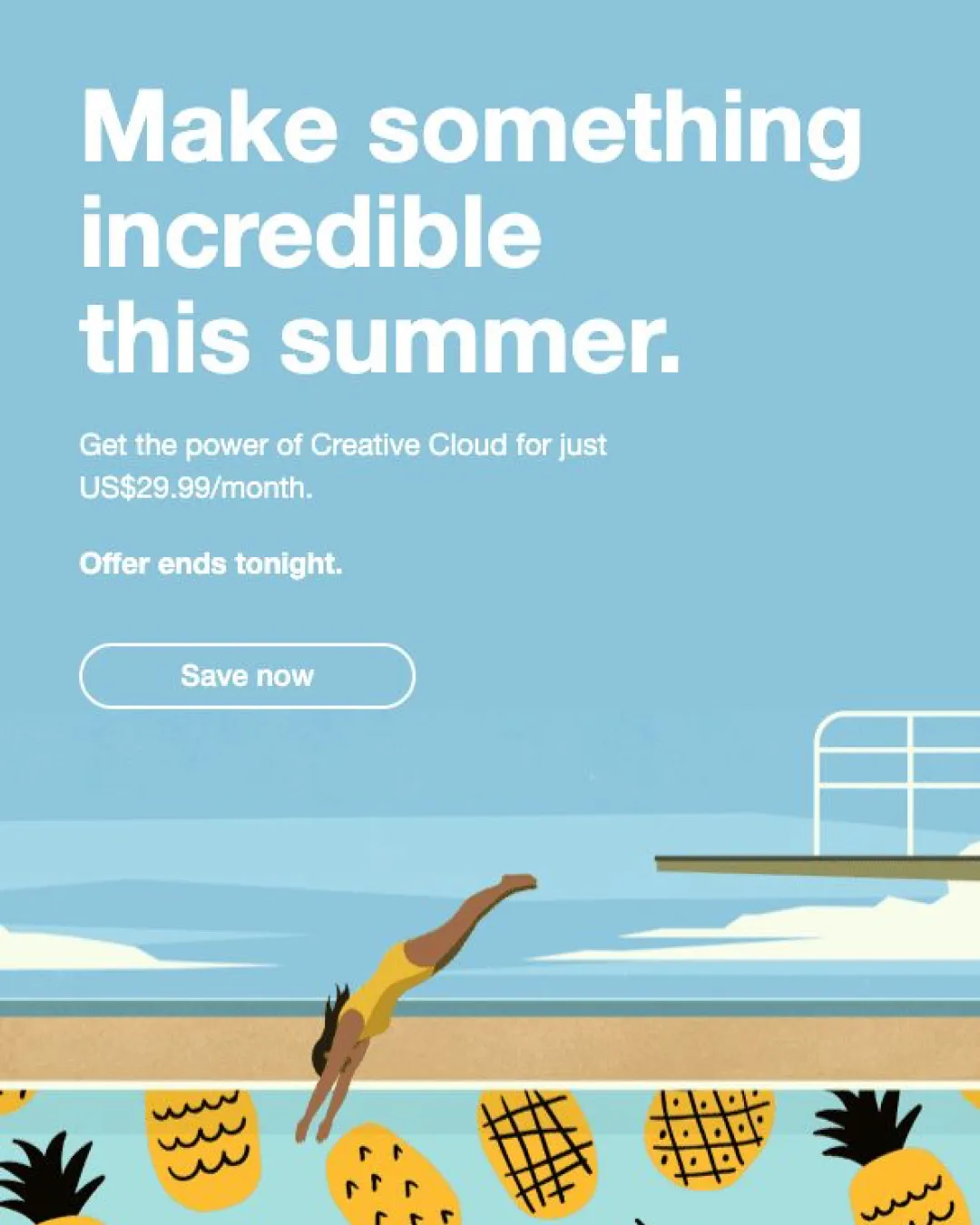
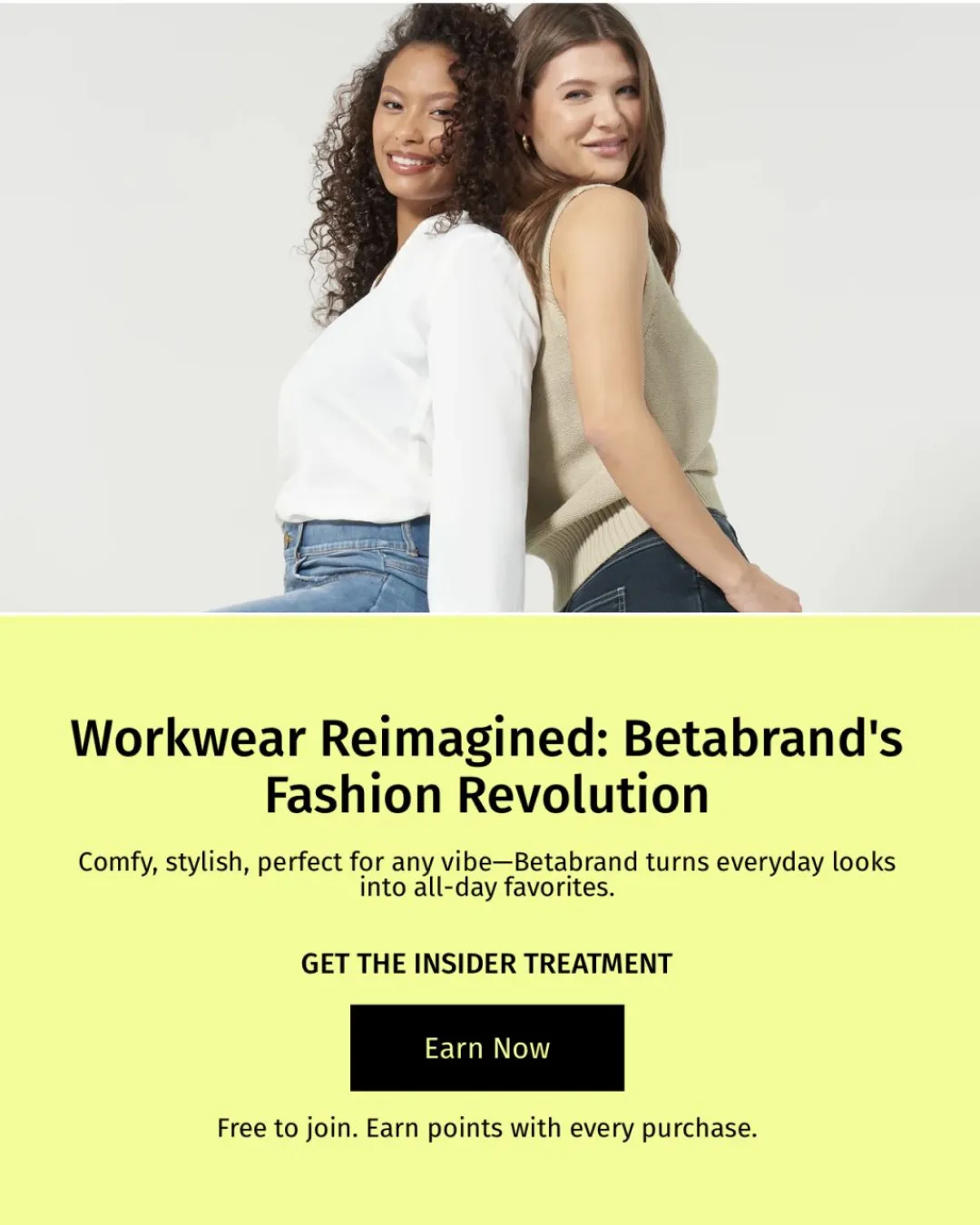
Great examples in the pictures:
1. Adobe Creative Cloud — Make something incredible this summer.
2. Betabrand — Get the insider treatment.
If your CTA is doing all the “what,” you’re missing a chance — add the “why.”