Cryptonix: Crypto payments with the calm of private banking
A new category
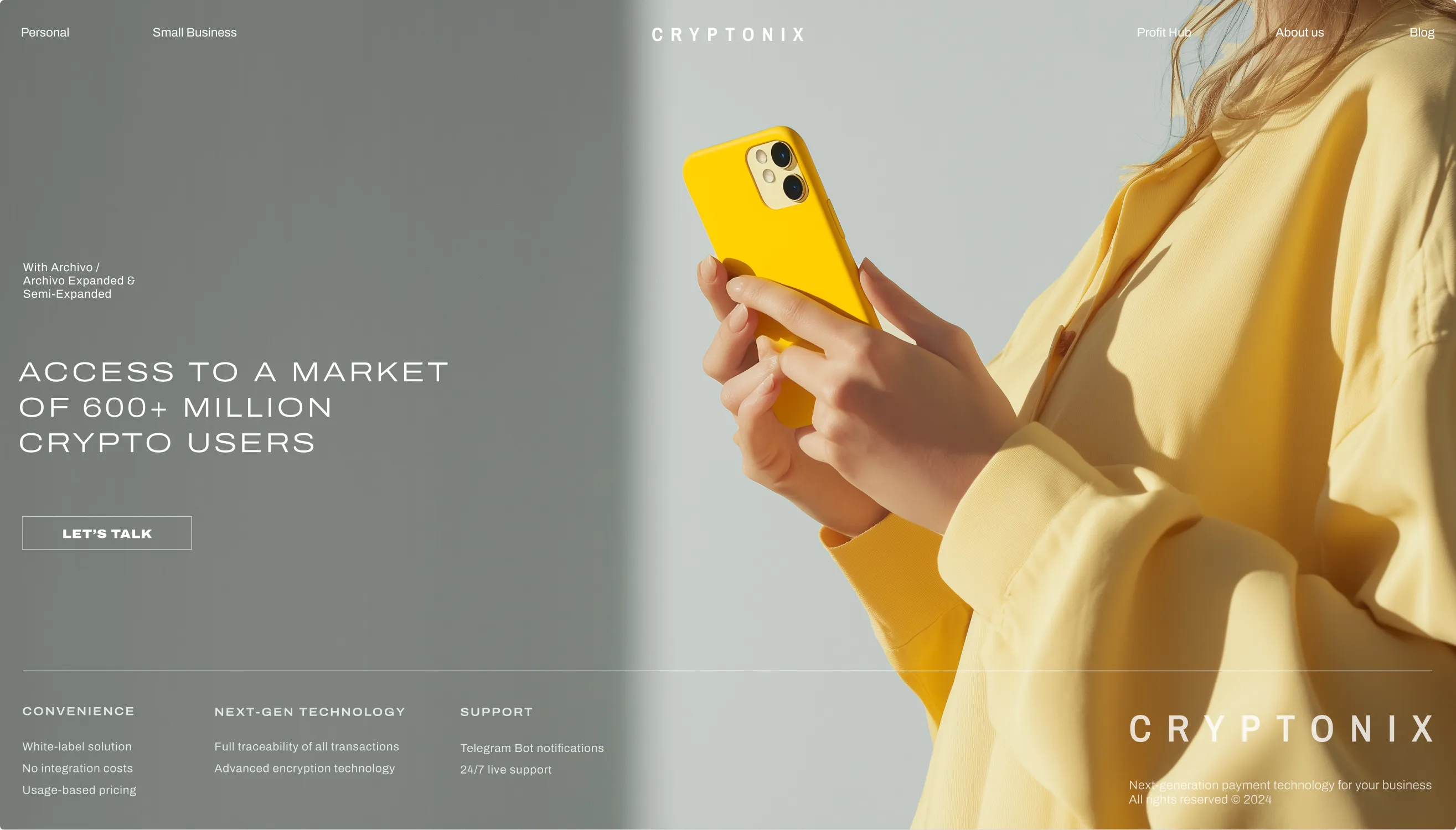
Finance is no longer divided between traditional banking and crypto. We designed Cryptonix to feel native to both worlds: stable enough to earn trust, and agile enough to move with digital markets.
The strongest financial institutions rarely compete for attention.
Cryptonix borrows from that mindset, combining the restraint of private banking with the energy of a technology company.

We shaped the identity with typography, photography, color, and rhythm rather than one signature element. Every decision supports the same principle: less noise, more clarity.
First impression
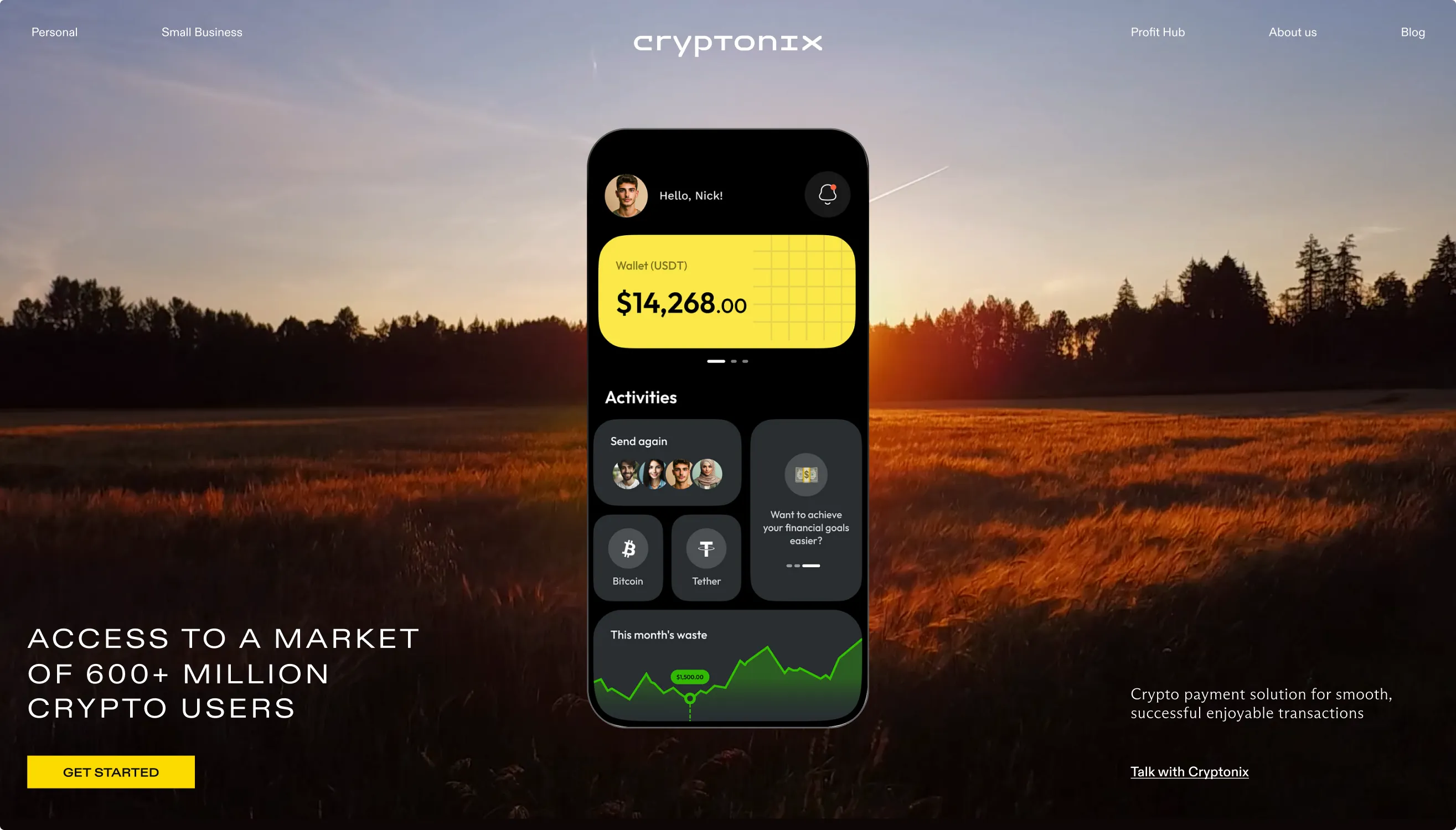
The website introduces the product without explaining everything at once.
Information unfolds progressively, helping users understand the offer before moving into detail.
One ecosystem
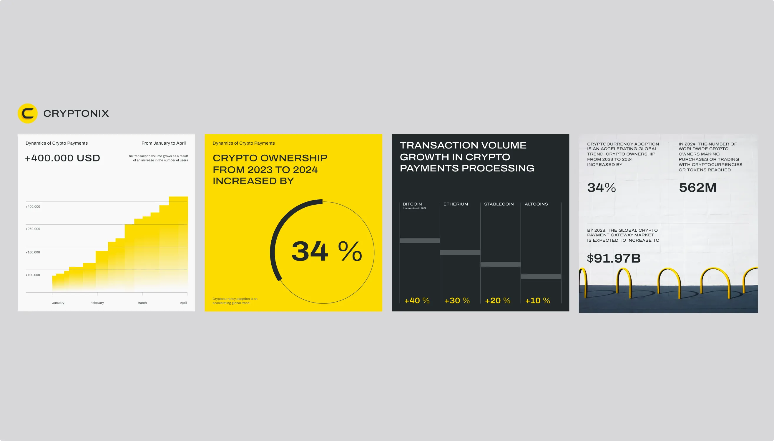
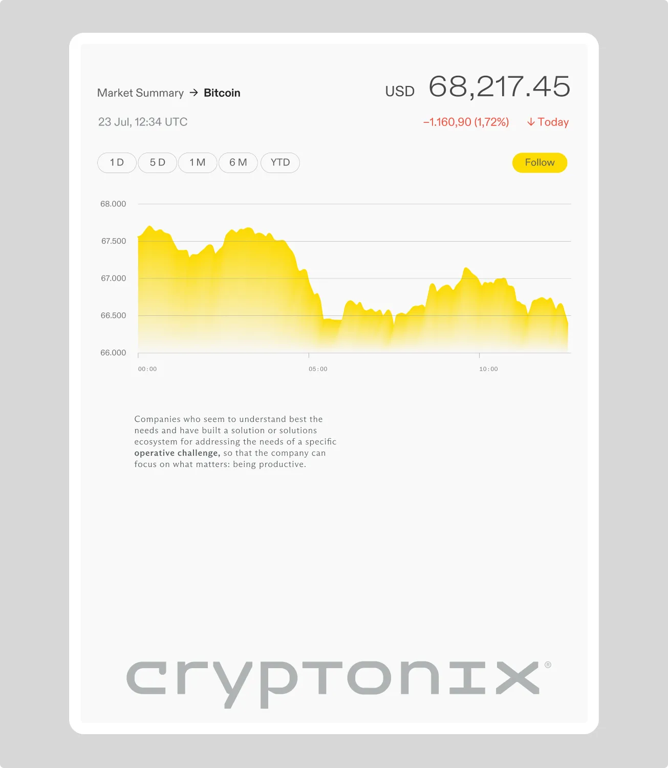
Charts, metrics, and dashboards became part of the brand language. Functional information carries the same visual character as the wider communication system.
The system extends across product interfaces, campaigns, presentations, social media, and recruitment. Each touchpoint feels distinct, while remaining unmistakably Cryptonix.





Impact
Trust first, then speed
Crypto brands usually shout. We positioned Cryptonix the way the strongest financial institutions present themselves — quiet, precise, confident — and built it as a system rather than a set of assets, so it grows across products and formats without losing recognition.
- 01
Charts and dashboards designed as part of the brand language
- 02
A website that unfolds the offer step by step
- 03
One system across product, campaigns, and recruitment