Tally: Making cashless tipping simple for the people who rely on it
Simplifying tipping for everyone
Tally makes tipping as simple as possible—no confusing features, no complicated tech. Just a clean, easy-to-use tool for people who don’t have time to get lost in apps.
Our job was to give that simplicity a brand people trust with their money.

Tips, no tricks
We developed the brand concept around two main ideas: financial stability and filling the void.
Take a closer look at the logo, and you will notice the silhouette of a slot for coins in a piggy bank, symbolizing an increase in finances and savings.
Inspired by Aristotle’s quote, “Nature abhors a vacuum,” Tally fills an unmet need in the tipping space.


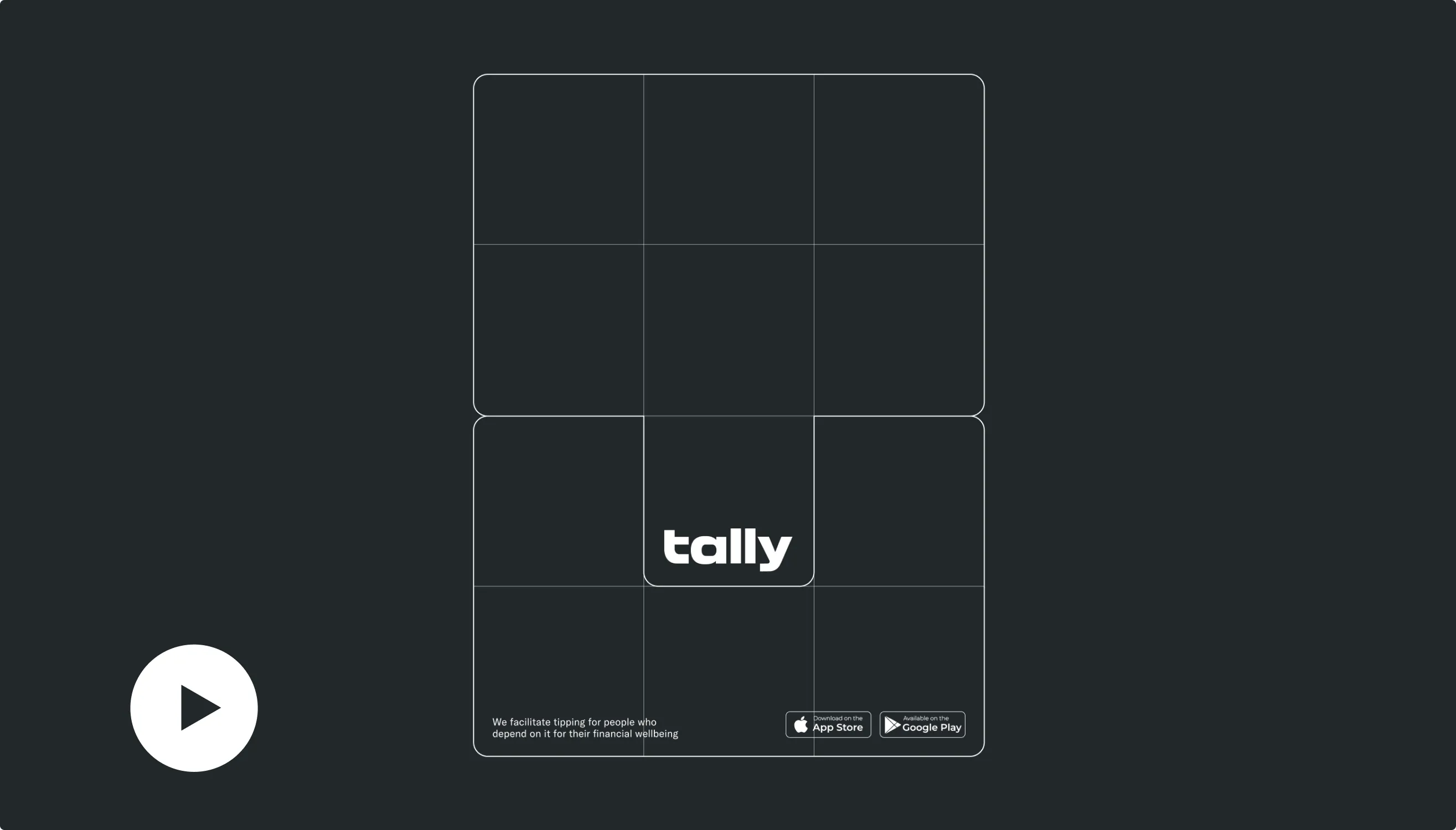
At the core of the brand identity is a symbol featuring the letter ‘T’ It seamlessly adapts to any format—ads, picture frames, or as a visual accent on landing pages—creating strong brand recognition.
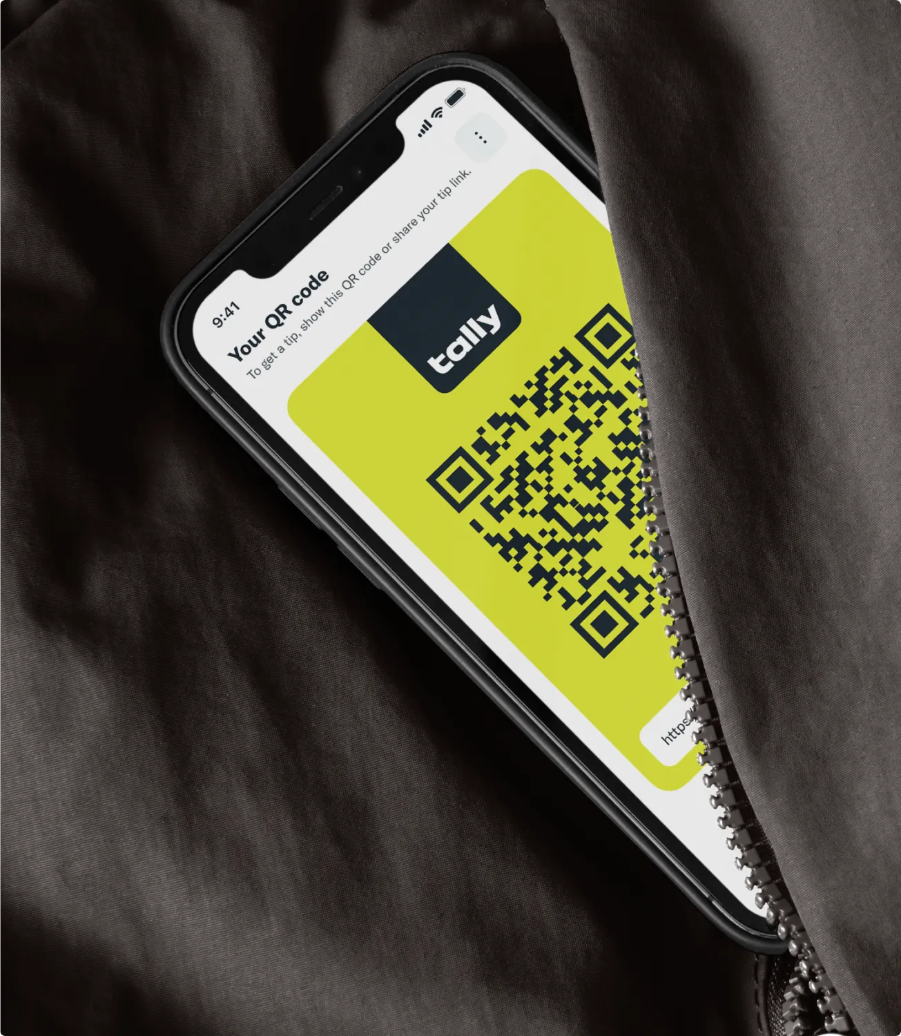
The logo is bold, simple, and instantly recognizable. Paired with a bright color palette and bold typography, it’s designed to be clear, easy to read, and get the message across fast.
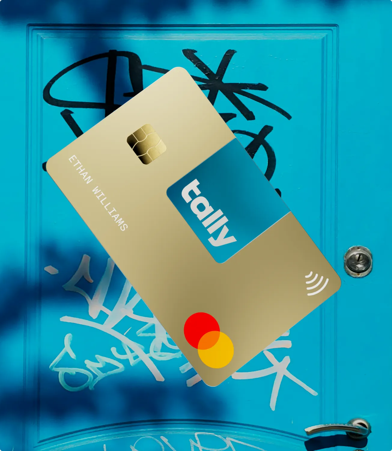


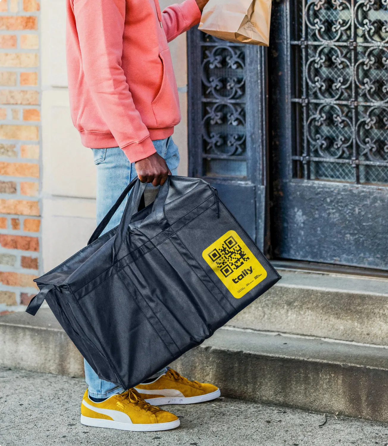
Your tip is much appreciated. Tally embodies both the Everyman and Caregiver archetypes by being simple, accessible, and supportive. It makes tipping easy for everyone, especially those less tech-savvy, while also supporting service providers by ensuring they receive tips smoothly and without hassle.




Everyone’s welcome
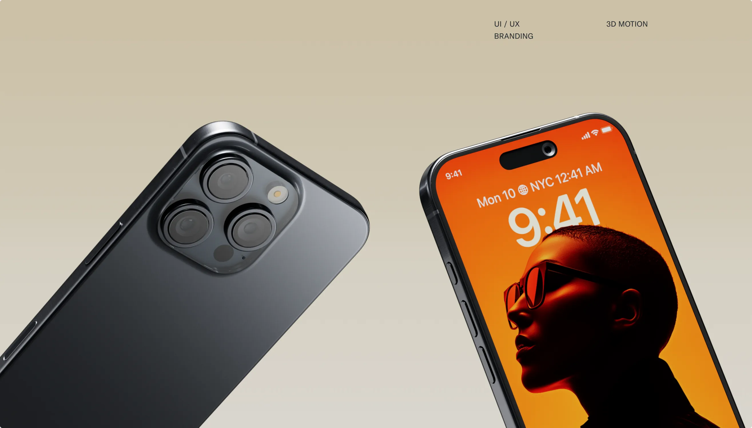
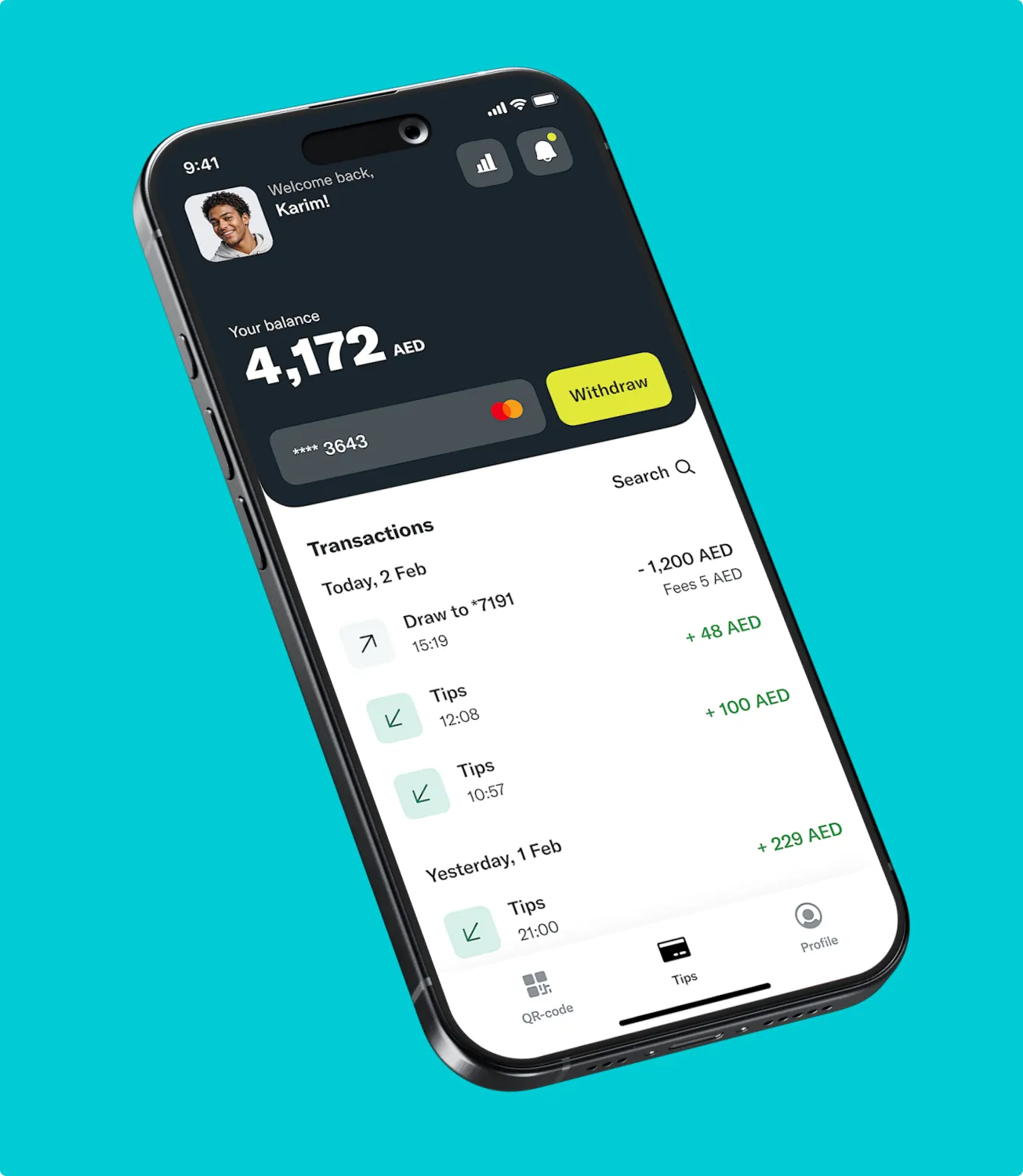
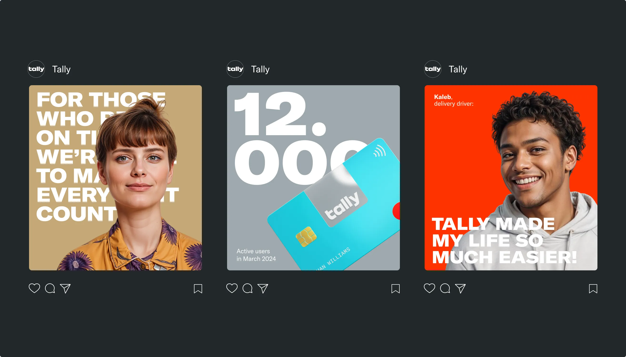
To make Tally more approachable and relatable, we’ve incorporated real, diverse faces that reflect the people we serve, across all walks of life.

Impact
Built on trust and simplicity
Tipping moved to cards and phones, and the people who rely on tips paid for it in confusion and delay. We positioned Tally as the simple, supportive option — the Everyman and the Caregiver in one brand — and designed a product concept anyone can use in seconds.
- 01
A logo that hides a coin slot: savings and growth in one mark
- 02
Real, diverse faces of the people the product serves
- 03
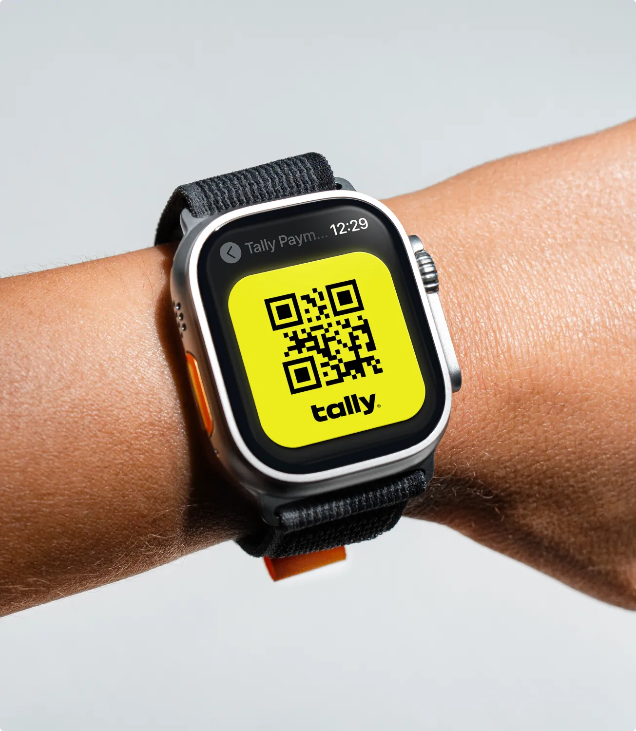
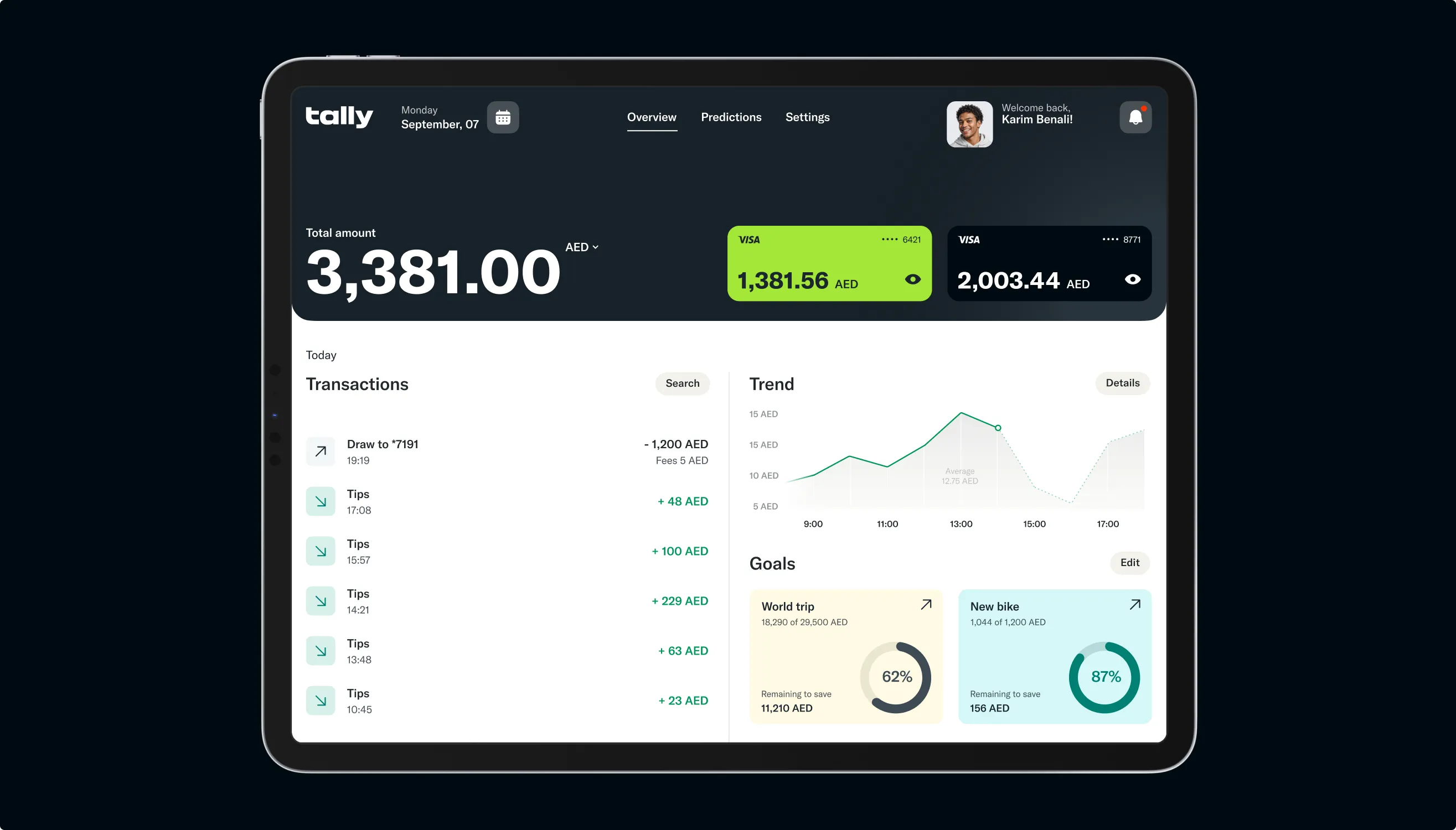
A UX/UI concept for phone, watch, and tablet