Tinder: Branding for Lexi, The League’s AI columnist, plus 130+ banners across Tinder’s family of apps.

Part 1. A columnist, not a chatbot
The League needed a voice its members would actually read. Not a notification or an assistant, but an AI columnist with opinions about love, ambition, and the rules worth breaking. We named her Lexi, gave her a biography, and built the brand she signs her name to.
She’s 36 and splits her time between New York, Paris, and Lisbon. She wears Totême and vintage YSL and drinks her Negroni with mezcal. Her writing is curious and a little flirtatious.
She asks better questions instead of handing out answers. Everything on this page is hers: the signature, the face, the letters, and the invitations.


Her name is her logo
We started by following the rules. There was a grid, a strict monogram, and an X that doubled as lips puckered for a kiss. It was elegant and had character, but it read as a brand mark more than a person.
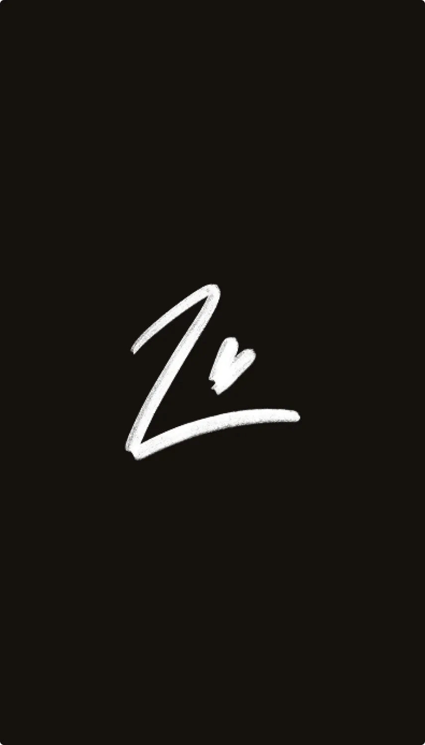
So we broke the rules, the same way Lexi does. A signature is the most personal mark a brand can own. It says that a person wrote this and stands behind it. Lexi’s logo became her name in her own hand, with a heart where the dot should be.
The signature can change without losing her. It can be neater or looser, more calligraphic or more rushed, like a note left on a linen napkin after a perfect night. It closes every post the way “xoxo” closes a letter.


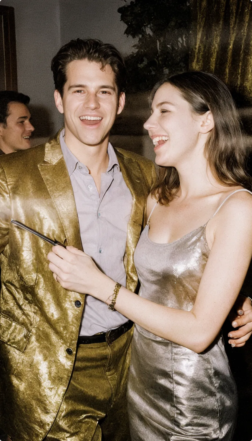
If we breathe humanity into the logo and the lines, then why not bring Lexi herself to life — especially now that technology allows it?
A vector avatar or flat portrait is not our level. Lexi should be realistic — either styled as posh, or as a modern columnist.
We explored her appearance the way you’d cast an actress. We tried posh versions and modern ones, some sharper and some softer, until the face matched the voice: warm but not sweet, confident but still approachable.
The rule was one Lexi wrote herself: “If I look untouchable, why would anyone start a conversation?” So she’s shown in real scenes, like evenings in speakeasies, parties, and the editorial desk, not in studio perfection.

Lexi’s writing looks like a stylish publication that someone has marked up by hand. Newspaper serifs set the headline, a typewriter face carries the details, and handwritten notes appear in the margins.
One system covers everything Lexi publishes: LinkedIn columns, event invitations, and short provocations like “The Promotion That Costs Too Much.” Every format reads like a page torn from the same magazine.
The handwriting ties it together. The letters don’t just sit on the page. They move, underline, and cross things out. It’s how The League’s voice gets its sense of humanity, even when the columnist is AI.




Part 2.
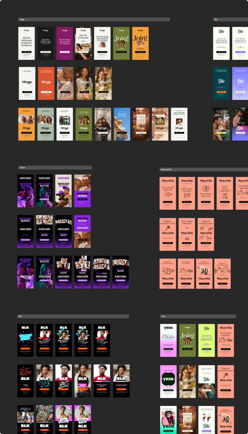
130+ banners
Tinder is where most people start, but it is not where everyone belongs. Someone raising a child alone, someone who wants to date inside their own community, someone ready for something slower — each has a sister app built for exactly that.
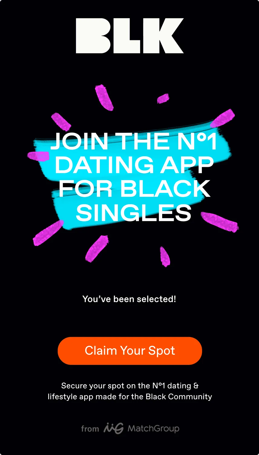
We designed the full-screen banners that make the handoff, across seven apps: Yuzu, Stir, Hinge, Upward, BLK, Archer, and Plenty of Fish.
Each one had to read as a door, not an ad. Tinder’s own rhythm on the outside, the destination app’s world inside, one line and one thing to do.


One project pointed people to the app that fits them. The other gave one of those apps a voice worth staying for.