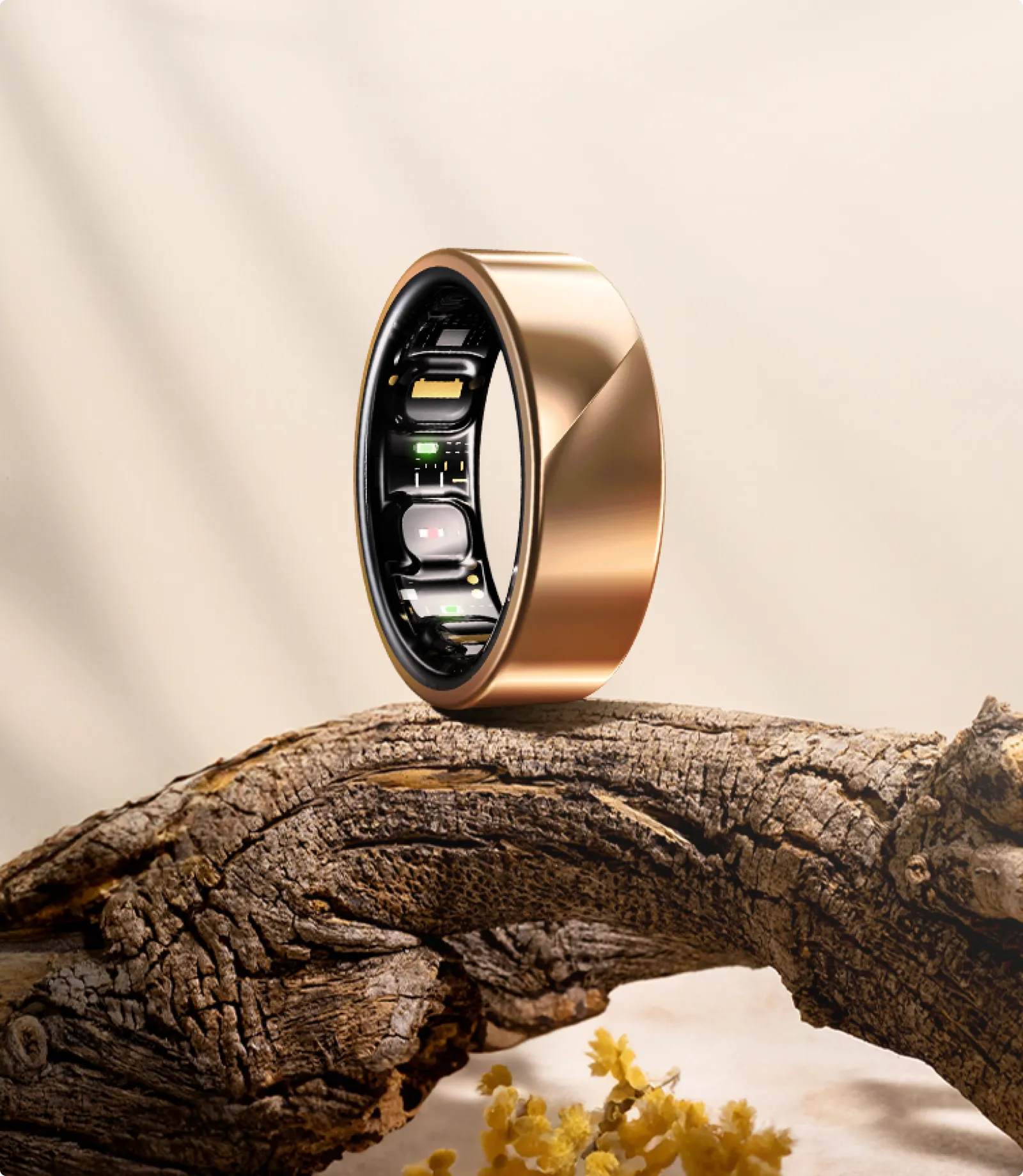
Luna Ring: We built an app that explains the body instead of just measuring it
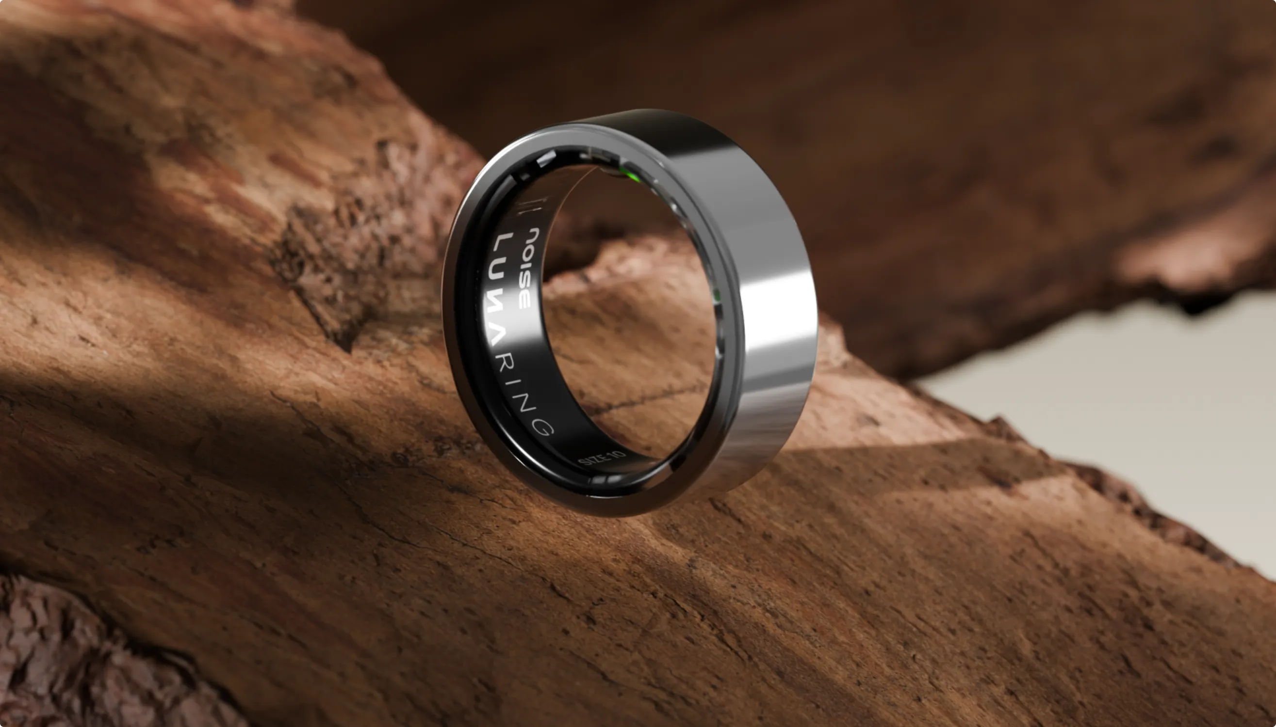
From a wall of numbers to one simple question
Luna Ring tracks sleep, heart rate, HRV, blood oxygen, skin temperature and activity, all from a ring people wear day and night.
The hardware collected rich, accurate data, but the app showed it as a wall of numbers and charts. Users could see their metrics but couldn’t tell what they meant or what to do next. Luna came to us to redesign the mobile app around one simple question: how am I today?

Key takeaways
- 01
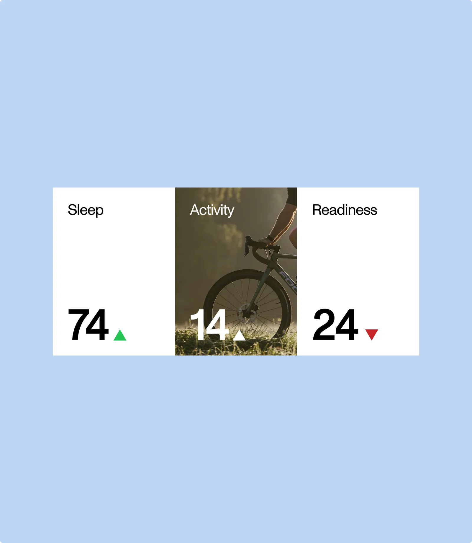
We built the experience around three daily scores: Sleep, Activity, and Readiness.
- 02
A short daily check-in pairs what the ring measures with how people actually feel.
- 03
Every score now comes with context, a reason, and a next step in plain language.
The design in numbers
- 6
signals the ring tracks day and night: sleep, heart rate, HRV, blood oxygen, skin temperature, and activity
- 3
daily scores at the heart of the app: Sleep, Activity, and Readiness
- 1
simple question the whole app is built around: how am I today?
- 7 a.m.
the moment we designed for: bold numbers you can read at a glance, even half-awake
Understanding the gap
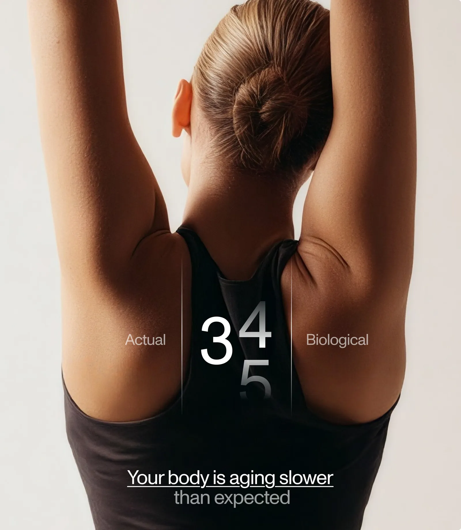
When we first reviewed the app, there was a clear gap between what the ring could measure and what users actually understood.
The data behind the scenes was precise, continuous and genuinely valuable.
However, the interface felt technical and overwhelming. It looked like a medical dashboard, not something people want to open every morning.
Making the data meaningful
Rather than adding more features, we focused on making the existing data meaningful.
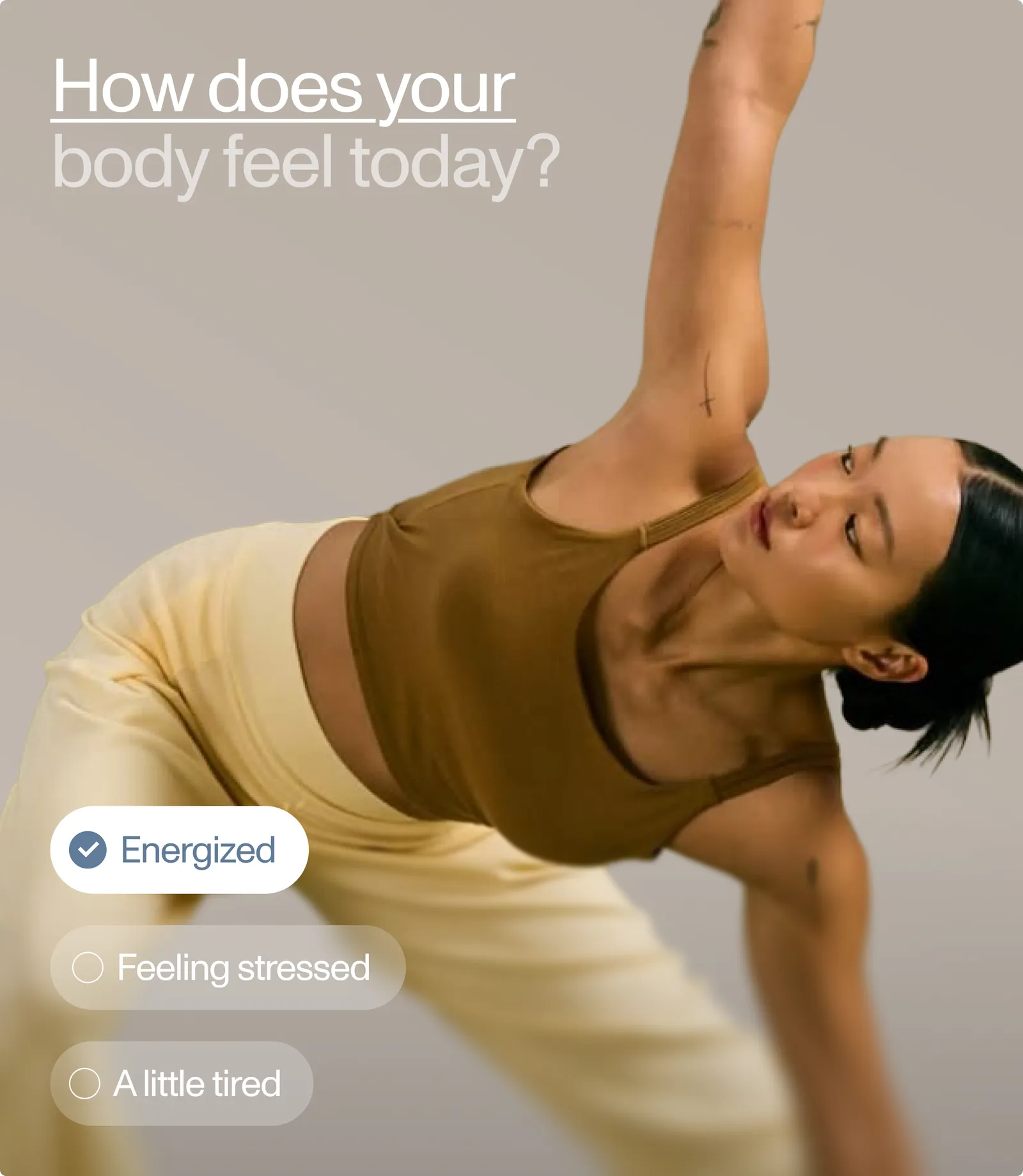
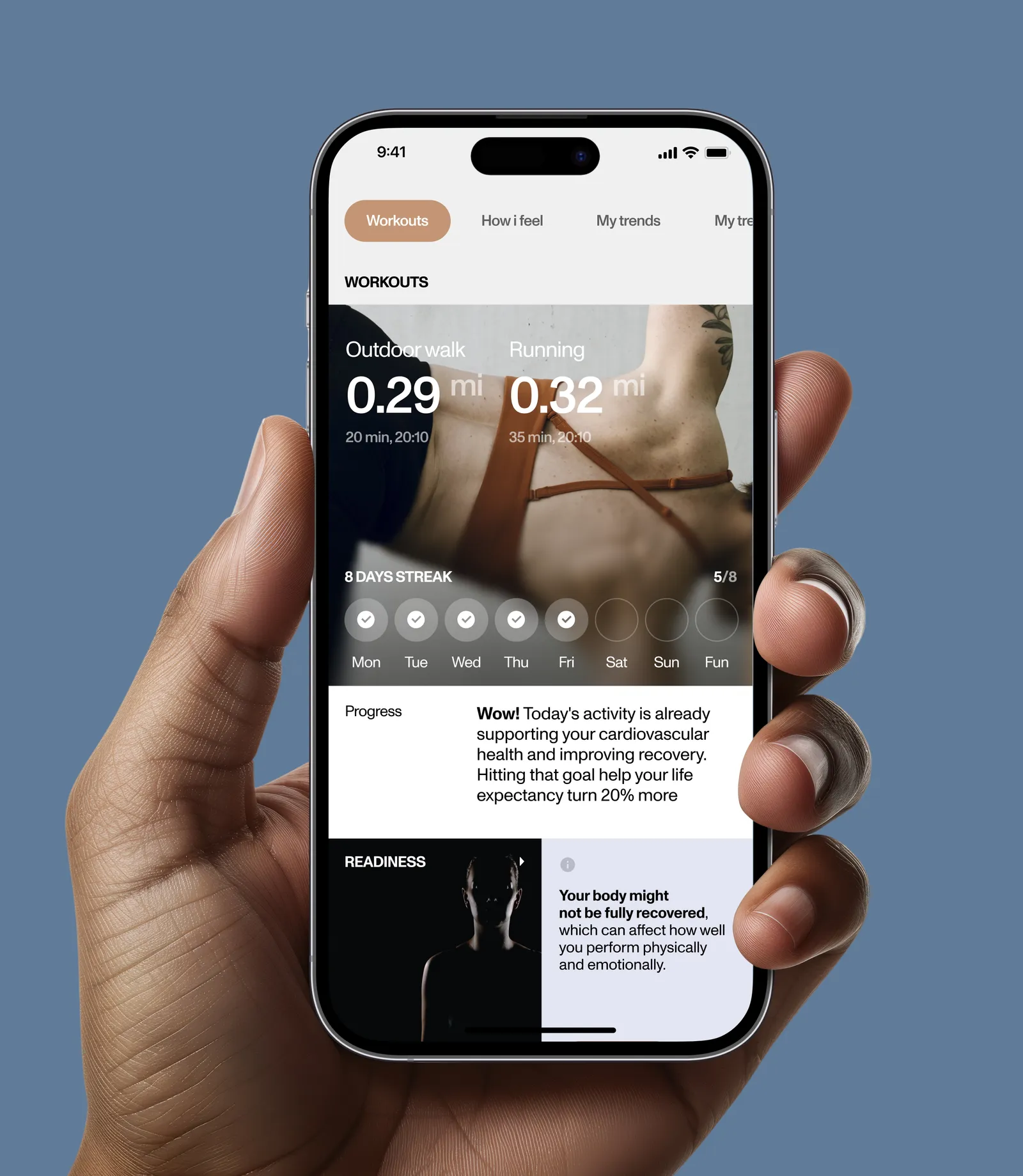
We built the experience around three daily scores (Sleep, Activity and Readiness) and a short check-in that asks how your body feels, so the app combines what the ring measures with how the person actually feels.
The outcome is a calm, personal companion: it explains why a score is low, notices when something is off, and suggests one simple action for the day.


Precision and warmth
The product was built around a balance between precision and warmth. It needed to feel scientific enough to trust, yet personal enough to use every day.
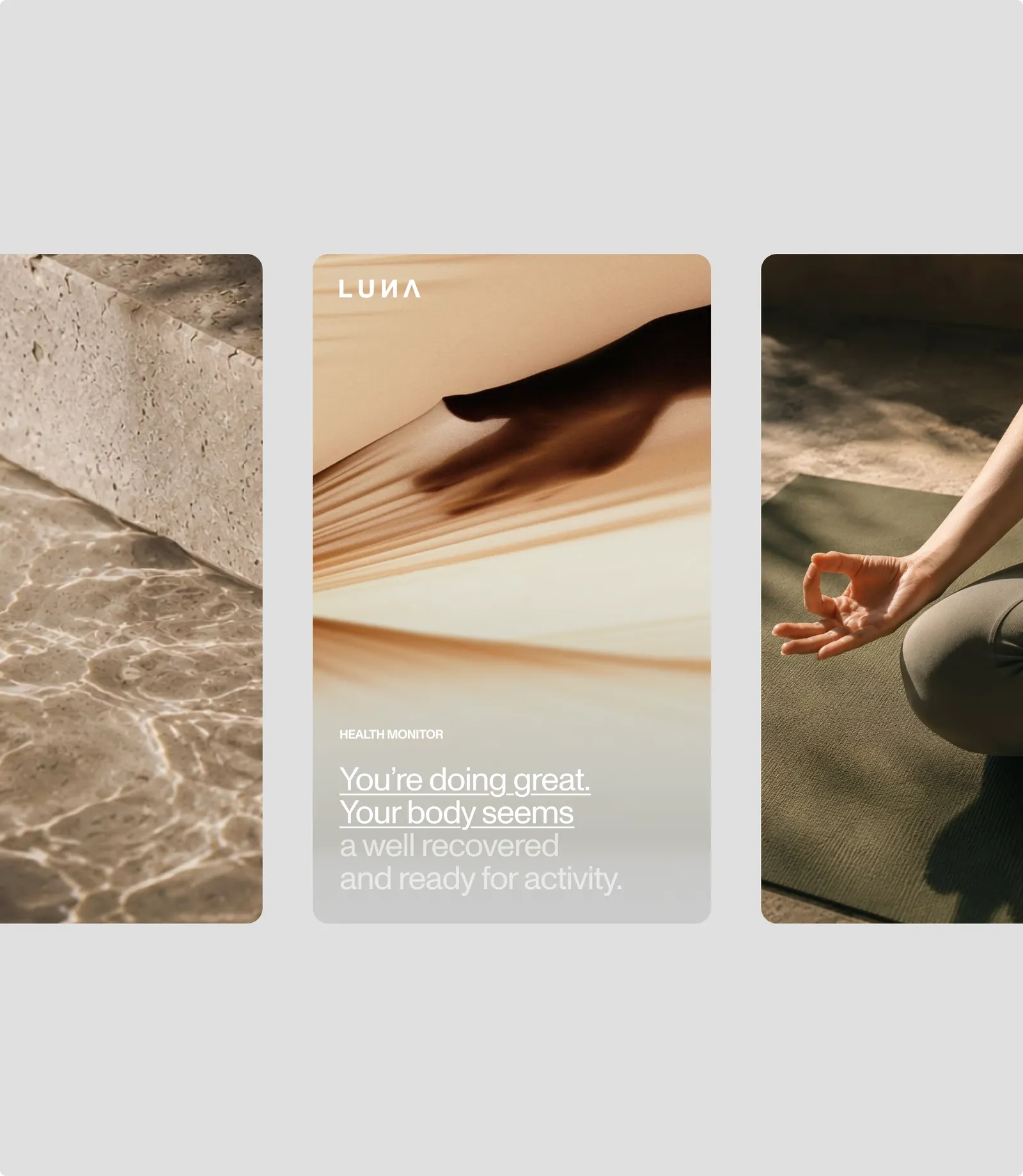
The visual system reflects this through clean cards, a clear hierarchy of scores and bold numbers that can be read at a glance, even half-awake at 7 a.m.
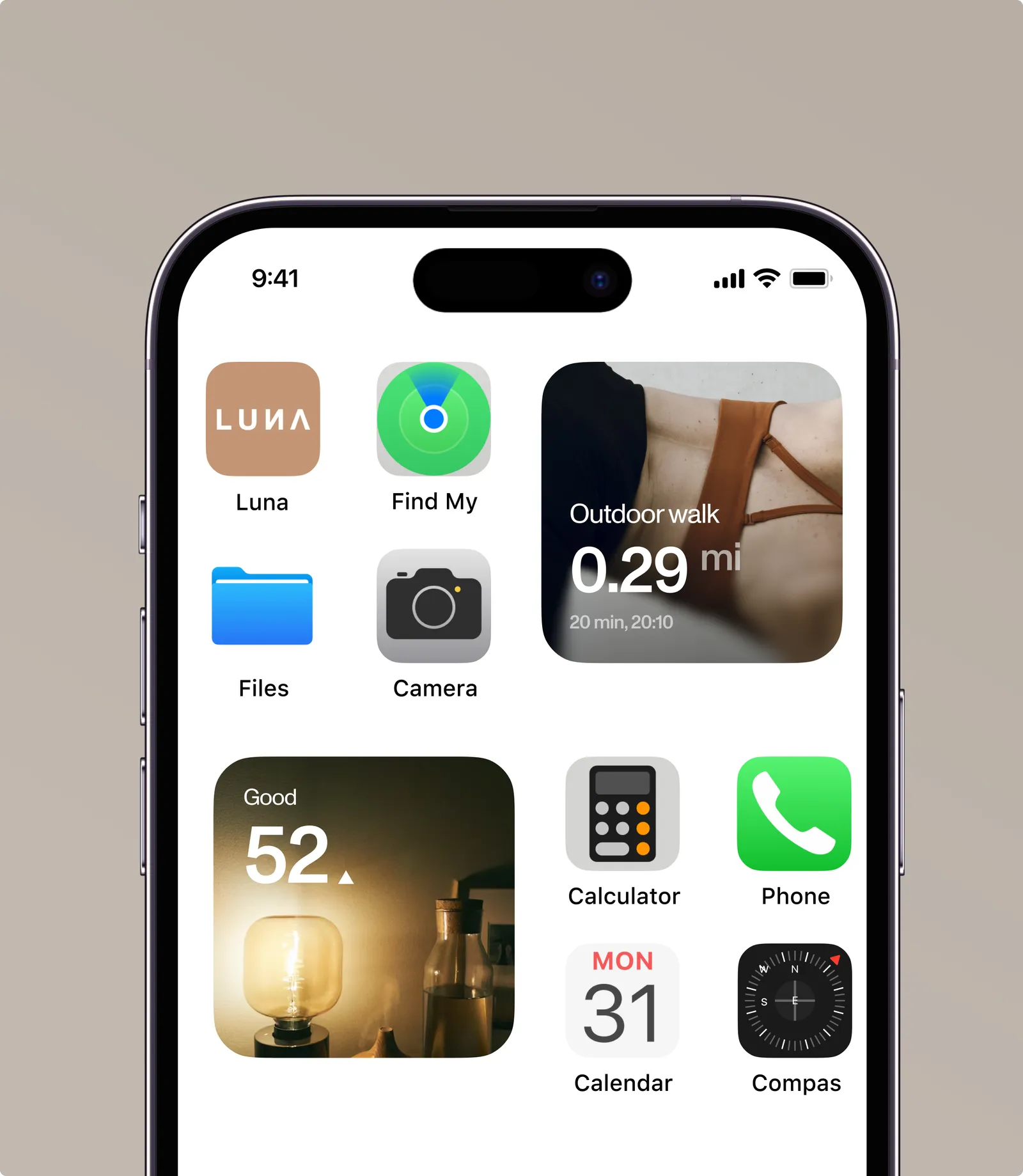
At the same time, lifestyle photography and soft, natural tones bring the ring’s physical presence into the interface.
A scalable component library for scores, charts, trends and alerts lets the team add new metrics, such as cycle tracking, stress and biological age, without breaking the system.
Supportive, clear, and human
The voice follows the same principle: supportive, clear and human.
“Low because of late bedtime”
It avoids clinical jargon.
Insights stay short and actionable, so people feel informed without being alarmed.

Across the whole day
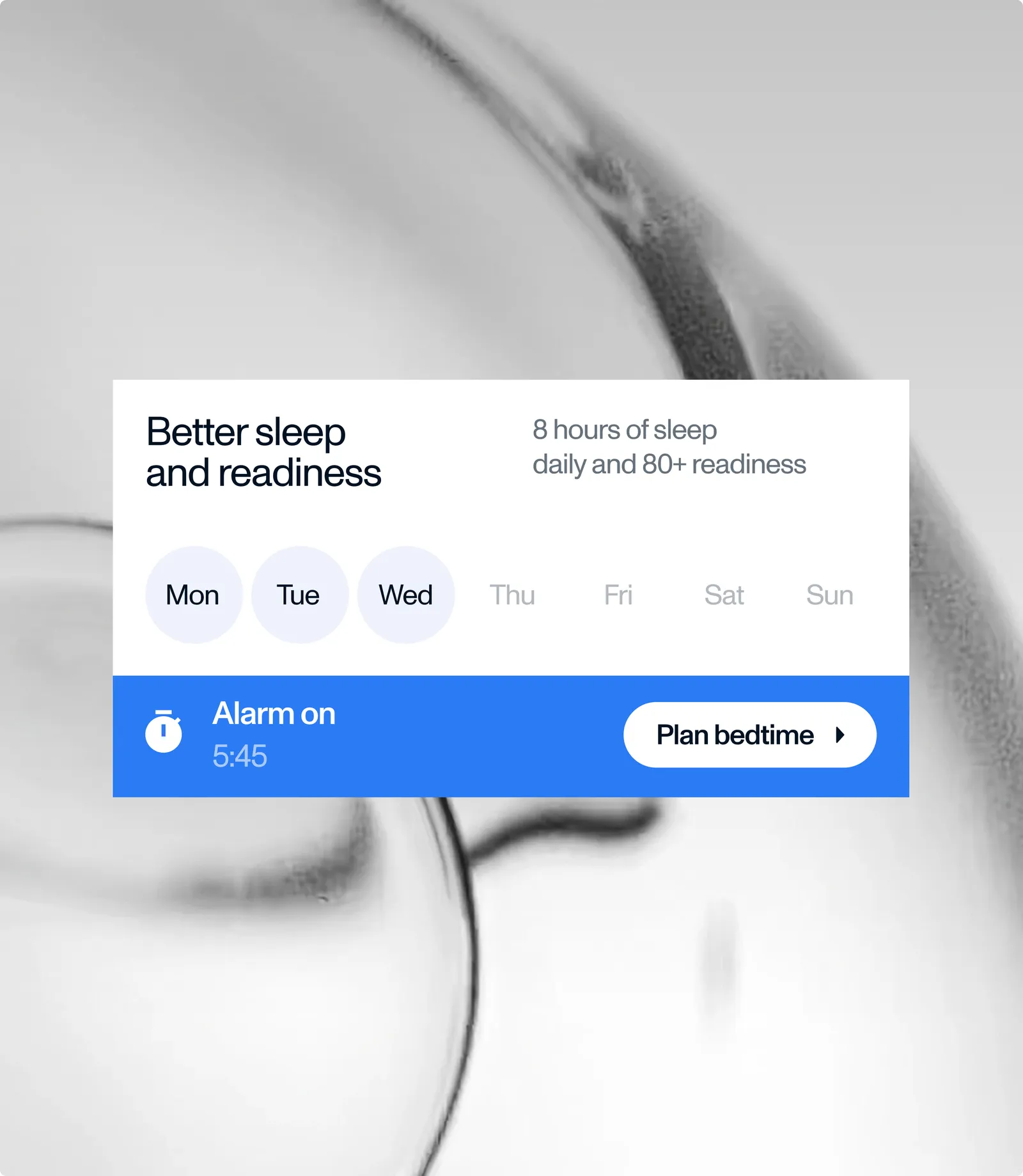
The experience comes to life across the whole day.
- Morning
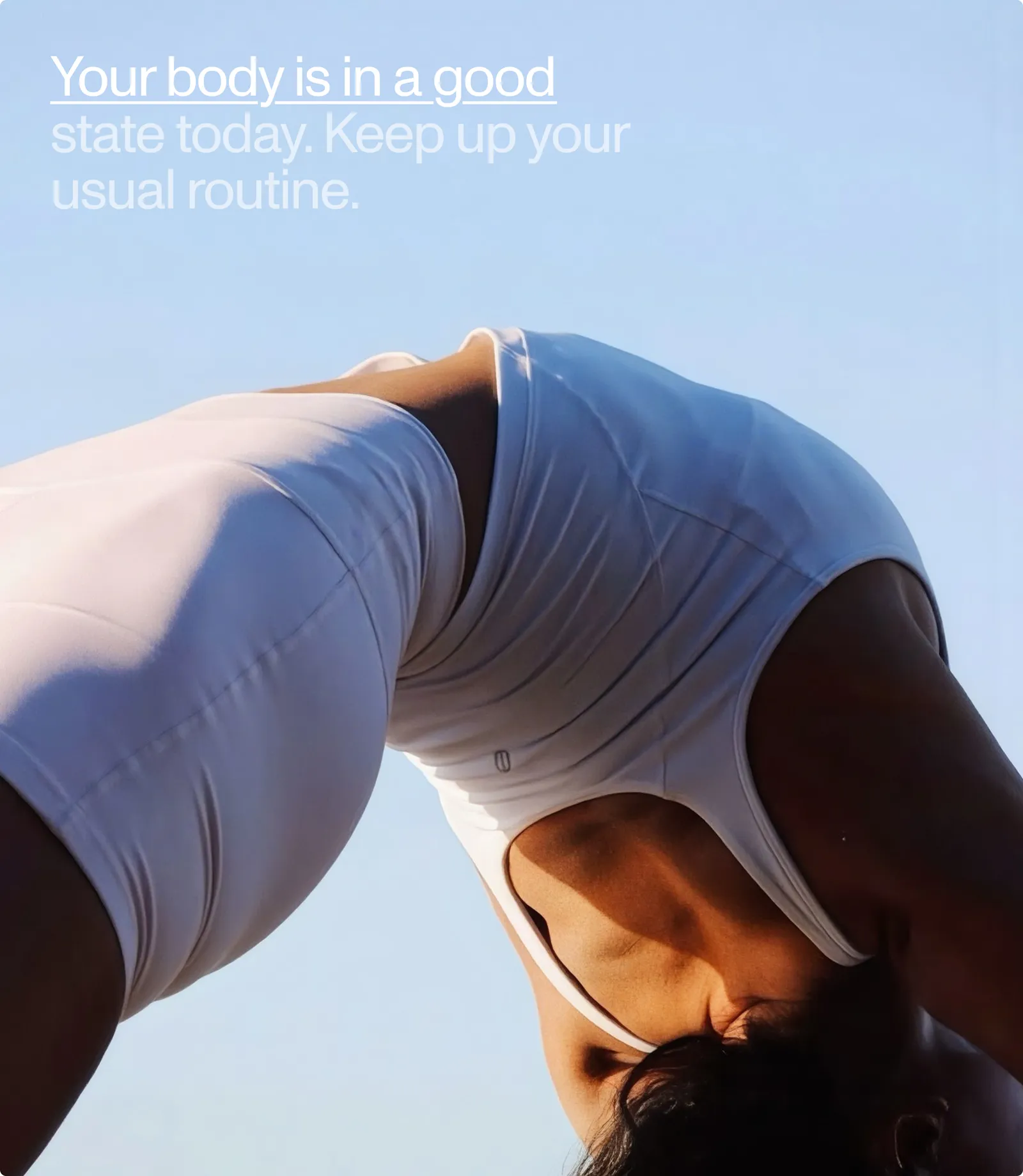
The app shows how well you recovered and whether you’re ready to push or take it easy.
- Day
It tracks activity, stress and workouts in the background.
- Evening
It helps you plan bedtime and wind down.
Each screen answers one question first and keeps the details one tap away, so users get the answer in seconds and dig deeper only when they want to.
Over time, trends and streaks turn single readings into patterns, helping people see how their habits shape the way they feel.

What we did
- 01
UX review
- 02
Experience design
- 03
UI design
- 04
Product voice
- 05
Design system
Related work
 HomeMedixA brand that finally matches the service HomeMedix already delivers.
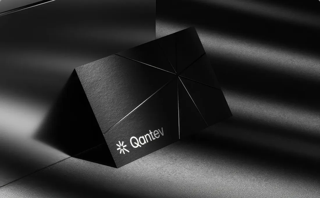 QantevAn in-house brand concept for Qantev, an AI-powered platform applying AI and mathematics to health insurance operations.
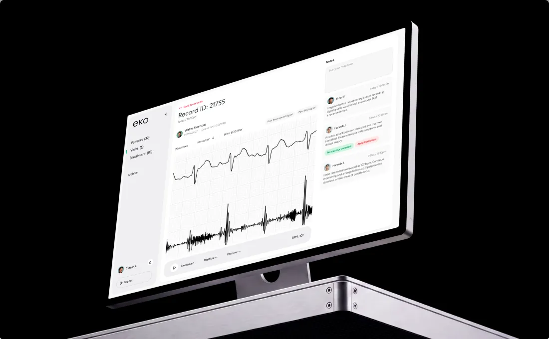 Eko HealthBrand for a startup that brings together advanced stethoscopes and smart assessment software.