A banking app is judged in the first 4 minutes
Install, verify identity, fund the account, make one payment. That stretch decides every fintech app, and it happens on a phone, often on cellular. Our mobile app design for fintech starts there.
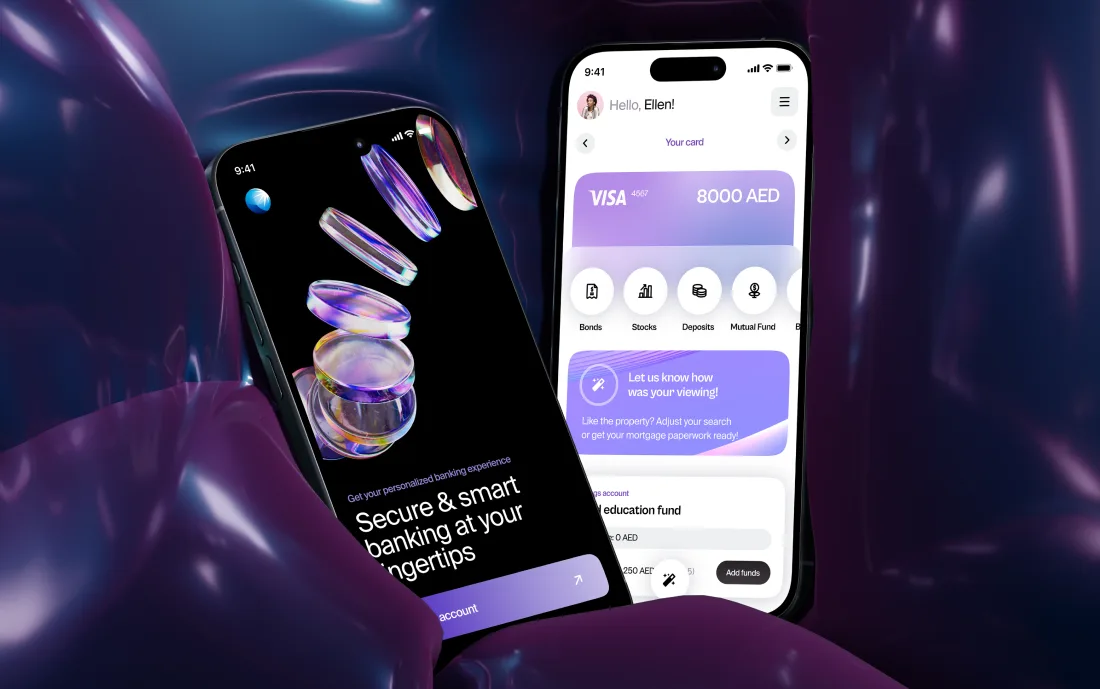
Why fintech teams bring us in for mobile
A banking app is not browsed. It is checked, usually in under a minute.
So the home screen is a status board, and everything else earns its place behind it.
What we design in a fintech app
Drawn from banking, business banking, and wallet products we have shipped.
- 01First run and KYCDocument capture, liveness, retries, and a rejection path that keeps the user in the funnel.
- 02Biometrics and securityFace and fingerprint, PIN fallback, step-up authentication, session and device management.
- 03Home and balancesWhat the screen must answer in one glance, and what belongs one tap deeper.
- 04Payments on a phoneRecipient selection, confirmation, fees, receipts, and repeat-payment shortcuts.
- 05Card managementFreeze, limits, virtual cards, Apple and Google Wallet handoff, physical card activation.
- 06NotificationsWhich events earn a push, what the copy says, and how the app opens after each one.
- 07Offline and degraded statesWhat the app shows with no signal, stale data, or a provider outage.
- 08Store presenceApp Store and Play screenshots, listing copy, and the review prompt timing.
Designed around real phone behavior
Three conditions a banking app has to survive.
The first 4 minutes are the product
Signup, identity checks, and funding happen before anyone has seen the app do anything useful. We design that stretch as one flow, with the waits explained and the fields cut to what the check actually needs.
The phone fails in its own ways
Biometrics fail, SMS codes arrive late, the app is reopened mid-payment, the device is someone else’s. Each of these is a designed screen, not an error string, because each one is a moment a customer decides whether their money is safe here.
It is opened to answer one question
Did that arrive, what was that charge, how much is left. Most sessions are that short. The home screen answers all three without a tap, and search and statements get designed as core screens rather than as settings.
Fintech apps we have designed
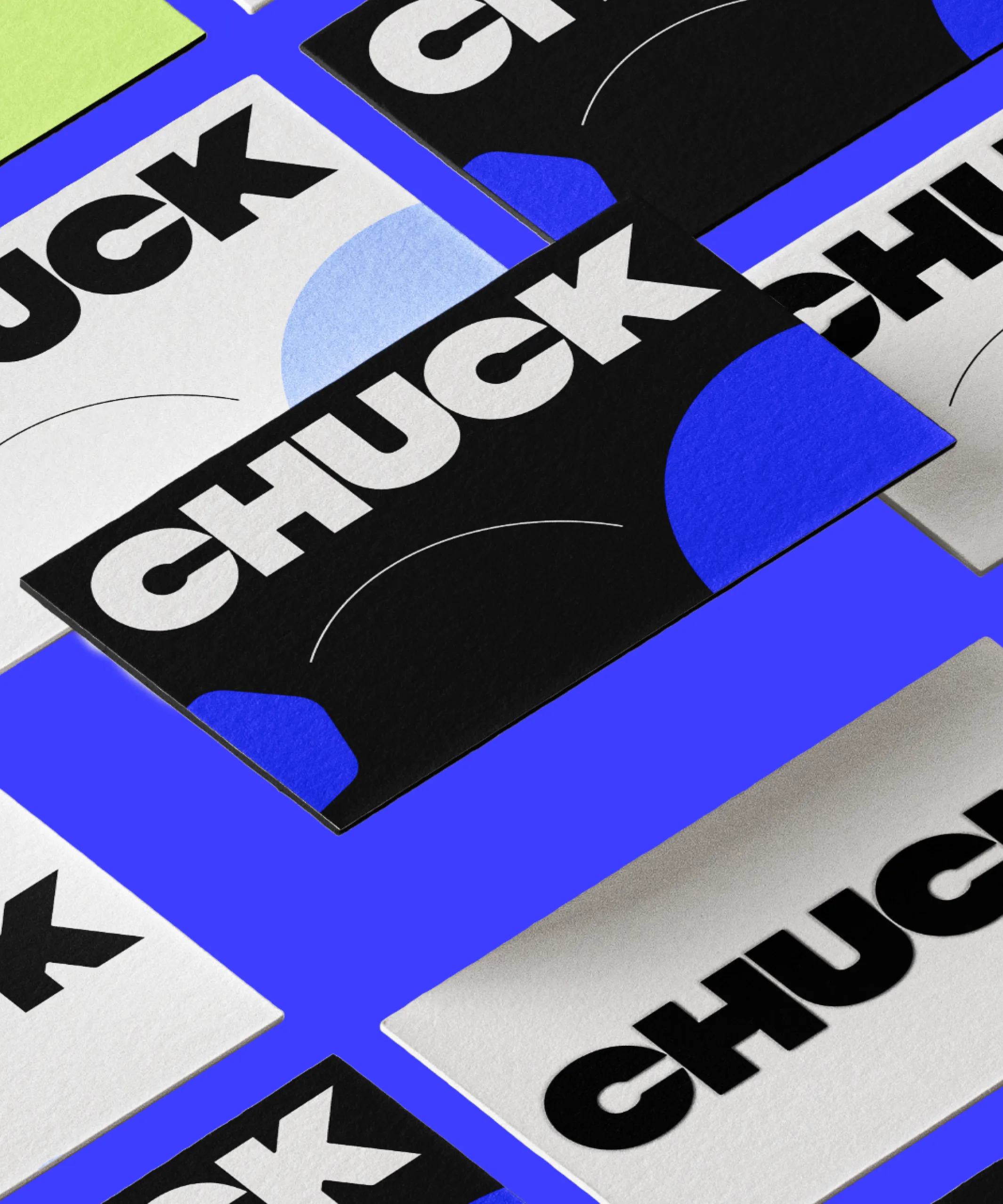
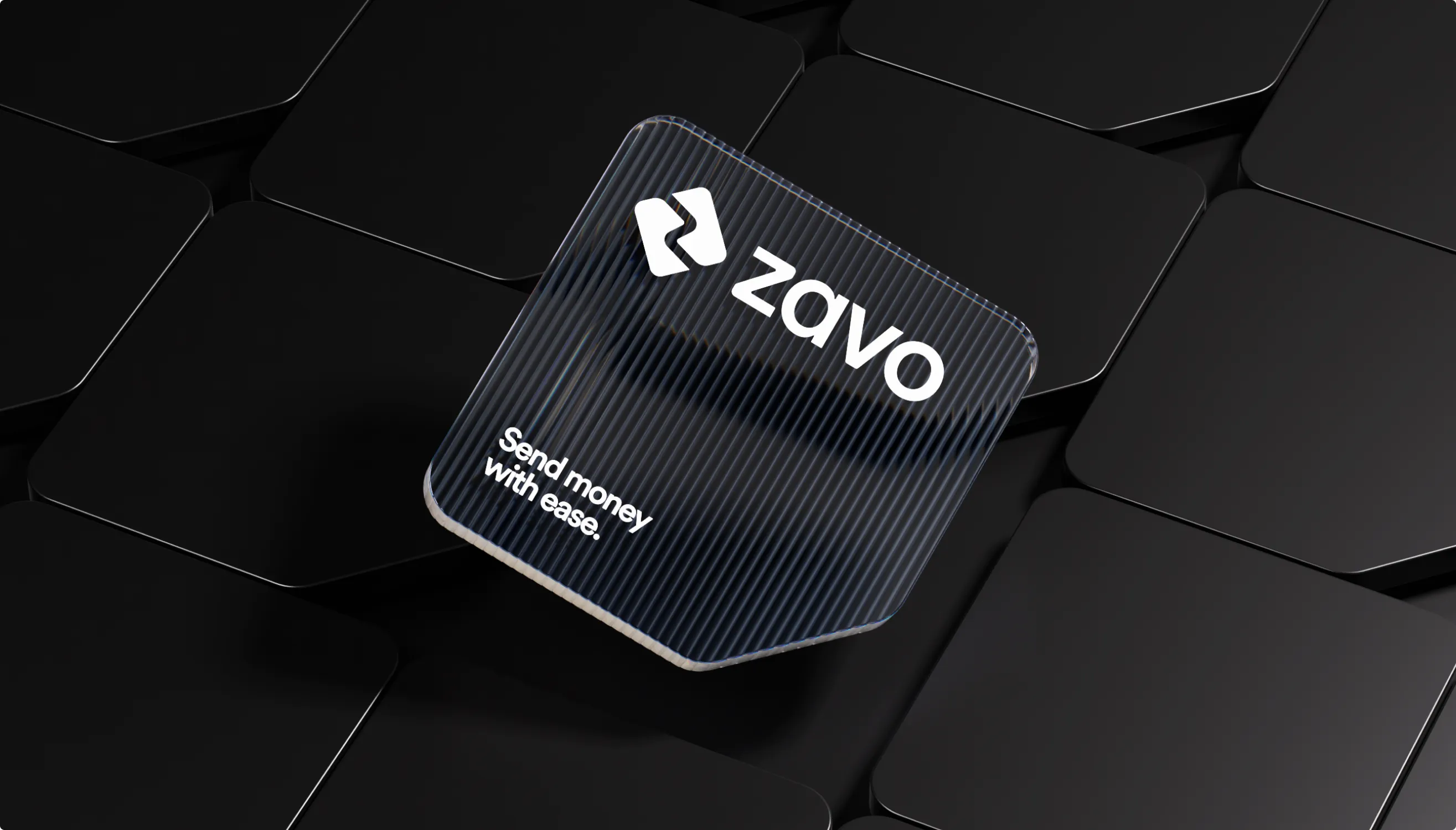
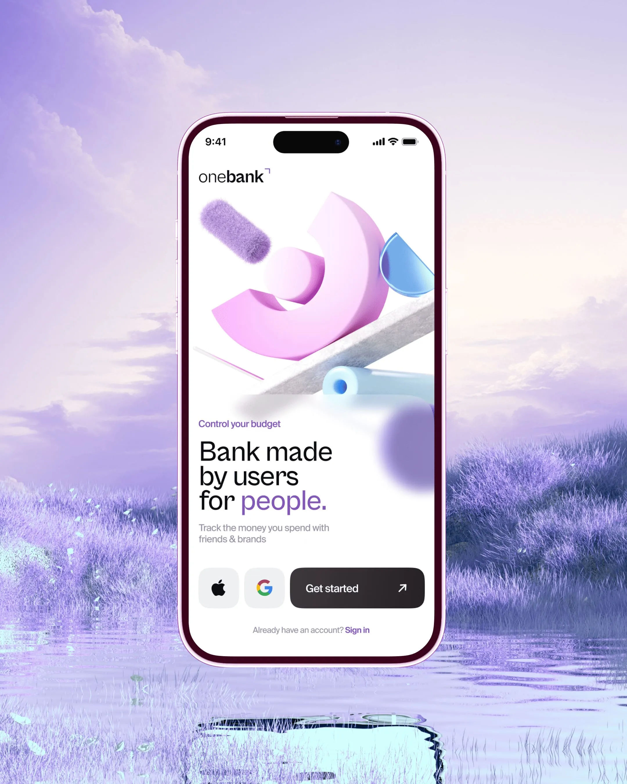
Three published cases where the phone was the product.
From idea to launch
Built to survive compliance review, not to route around it.
Rules and states
Your product rules turned into the full state matrix before a screen is drawn.
First-run flow
Signup, identity checks, and funding designed as one continuous path.
Core screens
Home, payments, cards, and statements, designed one-handed and on a real device.
Two platforms, one system
Shared logic once, platform specifics separately, components handed over in code.
Store and measure
Store assets, release, and the funnel read afterward against the numbers we agreed.
 Stoovo
“We were in constant touch with our Design Lead, and he was really a part of our team.”
Hantz Févry · Co-Founder & CEO
Read the full review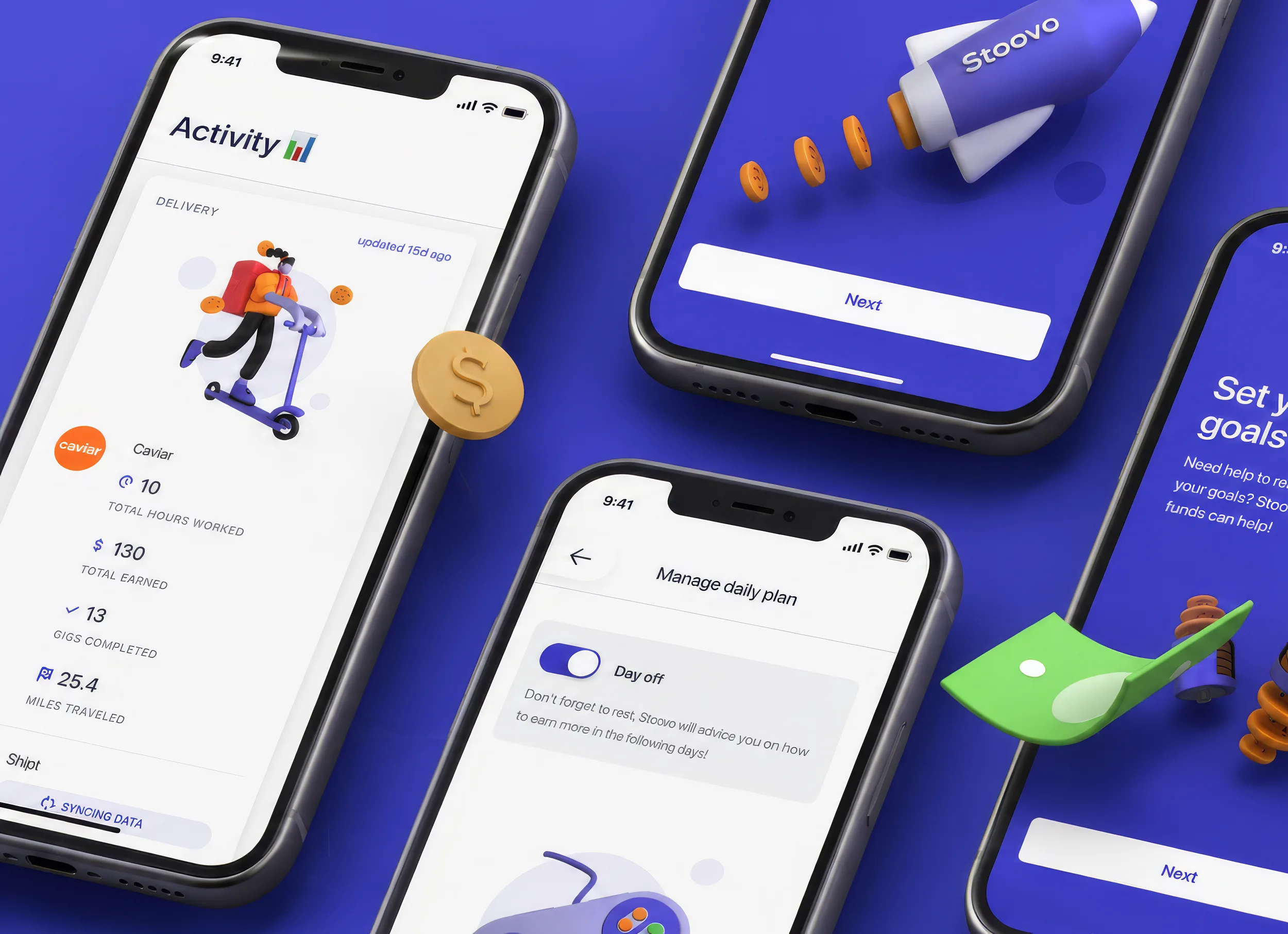
Join hundreds of teams. And counting.






































See what this would look like on your product.
Send the product and the deadline. You get a reply within 24 hours with the closest cases, a timeline and an estimate.
Questions?
Do you design for both iOS and Android?
Yes, in one engagement. We follow each platform where users would notice a difference: navigation, sheets, system authentication, share. Everything else stays identical, so the design system stays one system.
Can you improve onboarding conversion without a full redesign?
Usually, yes, and it is the cheaper first project. We run a focused pass on first run and KYC: cut fields, re-sequence verification, rewrite the rejection copy, add the states you are missing. That scopes to weeks and makes the case for anything larger.
Do you hand over specs engineers can build from?
Yes: components, tokens, states, and the platform differences documented. On engagements that include our AI infrastructure service, agents produce the handoff specs and resizing inside your workspace, and a human reviews everything. That keeps the specs current after delivery.
What about App Store assets?
Included when you want them. Screenshots and listing copy are what people see before installing, so they are part of the conversion path. We design them with the same attention as first run.
Can you work under our compliance and legal review?
Yes, and it is faster when compliance joins early. We bring the flow, the states, and the wording to review together rather than designing a happy path and patching it afterward, which is where most of the rework in a regulated app comes from.
How do you know whether the app got better?
We agree the numbers before the work starts — completion of the first session, drop-off per identity step, support contacts per thousand payments — and read them after release. If one did not move, we say so and tell you what we think it costs to move it.
Last updated