UX/UI design for healthtech, clinician side and patient side
A clinician has 9 minutes per appointment. A patient reading a result is worried and short on time. We design healthtech products for both, backed by published UX research across 30+ healthtech platforms.
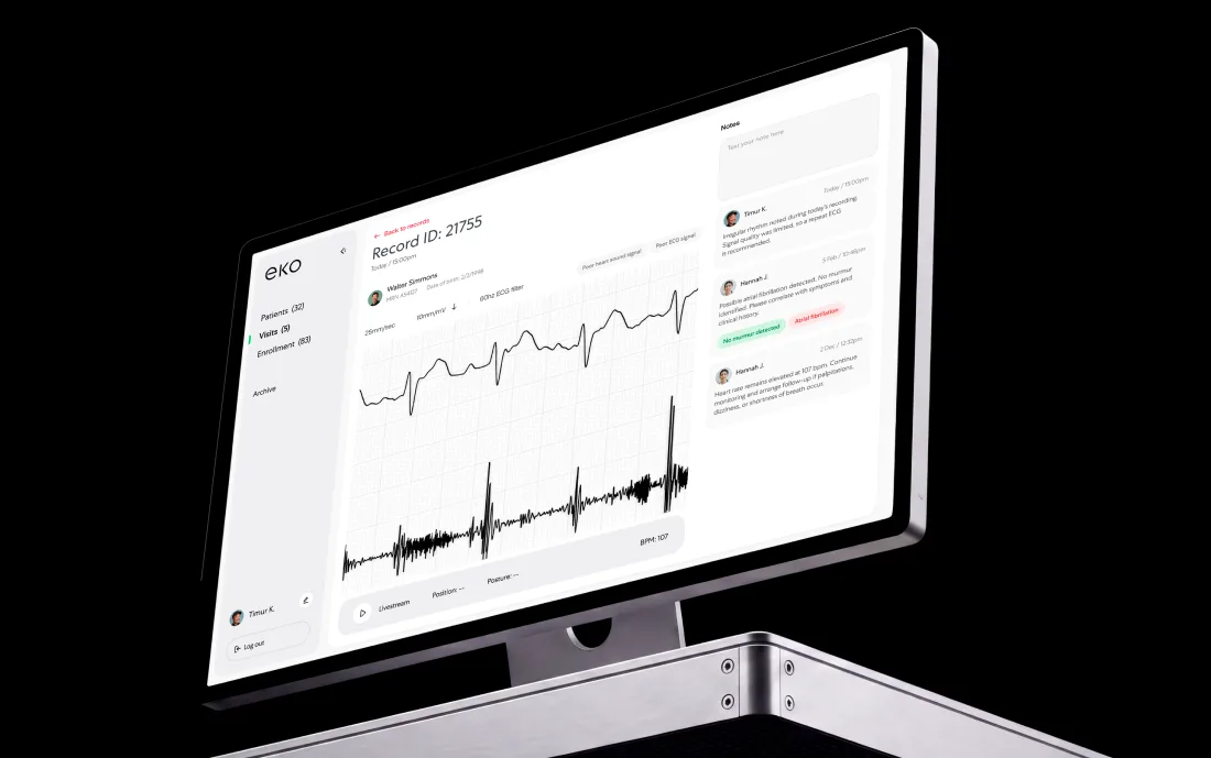
Why healthtech teams bring us in
A clinician gives your interface the time between two patients.
Everything the screen asks for has to be worth part of that.
What we design for healthtech products
Everything below comes from shipped work or published research.
- 01Clinician toolsDense, keyboard-first interfaces built for a 9-minute appointment.
- 02Patient appsOnboarding, adherence, results in plain language, and escalation when a result is urgent.
- 03Device interfacesPairing, capture, signal quality, retries, and the failure states a physical device brings.
- 04Results and reportingHow a result is shown, qualified, shared, and archived, including inconclusive and urgent.
- 05Insurance and claimsClaim intake, review queues, model-assisted decisions, and the audit trail behind each one.
- 06Provider selection and bookingThe step where healthtech funnels leak most, according to our own conversion study.
- 07Consent and privacy UXConsent screens in plain language, data-sharing controls, and the wording around both.
- 08Design systems for regulated UITokens, components, and accessibility checks that keep a growing clinical product consistent.
Three patterns from our healthtech work
They show up on almost every engagement.
The 9-minute appointment
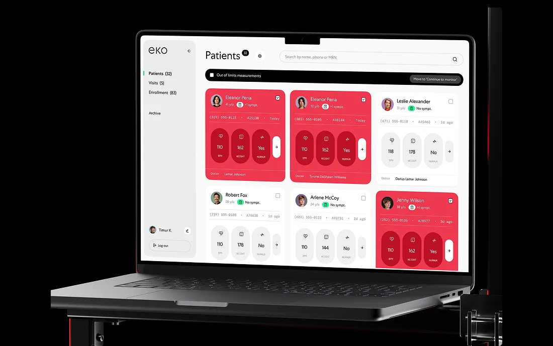
Clinician screens are designed for speed under interruption. Everything needed for a decision sits in one view, no modal loses context, and there is a path back to where the last patient left off.
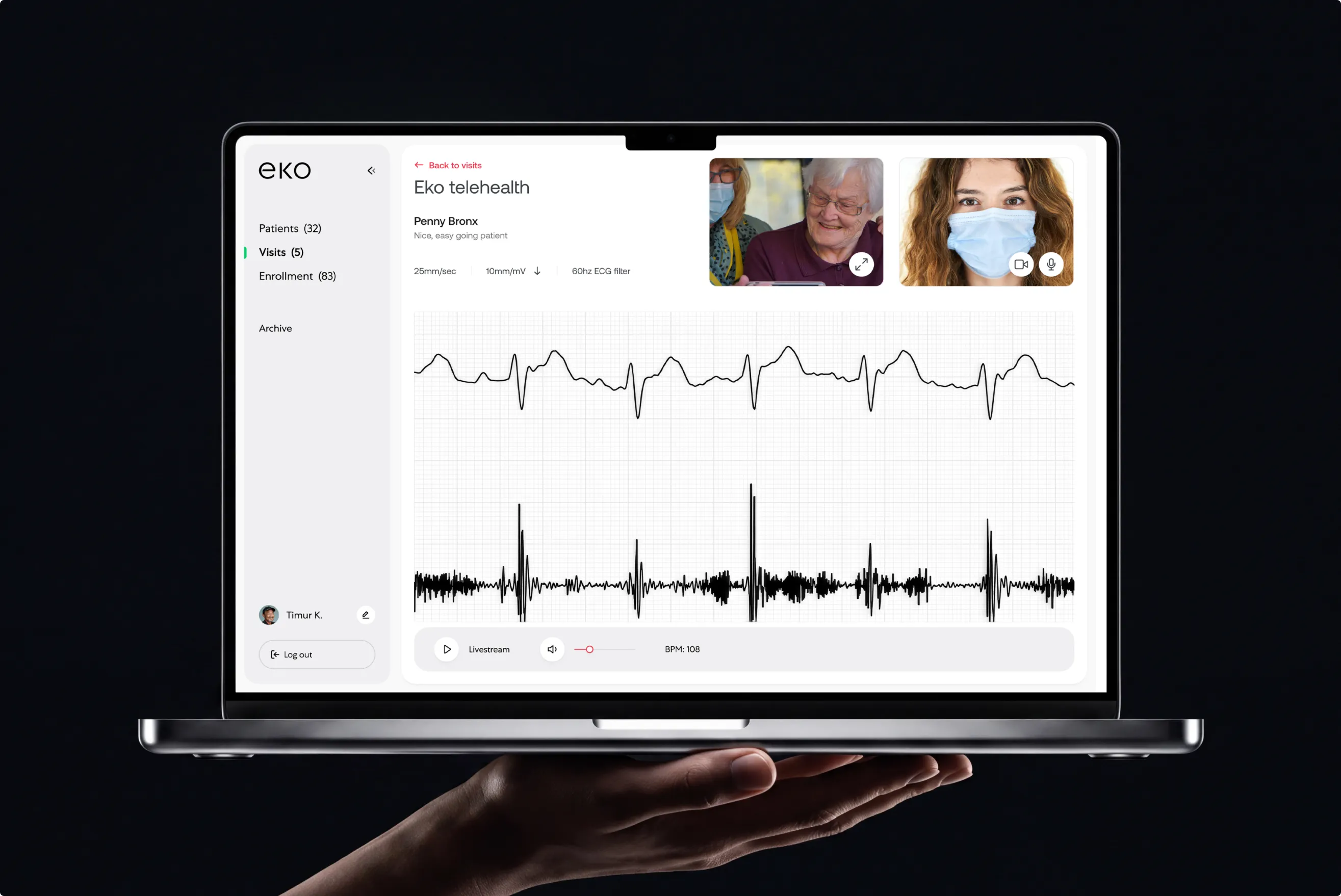
Results a patient can act on
A number with no explanation creates a phone call. We design the reading, the range, the plain-language meaning, and the next action together. Inconclusive is a result too, and it gets its own screen.
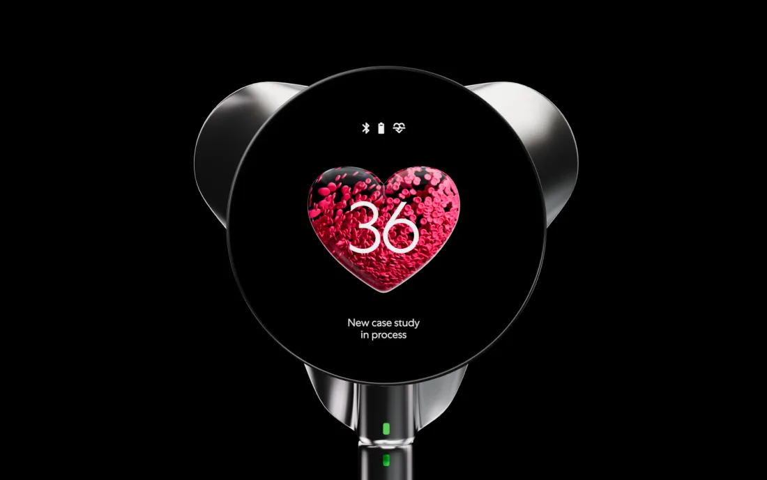
The device is part of the interface
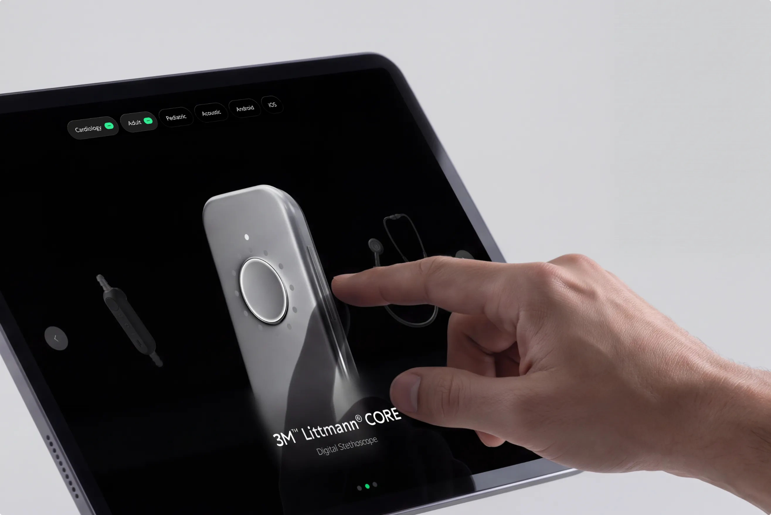
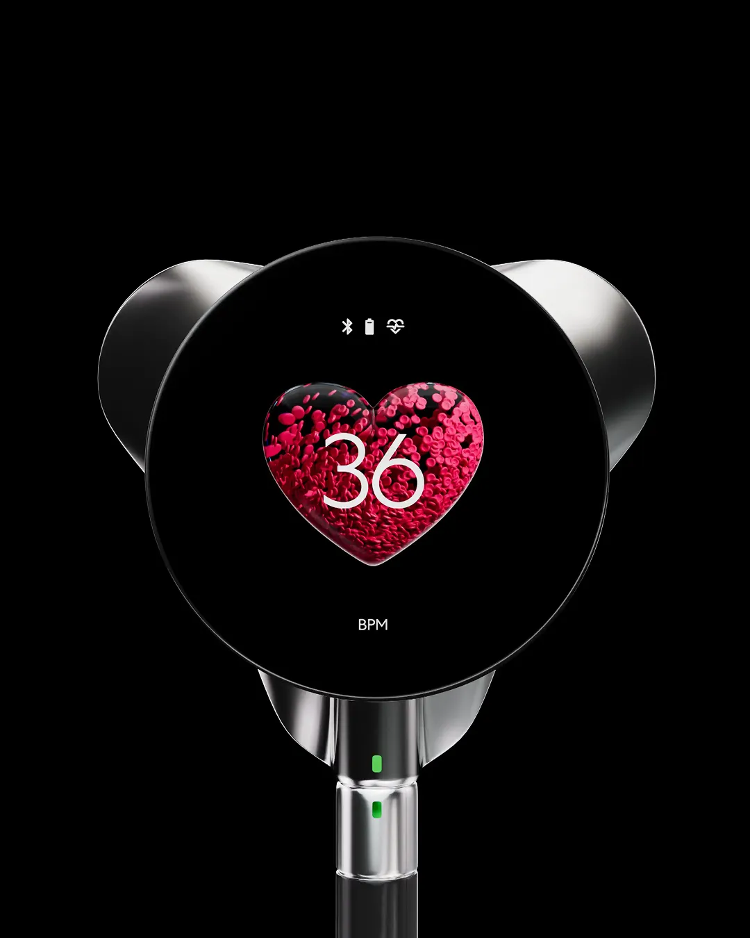
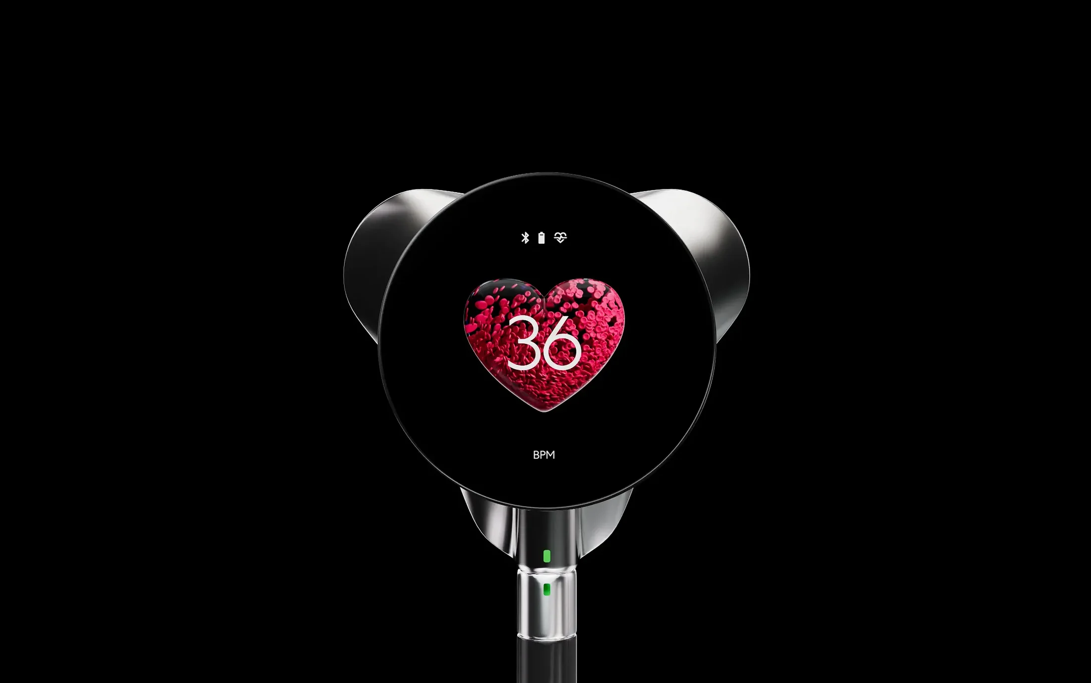
When a stethoscope, sensor, or camera is in the loop, half the UX is pairing, signal quality, and retry. We design that handshake with the same care as the dashboard it feeds.
Healthtech work and research
Four of our published cases are healthtech. Two of them, plus the research:
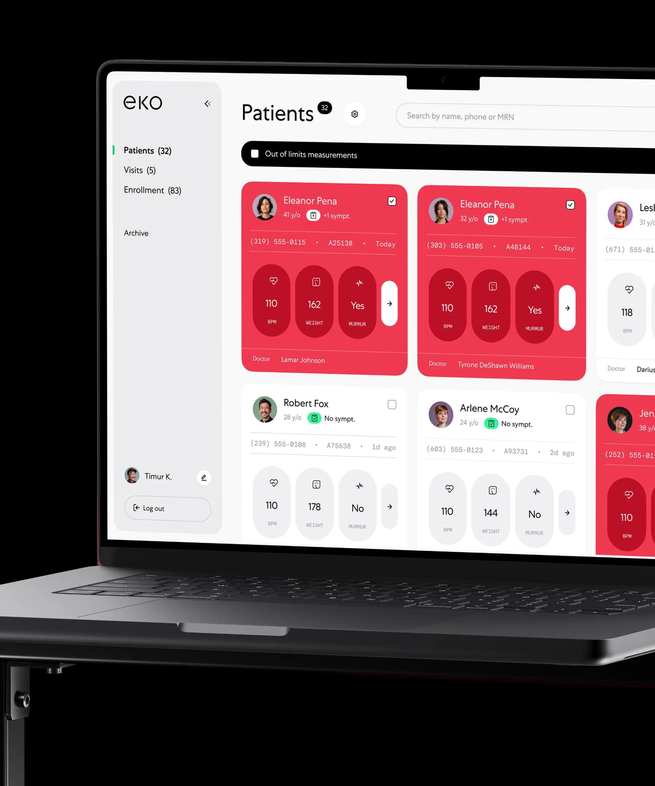
Eko Health
Advanced stethoscopes and smart assessment software, with the exam and result states that come with them.
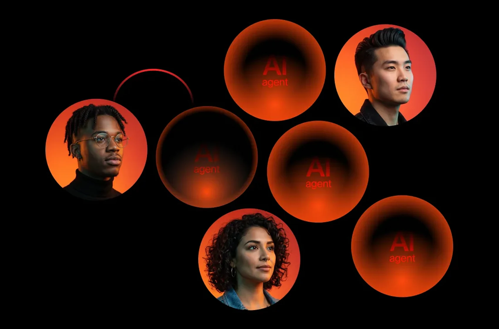
Qantev
An AI platform applying mathematics to health insurance operations. We gave it a brand and a language it can sell with.

Healthtech UX report
Our published UX audit of 30+ healthcare platforms. Free to read.
From idea to launch
Built to survive clinical review, not to route around it.
Clinical context
We watch the work happen: who reads the screen, when, and next to which other system.
States and evidence
The full state matrix, including inconclusive, overridden, and pending, before any screen.
Both audiences
Clinician tools and patient screens designed together, on one component set.
Accessibility and system
Contrast, targets, and screen-reader paths designed in, then handed over in code.
Validate and ship
Tested with real clinicians and real patients, then read against the numbers we agreed.
 Spren (Elite HRV)
“UX design isn’t easy to get right but with them, we can move fast without compromising quality.”
Sophie Lezama · Innovation Director
Read the full review
Join hundreds of teams. And counting.






































See what this would look like on your product.
Send the product and the deadline. You get a reply within 24 hours with the closest cases, a timeline and an estimate.
Questions?
Do you work with regulated medical products?
Yes. We designed the clinical UI for Eko Health, a medical device company, and worked with Qantev on health insurance operations. Your quality and regulatory team owns the standard. We make sure the interface meets it and stays usable.
Can you design for clinicians and patients in one project?
Yes, and it is usually the right scope. The two views share one data model and differ in density and language. Designing them together keeps the patient and the clinician from seeing two contradictory framings of the same number.
What do you already know about our competitors?
Probably a lot. We published a UX audit of 30+ healthcare platforms and a conversion study across 30+ healthtech platforms, covering onboarding, pricing, provider selection, social proof, and support. Both are free to read on this site.
Do you do accessibility work?
Yes, on every healthtech project. Older patients, impaired vision, one-handed use, and clinical lighting are the normal conditions in this category. Contrast, target size, focus order, and screen-reader labels are part of the design system we hand over.
How do AI features fit into a clinical interface?
With the human decision always visible. We show the model’s confidence, show the evidence behind a suggestion, and make the override the easiest action on the screen. Our AI flow design page covers these patterns.
How do you know whether the design worked?
We agree the numbers before the work starts — time to complete a review, error and correction rate, patient completion of a result flow, support contacts per thousand sessions — and read them after release. If one did not move, we say so and tell you what we think it costs to move it.

Last updated