Dashboard design for healthtech, built around the worklist
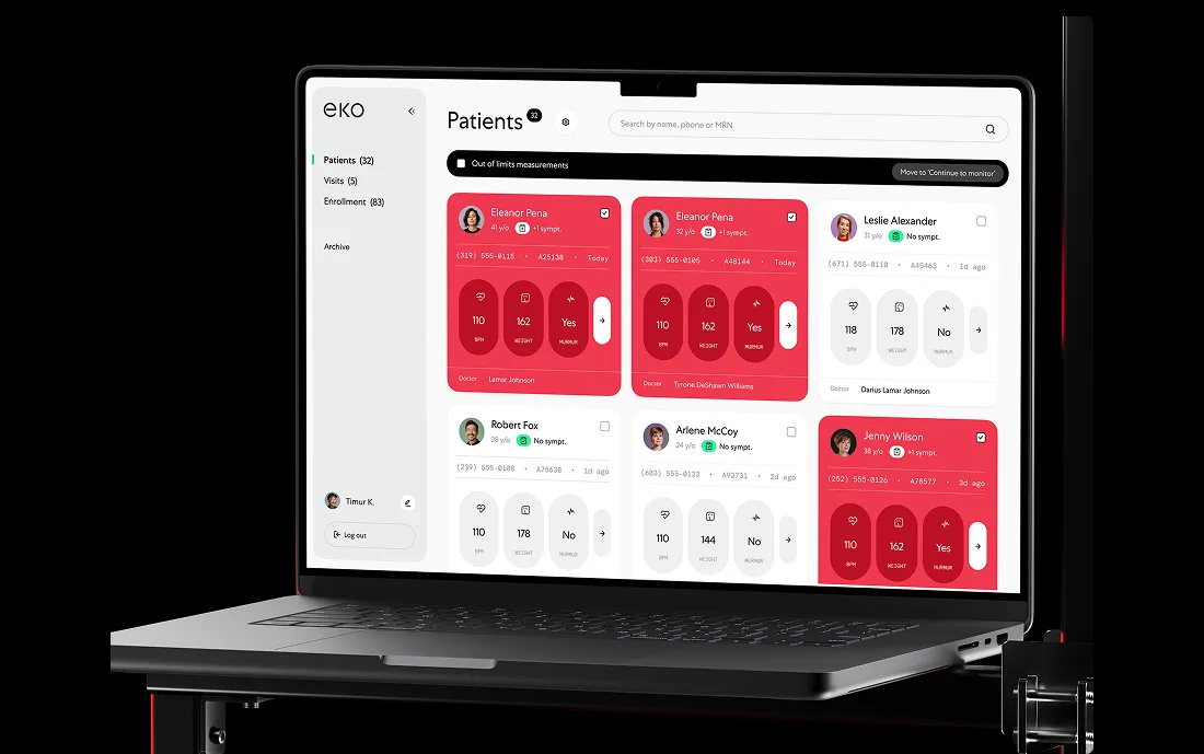
Healthcare software gets used in worklists, panels, and review queues, under time pressure, by people who get interrupted before they finish. The first job of every screen is to show what needs attention now.
Why healthtech teams bring us in for dashboards
A worklist is not a report. It is a queue somebody has to finish.
So the first question the screen answers is what to open next, and why that one.
Types of clinical dashboards we build
From the first clickable prototype to a screen read for a whole shift.
- 01Worklists and triageWhat to open next, why it is next, and what happens when it is skipped.
- 02Case and patient viewsEverything needed for one decision, without a second window.
- 03Model output with evidenceA suggestion, its basis, its confidence, and the way to disagree with it.
- 04Exception and escalationThe path for the case that does not fit the flow, designed rather than improvised.
- 05Audit and historyWho saw what, when, and what they did — visible in the interface, not only in a log.
- 06Reporting and exportThe reports that leave the product and land in someone else’s meeting.
- 07Roles and permissionsClinician, operations, and admin views that do not become three products.
- 08Integration surfacesThe screens that carry data from an EHR or a lab system you do not control.
The three conditions we spend the most time on
From clinical and claims work we have shipped.
The worklist
Sorted by urgency, filterable in one click, and readable at a glance from across the room. Every row carries the one fact that decides whether it gets opened next.
The case view
Everything needed for one decision sits in one view: history, the current reading, the model’s suggestion with its basis, and the action. No modals that lose the reviewer’s context.
The exception path
Missing data, conflicting records, an inconclusive result, a claim that needs a human. Design the exceptions well and staff stop keeping a spreadsheet next to your product.
Healthtech platform work
Two published cases and our healthtech UX report.
Qantev
An AI platform applying mathematics to health insurance operations: review queues and assisted decisions.

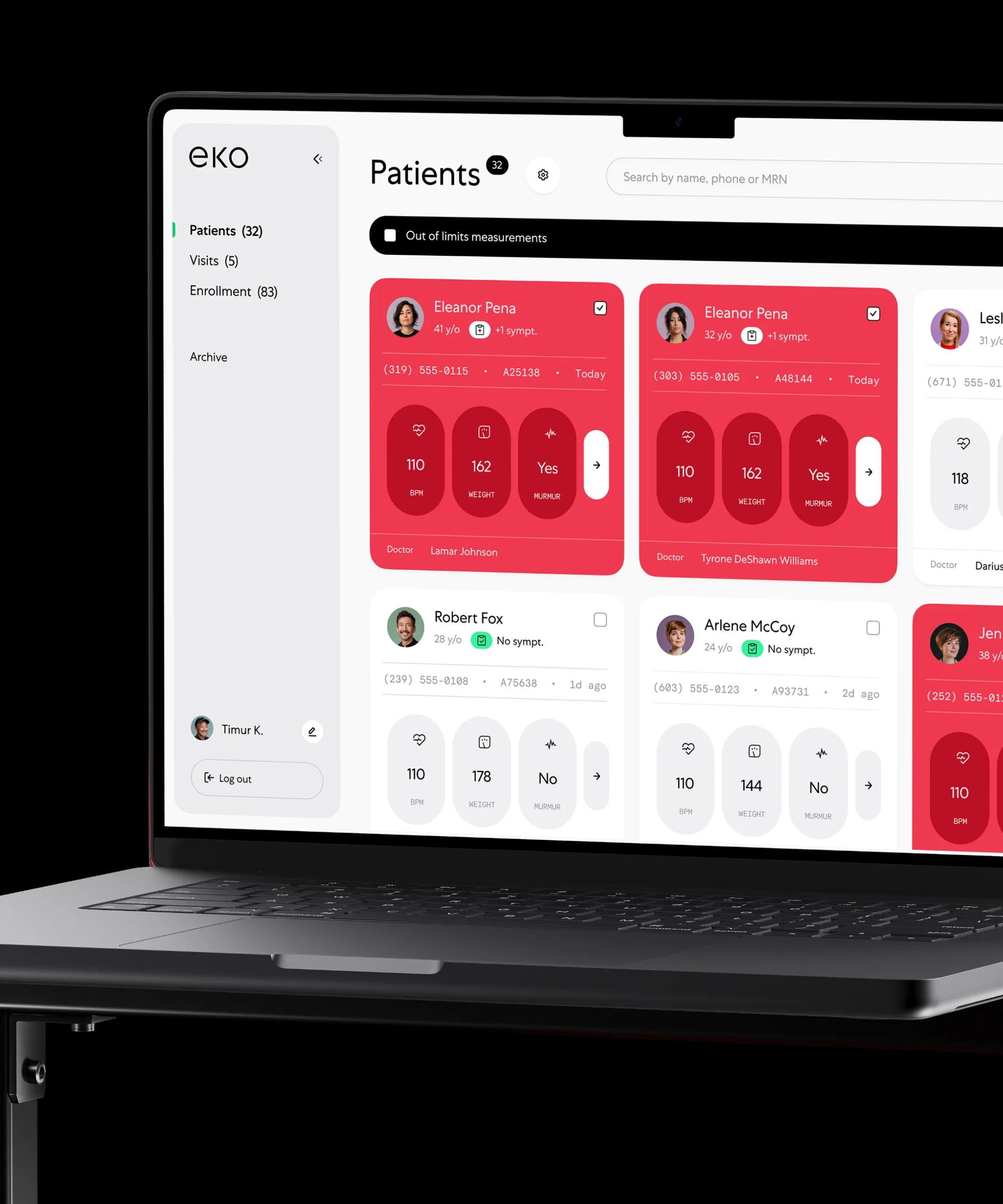
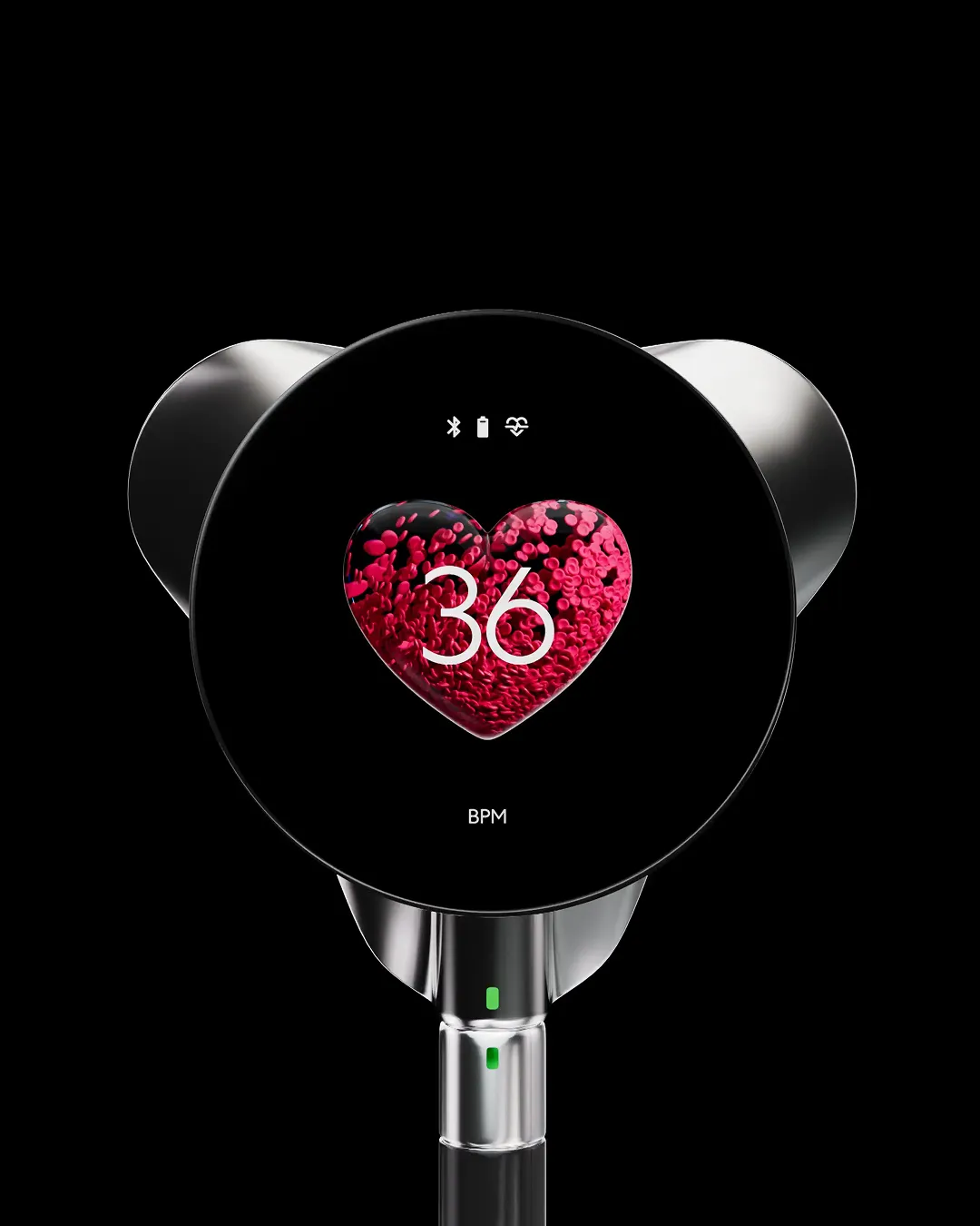
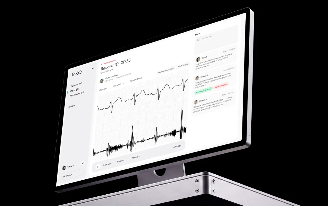
Eko Health
Advanced stethoscopes and assessment software, including the exam and result screens.
Healthtech UX report
Our published audit of 30+ healthcare platforms, including the operational screens.
From idea to launch
Designed next to the people who will run the queue.
Shadow the work
We watch the queue being worked, on the real screens, next to the real systems.
Queue and states
Priority, ownership, and every state a case can be in, agreed before a screen.
The three screens
Worklist, case view, and the exception path, designed and tested together.
Density and system
Type, tables, and keyboard paths built as components and handed over in code.
Validate and ship
Tested on a real caseload, then read against the numbers we agreed.
 Tangible Markets
“They went beyond by putting in overtime hours when necessary to ensure the project's success.”
Samantha Jollivet · Operations Coordinator
Read the full review
Join hundreds of teams. And counting.





































See what this would look like on your product.
Send the product and the deadline. You get a reply within 24 hours with the closest cases, a timeline and an estimate.
Questions?
Do you design for clinicians or for operations teams?
Both. They need different screens from the same data: a clinician wants the patient in front of them, and an operations lead wants the queue, the aging, and the exceptions. We design them as two views on one model.
How do you show AI suggestions in a clinical dashboard?
With the evidence attached and the override within reach. A suggestion appears next to what it was based on, with a plain statement of confidence. Disagreeing with the model takes one click, and the human decision is recorded as the decision. Our AI flow design page covers these patterns in more detail.
Can you work within our existing EHR or platform constraints?
Yes. Most healthtech dashboards live beside systems that cannot change, so we design within those constraints. We say plainly which improvements need a platform change; that distinction is usually the most useful output of the first week.
Is accessibility relevant for internal clinical tools?
Yes. Clinical lighting, gloves, small laptops on carts, long shifts, and imperfect eyesight are the working conditions. Keyboard-first navigation, visible focus, generous targets, and high contrast are the baseline we design to.
Do you design the reports as well as the screens?
Yes. A report that leaves the product and lands in someone else’s meeting is part of the product, and it is usually where a dashboard’s credibility is decided. We design the export with the same care as the worklist.
How do you know whether the dashboard got better?
We agree the numbers before the work starts — time to clear a case, queue age, correction and rework rate, how often people leave for a second system — and read them after release. If one did not move, we say so.


Last updated