Dashboard design for SaaS, from the empty state to year three
Most dashboards are designed for the customer who has been around a year, but every trial starts with an empty screen. We design both ends: a first run that gets to value quickly, and dense views that hold up as the data grows.
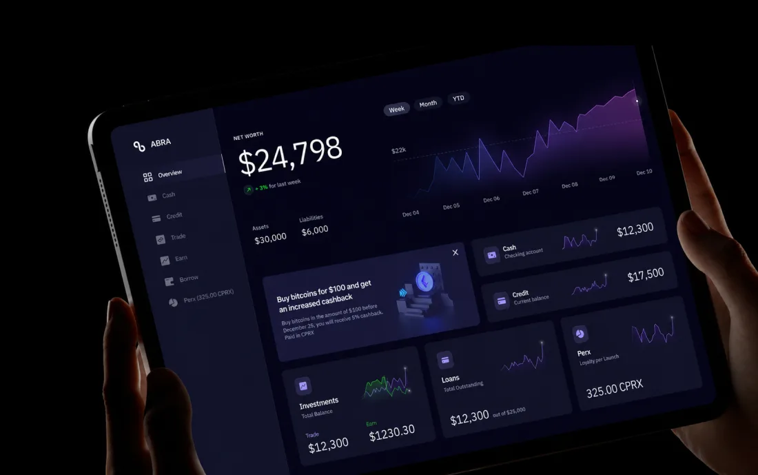
Why SaaS products outgrow their first dashboard
Nobody logs in to see a dashboard. They log in to find one thing and act on it.
So the landing screen is a queue with a next action, not a wall of charts.
What we design in a SaaS dashboard
The surfaces that decide activation, retention and support load.
- 01First run and empty statesImport, sample data, the first useful action, and visible progress.
- 02Overview and metricsWhat earns a place on the landing screen, and what belongs in a report instead.
- 03Tables and listsSorting, filtering, saved views, bulk actions, pagination, and column management.
- 04Detail and editDrill-down, inline edit, side panels, and an undo people can trust.
- 05Settings and permissionsRoles, invites, SSO, audit log, and billing.
- 06Notifications and digestsIn-app and email, tuned so the important event is not buried in noise.
- 07Reporting and exportScheduled reports, CSV, share links, and the permissions that travel with them.
- 08Design system for data UITable, chart, filter, and form primitives documented in code, with accessibility built in.
Three decisions that make or break a dashboard
Where we focus first, based on the products we have shipped.
What the landing screen is for
We pick the one question the landing screen exists to answer. Usually that is “is anything wrong, and what needs me today?” Everything else moves to reports.
How the table behaves at scale
Filters that combine, views a team can share, bulk actions with a safe undo, and a loading pattern that does not shift the layout. Power users spend their day here, and trials get abandoned here.
Who is allowed to see what
The permission model shapes the navigation, the empty states, and the invite flow. Designing it late is the most common reason a B2B product feels bolted together.
Dashboard and platform work
Three published cases with data-heavy interfaces.


From idea to launch
Read the funnel first, redraw second.
Funnel read
Where activation actually breaks, from your own data rather than from a hunch.
First run
Empty states designed as onboarding, so the product teaches itself on day one.
Core screens
Overview, tables, detail, and settings, designed against real volumes of data.
System in code
A component library your engineers extend without coming back to us.
Ship and measure
Release, then read the same funnel numbers we started from.
 Lafluence
“The collaboration was very lean and transparent. The work was very well structured.”
Peter Varga · Founder & CEO
Read the full review
Join hundreds of teams. And counting.






































See what this would look like on your product.
Send the product and the deadline. You get a reply within 24 hours with the closest cases, a timeline and an estimate.
Questions?
Can you improve activation without rebuilding the product?
Usually, yes, and it is the right first project. A focused pass on first run, empty states, and the first useful action takes a few weeks and ships inside your existing design system. It produces a measurable change in trial-to-active before anyone commits to a redesign.
Do you design data visualization?
Yes, with a bias against decoration. We choose each chart for the question it answers and use color for meaning. Every chart has a table behind it, because most people who care about a number want the rows.
How do you handle a product that has grown messy?
We inventory the screens, find the duplicated patterns, and propose a component set that covers them. A ranked plan says which screens to migrate first for the most relief. You decide how far to go, and nothing has to be rewritten at once.
Do you work with our engineers or hand over files?
Both. On engagements that include our AI infrastructure service, agents produce the handoff specs, resizing, and design-QA passes inside your workspace, with a human review gate. The specs stay current as the build moves.
Is accessibility part of dashboard work?
Yes. In dense B2B UI, accessibility is mostly keyboard and focus work: tab order that follows the layout, visible focus, shortcuts for repeated actions, and contrast that survives a projector in a meeting room.
What numbers tell you the dashboard work paid off?
We agree the numbers before the work starts — activation on day one, time to the first useful action, weekly return rate, support contacts per thousand sessions — and read them after release. If one did not move, we say so and tell you what we think it costs to move it.
What SaaS dashboards have you actually shipped?
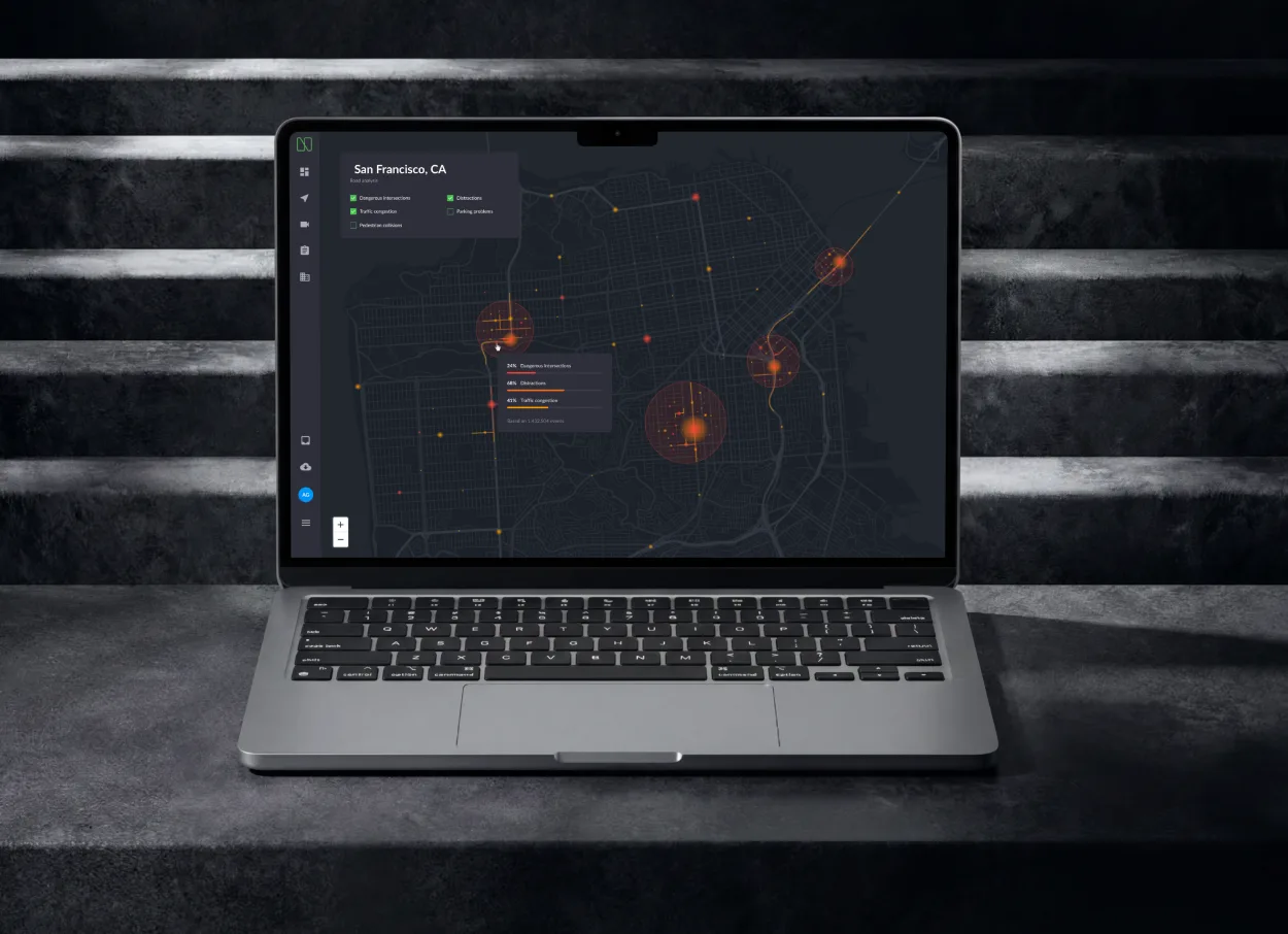
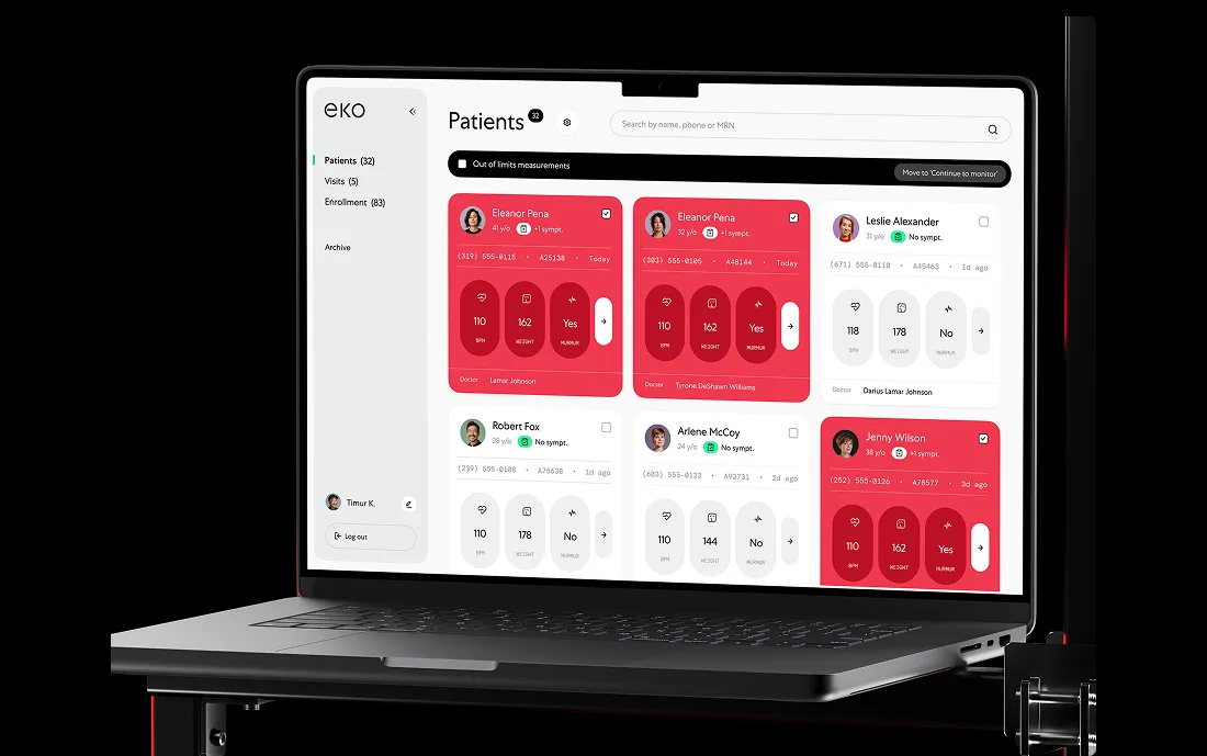
Quipli, where independent equipment rental companies run inventory, orders, and billing from one platform. Acronis, where a security company protecting 750,000 businesses needed its web console rethought. Qantev, where claims handlers spend the whole day inside model-assisted review queues. Three different data shapes, one common thread: the table is the product.


Last updated